Hi,
I’m trying to visualize my data to be in this form:

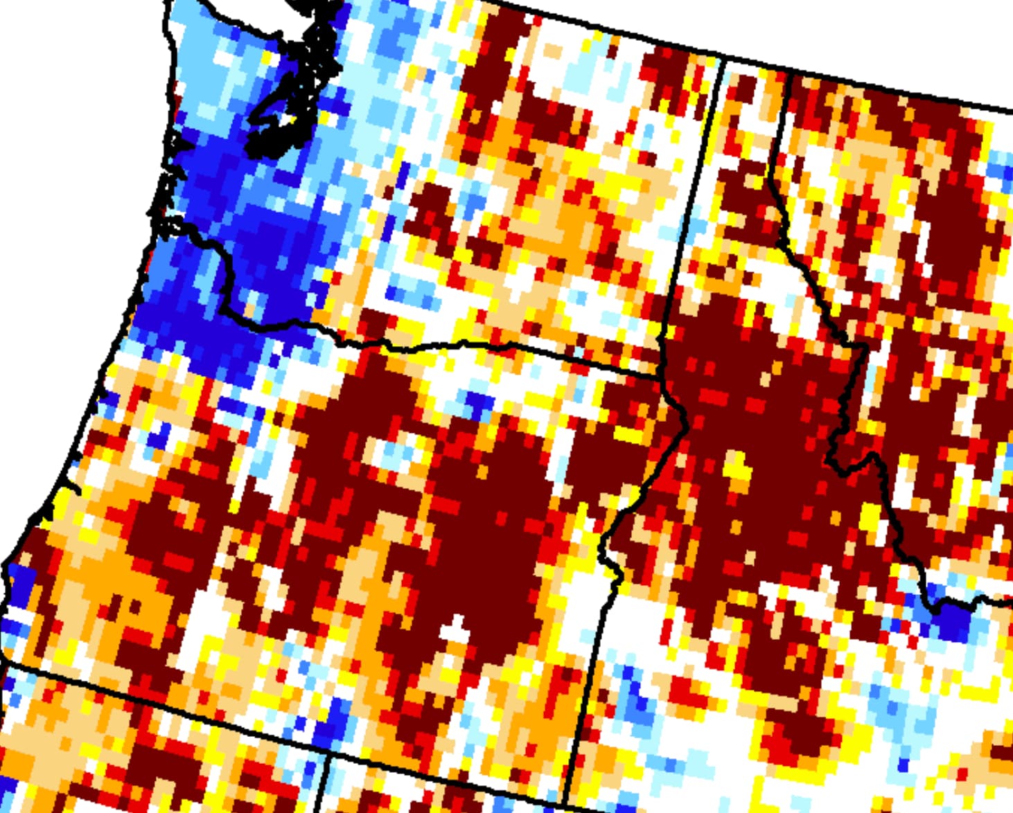
Using Plotly, I plotted my data onto a map. However, the issue is that when zooming in, you can see the space between the data points:

It seems like the kind of map I want is a choropleth, however, most of the choropleth maps seem to be either for states or counties. I want my map to be like gridded squares (like the first image) at a resolution of 0.125 deg (the same resolution as the data). Is there any way I can do this?
I’m quite new to this so I would appreciate any help!
Thanks!