Hello guys,
i have a short question to u all! ![]()
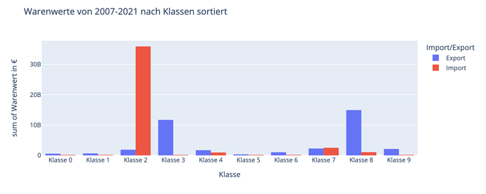
I would like to make a histogram with groups (see picture 1) → With a timeslider
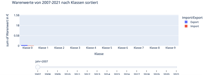
I have already made one but it only shows me the “class 1” → english: “class 1”.
Code:
fig = px.histogram(df_for_slider1, x="Klasse", y="Betrag", color='Import/Export', barmode='group', height=400, animation_frame="Jahr",  animation_group="Klasse", labels={'Betrag':'Warenwert in €'}, title='Warenwerte von 2007-2021 nach Klassen sortiert')


fig["layout"].pop("updatemenus") # optional, drop animation buttons
fig.show()
Do you have an idea what could be wrong?
I would be very grateful to you!
Greets!

