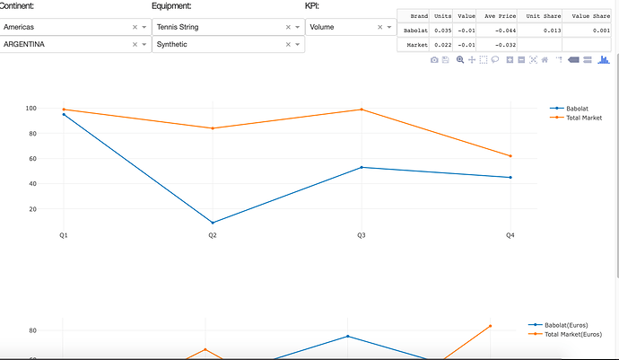
I have created a dashboard that has 2 graphs which are connected to dropdown using multiple inputs and outputs. While all the inputs and outputs with the dropdowns work, the layout of the final graphs do not appear at all and I have no idea why. This is my current code focusing on the last callbacks for the first graph:
@app.callback(
dash.dependencies.Output('linear2','figure'),
[dash.dependencies.Input('country','value'),
dash.dependencies.Input('Equipment_Type','value'),
dash.dependencies.Input('Volume_Sales','value'),
dash.dependencies.Input('Equipment_Sub_Category','value')])
def update_graph(country_name,type_name,volumeorsales,category_name):
 Babolat1=Babolat[Babolat['Country'] == country_name]
 Babolat2=Babolat1[Babolat1['Equipment_Type'] ==type_name]
 Babolat3=Babolat2[Babolat2['Volume_Sales'] ==volumeorsales]
 Babolat4=Babolat3[Babolat3['Equipment_Sub_Category'] ==category_name]#creating column values where the variables pass through to reflect new changes in dropdown
 Babolat4_x=Babolat4.Quarter
 Babolat4_y=Babolat4.Value
 Totalx=Babolat4.Total_Quarter
 Totaly=Babolat4.Total_Value
 trace1=go.Scatter(x=Babolat4_x,y=Babolat4_y,mode='lines+markers',name='Babolat')
 trace2=go.Scatter(x=Totalx,y=Totaly,mode='lines+markers',name='Total Market')
 return {'data':[trace1,trace2],
        'layout':go.Layout(xaxis={'title': '2018'},
                           yaxis={'title': 'Production'},
                           title= 'Shipment',
                           hovermode='closest')}
The second graph is almost a replica just with different variables representing the data.
This is what the dashboard currently looks like with the code:
As you can see, the data in the function appears but the layout itself ( the x axis title, y axis title, and title of the graph) does not appear for either graph. I feel like there is a simple answer here but I couldn’t find anything that relates to this issue and I have no idea what I am missing. Any help would be great appreciated, thanks!
