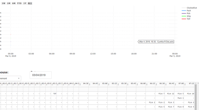
If you can notice closely, I know that the data points are being registered in the gantt chart. but they’re all appearing as small bubbles on the axis lines for each user.
I tried changing the bar-wdith parameter of ff.create_gantt but that doesn’t seem to be working:
        fig =  ff.create_gantt(graph_employee_data, colors=colors, index_col='Resource', title='', group_tasks=True,
    show_colorbar=True, bar_width=10000, height=500, width=1500, showgrid_x=True, showgrid_y=True)
Anybody know how to make the data points for each 15 minute benchmark appear onto the gantt chart?
