Filter Dataframe based on Dropdown Filter for px.timeline

Hello @farispriadi,
This is Great and I will certainly study and learn much from this code.
As a newbie , my actual application is for work and Is there a way I can share with you directly my dilemma for privacy??.
My work plot has mulitple timeline plots for various task associated with each product as well certain Milestones which I used (add.trace)Timeline &Scatter plots to accomplish ?
Meanwhile for others to learn along with me, I will attempt to describe further keeping this example in mind.
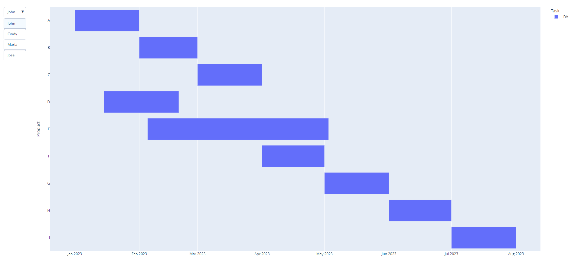
Below is what I came up with from trying different codes snippets( if theres a source for a beginner to understand the updatemenus / buttons / args please advise :grinning:

As shown below. This however DOES NOT work as you indicated and YES the layout is broken once I click on the dropdown. I also did not figure out how to get back to label = "All " yet.

ALSO when I change the color = “Task” to color = “Customer” - the Legend appears and provides the EXACT functionality I am looking for but AGAIN for my end application the TASK in the Legend is what I need.

OK here’s what I’m thinking:
1. When I click on the Customer, can I then filter the dataframe and then pass the new args to the timeline plot to then regenerate the plot (same way as the legend would accomplish. ??

AGAIN thank you for the response but I’m still in need of a way of doing this WITHOUT DASH.

import plotly.express as px
import pandas as pd
import plotly.offline as pyo

file_path = “/Users/dabideena/Documents/Python Programs/SampleFilter.xlsx”
df = pd.read_excel(file_path)

fig = px.timeline(df, x_start=“Start”, x_end=“End”, y=“Product”, color=“Task”)

fig.update_yaxes(autorange=“reversed”)

fig.update_layout(
updatemenus=[
dict(
type=“dropdown”,
showactive=True,
buttons=list(
[

                dict(
                    label=cust,
                    method="update",
                    args=[
                        {
                            "visible": [
                                True if c == cust else False for c in df["Customer"]
                            ]
                        }
                    ],
                )
                for cust in df["Customer"].unique()
            ]
        ),
    )
]

)

fig.show()


Continuing the discussion from Creating a DrownDown Filter for px.timeline:

Hi @Dabi ,

Because of the previous post is mark as solved, I will try to response another post by creating new topics.

As the code shown above, you use update method on dropdown.

update method is used to modify the data and layout sections of the graph.

So you need to create multiple plots (in this case is px.timeline) and put it together into a Figure object (which mean fig variable) .

The multiple plot will be switched one another based on your choice on dropdown menu.

The reason why your plot got blank canvas when you change the dropdown values, is because you just create a plot so when you set visible properties as True, it just will give effect only on the first index.

If I understand your response well, what you really need is the filtered dataframe by Customer value on every option in the dropdown , and show the plot a customer with Task as the legend.

  1. When I click on the Customer, can I then filter the dataframe and then pass the new args to the timeline plot to then regenerate the plot (same way as the legend would accomplish. ??

NO, as far as I know you can not put filtered dataframe to args value. BUT you can create multiple plots based on filtered datafarame and swith to show one another using dropdown.

So as I implement it to code, it will be something like below.

import plotly.express as px
import pandas as pd
import plotly.offline as pyo

# read data from excel
df = pd.read_excel('path/file.xlsx')

# create timeline for certain customer (blue) by filtering the dataframe
# which is it will create 4 timeline charts, because there is 4 customers
for idx, customer in enumerate(df.Customer.unique()):
    df_filtered  = df[df.Customer == customer]
    print(customer, df_filtered)
    if idx==0:
        fig = px.timeline(df_filtered,x_start=df_filtered['Start'],x_end=df_filtered['End'],y="Product",color="Task")
        # hide the plot
        fig.update_traces(visible=False)
    else:
        fig1 = px.timeline(df_filtered,x_start=df_filtered['Start'],x_end=df_filtered['End'],y="Product",color="Task")
        # hide the plot
        fig1.update_traces(visible=False)
        fig.add_trace(fig1.data[0])

fig.update_yaxes(autorange="reversed")

fig.update_layout(
    updatemenus=[
        dict(
            active=4,
            type="dropdown",
            showactive=True,
            buttons=list(
                [
                    dict(
                        label=cust,
                        method="update",
                        args=[
                            {
                                "visible": [
                                    True if c == cust else False for c in df["Customer"].unique().tolist()+[None]
                                ]
                            }
                        ],
                    )
                    for cust in df["Customer"].unique().tolist()+[None]
                ]
            ),
        )
    ]
)
fig.show()

I hope this result is what you are looking for.
timeline_plot_part2

As a newbie , my actual application is for work and Is there a way I can share with you directly my dilemma for privacy??.

I think you can send personal message to another members, to prevent it as public post.

Have a good day!

2 Likes

YES , this is what I needed. Thank you for your wonderful explanation.
Just one more for this topic, how would i add the “ALL Customer” view ?

I tried and I got the ‘ALL Customer’ plot added. I’ve included my code snippet… Let me know if my elif and button append was used appropriatly. It does load intially with a ‘broken blank’ layout but then is set after picking a selection ? How can i fix that ? Thanks Again

# create timeline for certain customer (blue) by filtering the dataframe
# which is it will create 4 timeline charts, because there is 4 customers
print(df)
for idx, resource in enumerate(df.Resource.unique()):
    df_resource = df[df.Resource == resource]
    print(resource, df_resource)

for idx, customer in enumerate(df.Customer.unique()):
    df_filtered  = df[df.Customer == customer]
    print(customer, df_filtered)
    if idx==0:
        fig = px.timeline(df_filtered,x_start=df_filtered['Start'],x_end=df_filtered['End'],y="Product",color="Task")
        # hide the plot
        fig.update_traces(visible=False)
    elif idx>0:
        fig1 = px.timeline(df_filtered,x_start=df_filtered['Start'],x_end=df_filtered['End'],y="Product",color="Task")
        # hide the plot
        fig1.update_traces(visible=False)
        fig.add_trace(fig1.data[0])
    else:
        fig3= px.timeline(df,x_start=df['Start'],x_end=df['End'],y="Product",color="Task")

fig.update_yaxes(autorange="reversed")

button=[]
button.append({'label':'ALL','method':'update','args':[{"visible": True}]})
for cust in df["Customer"].unique().tolist():
    button.append({'label':cust ,'method':'update','args':
                   [{"visible":[True if c == cust else False for c in df["Customer"].unique().tolist()],}]})
    
fig.update_layout(updatemenus=[{"buttons": button}])

Hi @Dabi ,

I see, the problem apparently inside if-elif-else statement.

To make initial “ALL” option display the plot, just comment/remove the fig.update_traces(visible=False) and fig1.update_traces(visible=False) lines.

Also just comment/remove the else part, because it will never be executed.

And at last , you can change elif idx >0 to else, because nothing else idx==0, it will be executed in else.

if I update your code, it will be like below.

# create timeline for certain customer (blue) by filtering the dataframe
# which is it will create 4 timeline charts, because there is 4 customers
print(df)
for idx, resource in enumerate(df.Resource.unique()):
    df_resource = df[df.Resource == resource]
    print(resource, df_resource)

for idx, customer in enumerate(df.Customer.unique()):
    df_filtered  = df[df.Customer == customer]
    print(customer, df_filtered)
    if idx==0:
        fig = px.timeline(df_filtered,x_start=df_filtered['Start'],x_end=df_filtered['End'],y="Product",color="Task")
        # hide the plot
        # fig.update_traces(visible=False)
    # elif idx>0:
    else:
        fig1 = px.timeline(df_filtered,x_start=df_filtered['Start'],x_end=df_filtered['End'],y="Product",color="Task")
        # hide the plot
        # fig1.update_traces(visible=False)
        fig.add_trace(fig1.data[0])
    # else:
    #     fig3= px.timeline(df,x_start=df['Start'],x_end=df['End'],y="Product",color="Task")

fig.update_yaxes(autorange="reversed")

button=[]
button.append({'label':'ALL','method':'update','args':[{"visible": True}]})
for cust in df["Customer"].unique().tolist():
    button.append({'label':cust ,'method':'update','args':
                   [{"visible":[True if c == cust else False for c in df["Customer"].unique().tolist()],}]})
    
fig.update_layout(updatemenus=[{"buttons": button}])
1 Like

Upon review, how would i do the same for this example using Dash ?

Hi @Dabi ,

To implement the figure to Dash, you can use dcc.Graph to display the figure.

And don’t forget to comment or remove fig.show() line.

import plotly.express as px
import pandas as pd
from dash import Dash, dcc


# read data from csv
df = pd.read_csv('...')

# create timeline for certain customer (blue) by filtering the dataframe
# which is it will create 4 timeline charts, because there is 4 customers
for idx, resource in enumerate(df.Resource.unique()):
    df_resource = df[df.Resource == resource]

for idx, customer in enumerate(df.Customer.unique()):
    df_filtered  = df[df.Customer == customer]
    if idx==0:
        fig = px.timeline(df_filtered,x_start=df_filtered['Start'],x_end=df_filtered['End'],y="Product",color="Task")
    else:
        fig1 = px.timeline(df_filtered,x_start=df_filtered['Start'],x_end=df_filtered['End'],y="Product",color="Task")
        fig.add_trace(fig1.data[0])

fig.update_yaxes(autorange="reversed")

button=[]
button.append({'label':'ALL','method':'update','args':[{"visible": True}]})
for cust in df["Customer"].unique().tolist():
    button.append({'label':cust ,'method':'update','args':
                   [{"visible":[True if c == cust else False for c in df["Customer"].unique().tolist()],}]})
    
fig.update_layout(updatemenus=[{"buttons": button}])

# create Dash app
app = Dash(__name__)

# create layout
# display figure using dcc.Graph
app.layout = dcc.Graph(id='graph-id',figure=fig)

# run Dash app
if __name__ == "__main__":
    app.run_server(debug=True)
1 Like

Hello Again,
The following function def generate plots(df, customer=None), generates the individual plots for each customer that I want exactly.
I cannot seem to get the results using the previous example codes using the add_traces ?

The very bottom iteration code for idx, customer… shows each individual plot but I need just one plot at a time starting with ‘ALL’ and then selecting each customer ?

How can I display each plot using a dropdown menu ?

def generate_plots(df, customer=None):
    if customer:
        df_filtered = df[df["Customer"] == customer]
    else:
        df_filtered= df

# Create Figure Plot of Timeline and Milestones
    fig_timeline = px.timeline(
    # fig_timeline.add_trace(
    #     px.timeline(
        df_filtered,
        x_start=df_filtered["Design Validation\nStart"],
        x_end=df_filtered["Design Validation\nEnd"],
        y=df_filtered["Product"],
        text="DV_label",
        color="DV_label",  # This makes the legend to turn on and off
        color_discrete_sequence=["#2F75B5"],  # Set color for DV processes
    )

    # Add a trace for PV processes with a different color
    fig_timeline.add_trace(
        px.timeline(
            df_filtered,
            x_start=df_filtered["Process Validation\nStart"],
            x_end=df_filtered["Process Validation\nEnd"],
            y=df_filtered["Product"],
            text="PV_label",
            color="PV_label",  # This makes the legend to turn on and off
            color_discrete_sequence=["#BF8F00"],
        ).data[0]
    )
    # Adding Milestones 
    fig_milestones = px.scatter(
            df_filtered,
            x=df_filtered["Design Freeze\nStart"],
            y=df_filtered["Product"],
            color="DF_label",
            color_discrete_sequence=["#ed7c31"],
        )
    fig_milestones.add_trace(
        px.scatter(
            df_filtered,
            x=df_filtered["Tool kick off\nStart"],
            y=df_filtered["Product"],
            color="TKO_label",
            color_discrete_sequence=["#c6e0b4"],
        ).data[0]
    )
return fig_timeline

for idx, customer in enumerate(df.Customer.dropna().unique()):
    print(customer, idx)
    fig_idx = generate_plots(df,customer)
    fig_idx.update_layout(title=dict(text=customer, font=dict(size=30), automargin=True),)
    fig_idx.show()


Hi @Dabi ,

As I understand your questions,

in the part of iteration, I think you need to add traces (return of generate_plotsfunction) into a fig object.

After that you can add updatemenus buttons using update method.

for idx, customer in enumerate(df.Customer.dropna().unique()):
    print(customer, idx)
    if idx == 0:
        fig_idx = generate_plots(df,customer)
    else:
        fig_temp = generate_plots(df,customer)
        fig_idx.add_traces(fig_temp.data)

    #fig_idx.update_layout(title=dict(text=customer, font=dict(size=30), automargin=True),)

button=[]
button.append({'label':'ALL','method':'update','args':[{"visible": True}]})
for cust in df["Customer"].unique().tolist():
    button.append({'label':cust ,'method':'update','args':
                   [{"visible":[True if c == cust else False for c in df["Customer"].unique().tolist()],}]})
    
fig.update_layout(updatemenus=[{"buttons": button}])
fig.show()

If you provide reproduceable sample data, it will a big help.
Hope this works for you.