Clutch performance adjustment metric as a horizontal bar chart with dropdown to sort by different performance indicators (pct_clutch_adjusted, total_clutch_shots)
Participation Instructions:
Create - use the weekly data set to build your own Plotly visualization or Dash app. Or, enhance the sample figure provided in this post, using Plotly or Dash.
Submit - post your creation to LinkedIn or Twitter with the hashtags #FigureFriday and #plotly by midnight Thursday, your time zone. Please also submit your visualization as a new post in this thread.
Celebrate - join the Figure Friday sessions to showcase your creation and receive feedback from the community.
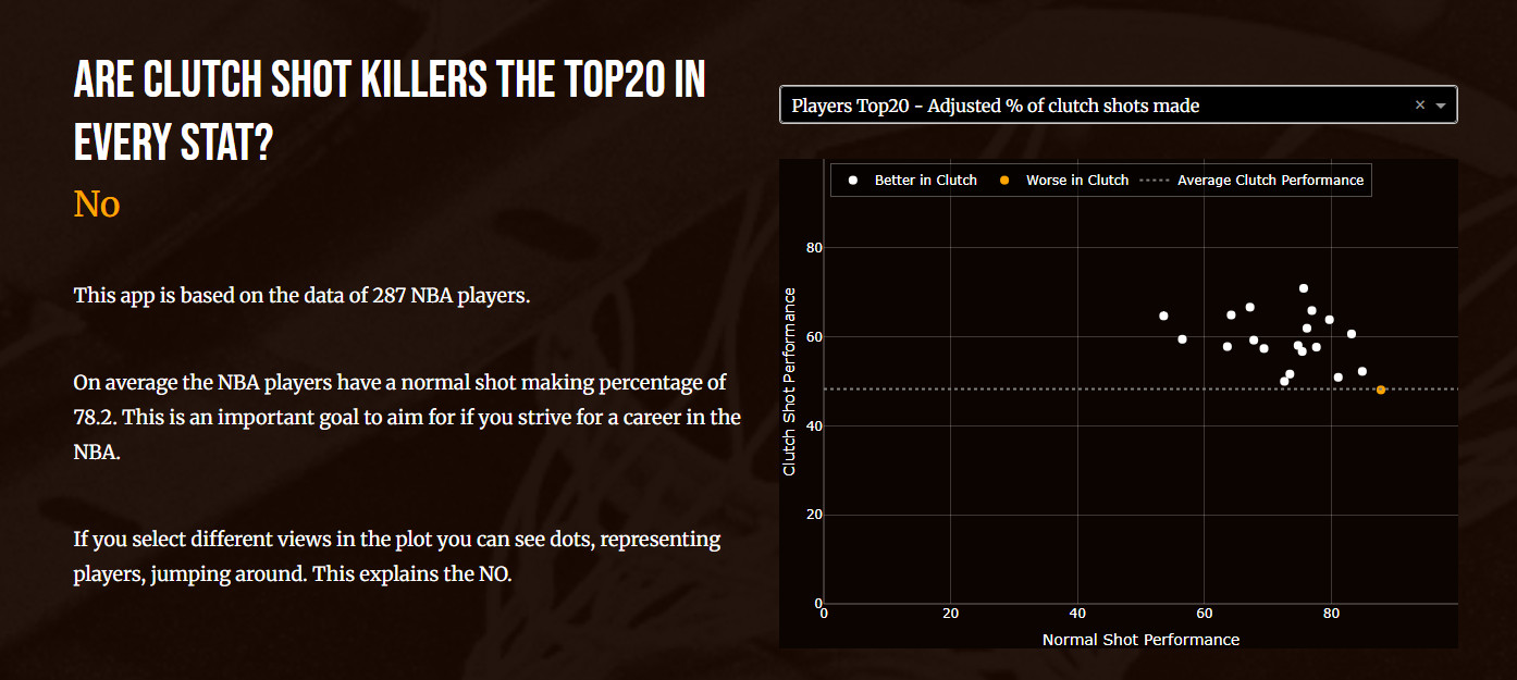
For this #figurefriday I created a Clutch Shot for Dummies app. And based on last weeks discussion about vertical scrolling I used the scroll pattern I shared to see how fast interactivity works. With this small dataset it’s fine.
Still not sure if I understand the subject completely, most answers come from AI. I used Opus 4 to speed up pimping plots when I had the basis.
Beatifull Marianne, I love it, well done. One question what´s exactly average impact?You deleted but I have the same question about the players position
What it exactly is, no idea, just a feeling and that could easily be wrong. But if I would have to put this feeling into my own words I would say: “These are the players who in the final stage of the game win the game for you most often.“
The clientside callback activates the javascript file which uses the observer pattern to see what happens in the browser window (clicking a nav link, current active section).
The “smooth“ effect is this css:
html {
    scroll-behavior: smooth;
}
Short answer: yes, it handles the navigation by observing the browser and nothing else so a clientside_callback seems logical. I don’t know if it’s faster.
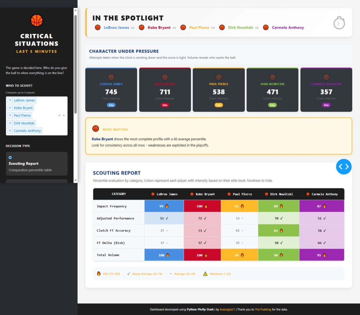
Hello FFF This week my approach is a dashboard/app who helps to answer this critical question
Who do you trust with the ball when everything is on the line?
The application compares up to 5 players based on their performance in clutch situations, defined as the last 5 minutes of the fourth quarter or overtime, with a score differential of 5 points or less.
The heart of the analysis is a set of five key metrics that measure different aspects of performance under pressure, all presented as percentiles. The percentile indicates how well a player performs in a specific metric compared to all other players in the datase). For example, a 90th percentile means the player is better than 90% of others in that metric.
Key Metrics: Impact Frequency:The frequency with which the player makes decisive shots (swg_made_per_game). Adjusted Performance:Field goal accuracy adjusted for shot volume (pct_clutch_adjusted). Clutch FT Accuracy:The percentage of free throws made in the Clutch (ft_pct_clutch). FT Delta (Risk):The difference between the free throw percentage in the Clutch and the percentage during the rest of the game (ft_delta). Total Volume:The total number of shots attempted in the Clutch(total_clutch_shots).
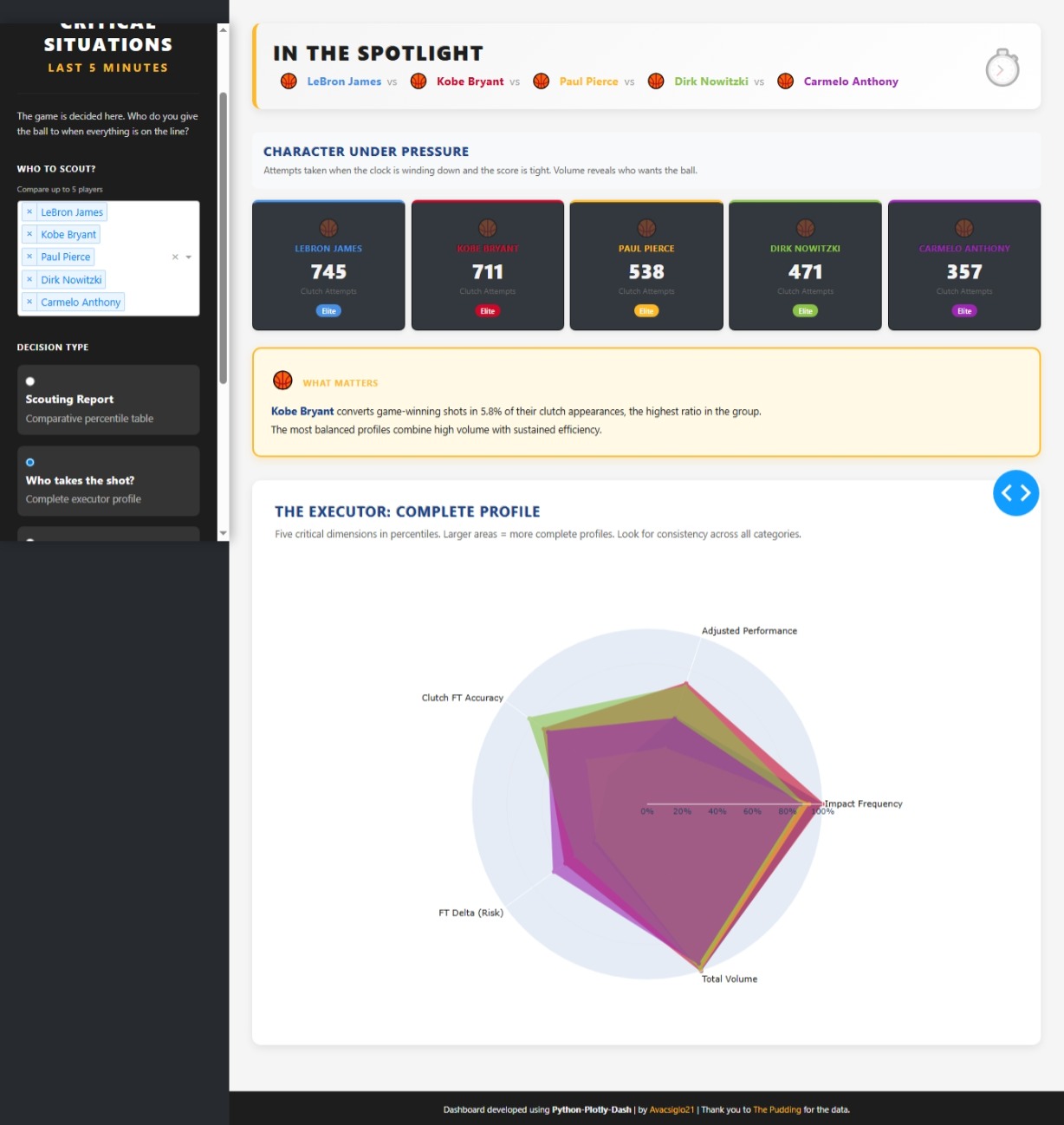
I selected 5 players (Kobe Bryan, Lebron James, Paul Pierce, Carmelo Anthony and Dirk Nowitzki) to compare and answer this 4 questions:
Scouting Report Objective: To see a quick summary of each player’s strengths and weaknesses across all categories. Interpretation: It is a table showing the percentiles.
Who Takes the Shot? Objective: To visualize the complete profile of a closer. Interpretation: The larger and more symmetrical a player’s area shape is, the more well-rounded their profile. A spiky or asymmetrical
Who do we send to the line? Objective: To identify a player’s vulnerability at the free-throw line under pressure. Interpretation: Compares the free-throw percentage in the regular season(Gray bar) with the percentage in the Clutch(Colored bar).
Who seals the game? Objective: To measure a player’s ability to finish the game with a basket. Interpretation: Shows the percentage of opportunities the player converts into a decisive basket.
I used my “thing“ to understand your app :-). Entered the top5 swing in your app and it looks like the outcomes agree. The Closer, that was the correct word. It’s almost 6 years since KB left planet earth, I found it a bit surrealistic to have him on top of a chart with active and retired players. Beautiful as always.
@Avacsiglo21 does this mean that the higher the percentage the better? So for example, Steven Adams has 97 delta. How do I interpret that?
I’m thinking it might be helpful to put the definitions of each category as hover text for when people hover over that column.
First of all, thanks you for your excellent question, despite the fact that this player does not have high free throw accuracy (66.7%) vs league average, the 97th percentile in ft_delta indicates that he highlights in the league at elevating his free throw performance when the game is on the line (Clutch Time). Tactically, the opponent loses the advantage of fouling him in crucial moments. Important to mention this interpretation is based solely on a percentile analysis within this specific dataset, which is a powerful simplification but not necessarily representative of the total complexity of performance across the entire league.
Absouletly agree with you in adding some more information will be helpful
@mike_purtell You’re probably right, I felt a bit of an alarm already when I read the texts etc @Avacsiglo21 used.
I should review this section, not going to happen today.
This NBA Clutch Performance Analytics app was built in Plotly Studio for Figure Friday 45 — using only a one-sentence prompt I gave at the start , designed with a dark purple–orange gradient theme and featuring interactive scatter plots, bar charts, and data tables that analyze players’ clutch performance under pressure.