Figure Friday 2025 - week 15

join the Figure Friday session on April 18, at noon Eastern Time, to showcase your creation and receive feedback from the community.

What car model has the highest electric range? How do they differ over the last 15 years?

Try to answer these and several other questions by using Plotly and Dash to visualize the Washington State Electric Vehicle dataset.

This dataset shows the Battery Electric Vehicles (BEVs) and Plug-in Hybrid Electric Vehicles (PHEVs) that are currently registered through Washington State Department of Licensing (DOL).

Things to consider:

  • what can you improve in the app or sample figure below (sunburst chart)?
  • would you like to tell a different data story using a different graph?
  • can you create a different Dash app?

Sample figure:

Code for sample figure:
from dash import Dash, dcc
import dash_ag_grid as dag
import plotly.express as px
import pandas as pd


# Download CSV sheet at: https://drive.google.com/file/d/1lgEHD5n4_xqIhzCCFBq0V72OJV51e8Xz/view?usp=sharing
df = pd.read_csv('Electric_Vehicle_Population_Data.csv')
df_filtered = df[df['Model Year'].isin(range(2019,2022))]

fig = px.sunburst(
    df_filtered,
    path=['Model Year', 'Make', 'Model'],
    values='Electric Range',
    color='Electric Range',
    color_continuous_scale='Greens',
    height=750
)

grid = dag.AgGrid(
    rowData=df.to_dict("records"),
    columnDefs=[{"field": i, 'filter': True, 'sortable': True} for i in df.columns],
    dashGridOptions={"pagination": True},
    columnSize="sizeToFit"
)

app = Dash()
app.layout = [
    grid,
    dcc.Graph(figure=fig)
]


if __name__ == "__main__":
    app.run(debug=True)

Participation Instructions:

  • Create - use the weekly data set to build your own Plotly visualization or Dash app. Or, enhance the sample figure provided in this post, using Plotly or Dash.
  • Submit - post your creation to LinkedIn or Twitter with the hashtags #FigureFriday and #plotly by midnight Thursday, your time zone. Please also submit your visualization as a new post in this thread.
  • Celebrate - join the Figure Friday sessions to showcase your creation and receive feedback from the community.

:point_right: If you prefer to collaborate with others on Discord, join the Plotly Discord channel.

Data Source:

Thank you to Data.gov for the data.

2 Likes

I ended up, nothing unusual going on, with the question, my car is 14 yo & actually I love it but if it would be banned today, in favour of electrical cars, ā€œwhich lease cars coming on the market could be interestingā€. I was optimistic, I selected from 2021 onwards. I used the dataset for make-model and range, there were a lot of zero’s so I asked ChatGTP for a script to scrape the web for the ranges as published by the brands or something equal. Which I know is very positive and a lease car has already made some km’s.

For the cities I used two datasets from Github, the Netherlands for myself and the World for you guys. It starts with a default value for city of Leeuwarden (35km’s from here) and the Tesla Model 3 since half the neighbourhood is driving it.

Since scraping ranges (30seconds per car, 119 cars) took very long, I have not corrected the cars set because the year in the dataset does not equal the year the car came on the market (or at least I think so).

EDIT 16/04/25: it was fun as long as it lasted. I used openmaptiles, they have no CORS record (web-related, not data related), the app has started erroring when fetching data from openmap tiles both on py.cafe & locally in all browsers.
Maybe I’m moving it to another map, maybe not, time…

8 Likes

I was so much fun to play with your app @marieanne . You’re always so creative with the type of Dash apps you create, letting people explore the data in unique ways.
I would definitely use this app when I’m buying an EV car because I would like to know how far I can get before needing to recharge.

3 Likes

I will add a disclaimer tomorrow. :grinning:

1 Like

Beautiful App @marieanne. As you mentioned there are a lot of zeros in the data set, particularly for the Range and Price. Very creative of you to scrape for better data sets. Like you, I only counted from 2021 onward. Older data may be historically interesting but is not relevant to anyone who is shopping for a new vehicle.

1 Like

Good Evening Everyone,

Here I share the dashboard I worked on this week. Originally, it included an analysis of several years, but the dataset was too large to upload to pycafe, so I decided to work only with a one-year 2024.

The Key Features

  • Interactive Map: Visualizes EV distribution across Washington cities with the ability to click on specific locations for detailed city-level analysis.

  • Comprehensive Statistics: Presents key metrics including total vehicles, popular makes and models, BEV vs PHEV distribution, average electric range, pricing data, and more.

  • Relationship Visualization: Uses an intuitive Sankey diagram to trace connections between vehicle makes, types, and clean alternative fuel vehicle (CAFV) eligibility.

  • Predictive Analysis: Employs a machine learning model (Random Forest Regressor) to forecast electric vehicle range based on various vehicle characteristics, with clear visualizations of prediction accuracy and feature importance.

Simply click on any city in the map to explore city-specific EV data, or use the ā€œResetā€ button to return to statewide statistics.

The Web App


As is now the rule, please don’t hesitate to let me know if you have any suggestions, comments, or questions.

5 Likes

Awesome work! I’m amazed that you produced this in such a small amount of time. I love the styling and the informative dashboard to the right of the map.

You may want to set the default lat/lon limits of the map to show the whole state. There are towns south and east that don’t show on initial load.

Heads up that nearly half of the rows have zero for the "Electric Range’. There are also a fair number with an empty range value. I think this is skewing your average range stats. Here’s the code I used to clean this up. Dropping the zero range rows for models with only a zero for range. Some models have multiple associated ranges, so I applied the mean for the model in place of the zero value. Here’s my code:

#We have EVs with a model range set as ''. Have to correct or ditch. Then can set the Electric Range data type to int.
dfwa = dfwa.loc[~(dfwa['Electric Range'] == ''),:]
dfwa['Electric Range']=dfwa['Electric Range'].astype('float64')

#We have a bunch of rows with range values set to zero. This causes issues later. 
#We need to delete the ones we don't have information for and  replace the zero
#with a mean range value for those we do.
fixable_count = 0
fixable_zeros_count = 0
for carmodel in dfwa['Model'].unique():
    carranges = dfwa.loc[dfwa['Model'] == carmodel,'Electric Range'].unique()
    model_numzeros = len(dfwa.loc[((dfwa['Model'] == carmodel) & (dfwa['Electric Range'] == 0)),'Electric Range'])
    if 0 in carranges and len(carranges) > 1:
        #We can fix the missing ranges by applying the average of ranges that are non-zero
        fixable_count += 1
        fixable_zeros_count += model_numzeros
        mean_range = np.mean(carranges[~(carranges==0)])
        #print(
        #    carmodel,' ',,model_numzeros,fixable_zeros_count
        #)
        dfwa.loc[((dfwa['Model'] == carmodel) & (dfwa['Electric Range'] == 0)),'Electric Range'] = mean_range
    elif 0 in carranges and len(carranges) == 1:
        #Can't fix it, drop the rows of the dataframe for the model
        print(
            "Can't fix ",carmodel,'with',model_numzeros,'rows without range information. Dropping the rows.'
        )
        dfwa = dfwa.loc[~((dfwa['Model'] == carmodel) & (dfwa['Electric Range'] == 0)),:]
2 Likes

My remark is about the UI. It took me some clicks on the map to realize that the data on the right changed. I’m not sure why Seattle is yellow and the rest is blue, but I expected the color of the marker on the map to change on click. But if it shows the number of cars it’s logical that it doesn’t.
Maybe, if you would make the title ā€œstats for {city}ā€ a dark color it’s easier to notice that the stats are changing from the corner of your eyes without changing the map.
Same for the other two section headings, I had to scroll up and down and compare values to see that all values have been adjusted . It is in the chart title, but would probably be much clearer if the section title would be adjusted.

Nevertheless, great work again!

2 Likes

Hello, thank you very much for your feedback. Let’s address your points one by one.
I centered the map using the average latitude and longitude, and I will review this – great suggestion. It’s true that some towns are not visible on the graph, and even with layer centralization, they can be difficult to notice. However, given the space dedicated to the map, zooming out slightly from a close-up view could cause some points to overlap. Regarding the electric vehicle range, you are correct that many zero values could be skewing the data, which is similar to the issue with the Suggested Retail Price"BSMP". In short, the goal for this web app/dashboard, given the limited time, is to create a basic outline, and it is far from complete. Actually, I had to change the initial concept, which was an analysis from 2010 to 2024. This was a significant timeframe, especially for predictive analysis, as vehicle autonomy has evolved over the years, making the year a relevant factor. After having to modify the idea, I focused only on the year 2024 to develop the app and upload it to PyCafe. Ultimately, this is a Minimum Viable Product, as they say.

Thank you again very much for sharing the code and for dedicating your time to analyzing the application.

:muscle:

1 Like

Hello Marianne,

Thank you for your feedback. Seattle is highlighted in yellow because it has the highest number of electric vehicles in that year, doubling or nearly tripling the second-place city. I chose this color scale because, in my opinion, it’s the most noticeable. Trust me, I tried different color scales, and this one stands out the most, especially with the light map background I used to enhance the contrast.

I didn’t implement a color change on click (good suggestion) because when running it on my local host, hovering over the map activates a hand cursor for clicking, which doesn’t happen when the application runs on PyCafe. In the statistics on the right, the city changes when you click on the map. The map is the application’s filter; all the charts update dynamically when you click on the cities.

Thanks again very much for your feedback.

:muscle:

1 Like

Marianne,
this application is simply fascinating, I loved it! You should add a BYD vehicle to see how far it can go :joy:, although I already saw that with a Fiat 500 I can reach the coast of Rio de Janeiro. :face_with_tears_of_joy: :winking_face_with_tongue:

2 Likes

:-). Going to add nothing, the app stopped working somewhere last night due to a CORS error on the ā€œmapā€ side. I created another implementation of the same but that one needs an access token, which is connect to my cc, so onlya small video is left online in my blog :slight_smile:

2 Likes

Hey @Avacsiglo21 ,
another insightful app. Thank you!

Can you please explain to community members who are new to data viz how to read this graph?
What does it mean when the marker is above or below the line?

2 Likes

Hi @marieanne ,

The reason that Seattle appears yellow is, I think, because the city has, by far, the largest number of EVs. I dealt with a similar problem as I broke the data down by county. I used a log color scale to even out the colorization. I posted a screen shot of my app to the Figure Friday channel of the Discord. The Seattle area still stands out, but you see more variation in the regions with fewer EVs.

2 Likes

Hi Adams, thanks a lot, this info is at click the button

Model Details

Random Forest Regressor Model

This section uses a machine learning model to predict electric vehicle range based on various characteristics.


How It Works:
  • The model analyzes patterns in existing electric vehicle data to identify relationships between vehicle attributes and range.
  • It combines multiple decision trees (like a ā€˜forest’ of different prediction paths) to make more accurate predictions.
  • Each tree makes its own prediction, and the final result is the average of all trees’ predictions.

Understanding the Results:
  • Prediction vs. Actual Value: Shows how well the model’s predictions match actual vehicle ranges. Points closer to the diagonal line indicate better predictions.
  • Feature Importance: Shows which vehicle characteristics have the greatest influence on electric range.
  • R² Score: Measures how well the model explains variations in range (higher is better, with 1.0 being perfect).
  • Mean Absolute Error: The average prediction error in miles (lower is better).
1 Like

Exactly, I first did it using county, then I decided to move to City.

1 Like

But I could enter an hour ago. :see_no_evil_monkey:

2 Likes

More specific to your question
Marker Above the Diagonal Line: it means the model overestimated the electric vehicle’s range.
Marker Below : it means the model underestimated the electric vehicle’s range.
Think of the diagonal line as the ā€˜perfect guess’ line. Each dot is one electric car. If a dot is right on the line, our computer model guessed its driving range exactly right! If the dots are all bunched up close to that perfect guess line, it means our computer is doing a really good job of figuring out how far these cars can go. The further away the dots are from that line, the more our computer’s guesses were off.

2 Likes

This Electric Vehicle Dashboard :automobile: for the year 2025 highlights key data on manufacturers and model performance. Tesla dominates the market with 54.1% of EVs, followed by Rivian (10.7%) and BMW (9.52%). The dashboard also shows that Land Rover models—Range Rover Sport and Range Rover—have the longest electric range, reaching nearly 60 miles on a single charge. Mercedes-Benz and Volvo also feature prominently among the top models with high range performance. Overall, the data showcases Tesla’s overwhelming market presence and the growing competition in extended-range EV models.

5 Likes

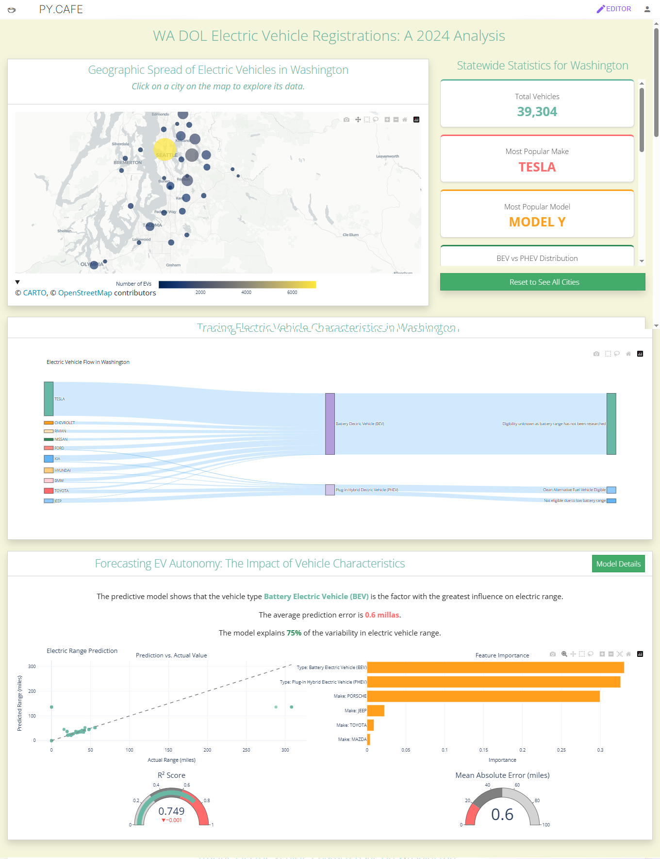
Just wrapped up a dark-themed, data-rich dashboard exploring electric vehicle population data across Washington State.

:magnifying_glass_tilted_left: The dashboard is fully interactive and built in Dash using Plotly Express + Graph Objects with a custom color scheme. It includes:

Top EV Manufacturers & Models (horizontal bar charts)

EV Type & CAFV Eligibility Distributions (Pie Charts)

Geographical Analysis (County-level EV breakdowns)

Manufacturer-Level Deep Dive (top models by make)

Time Trends (adoption over time for EV types and top brands)

:light_bulb: Filters include year, make, county, EV type, and CAFV eligibility to drill into insights at a granular level.

Still refining a few visuals, but happy with how this is coming together!


import dash
from dash import html, dcc, callback, Input, Output, State
import dash_bootstrap_components as dbc
import pandas as pd
import plotly.express as px
import plotly.graph_objects as go
import numpy as np

# Define color scheme
COLORS = {
    'cambridge-blue': '#96BDC6',
    'charcoal': '#36454F',
    'dark-slate-gray': '#2F4F4F',
    'eerie-black': '#1A1A1A',
    'night': '#141414',
    'text': '#E0E0E0',
    'accent': '#00FFB0',  # Bright accent for visibility
}

# App initialization with dark theme
app = dash.Dash(
    __name__, 
    external_stylesheets=[dbc.themes.DARKLY],
    meta_tags=[{"name": "viewport", "content": "width=device-width, initial-scale=1"}]
)

# Custom dark theme CSS
app.index_string = '''
<!DOCTYPE html>
<html>
    <head>
        {%metas%}
        <title>{%title%}</title>
        {%favicon%}
        {%css%}
        <style>
            body {
                background-color: ''' + COLORS['night'] + ''';
                color: ''' + COLORS['text'] + ''';
                font-family: Arial, sans-serif;
            }
            .card {
                background-color: ''' + COLORS['eerie-black'] + ''';
                border: none;
                margin-bottom: 15px;
            }
            .card-header {
                background-color: ''' + COLORS['charcoal'] + ''';
                color: ''' + COLORS['text'] + ''';
                font-weight: bold;
            }
            h1, h2, h3, h4, h5, h6 {
                color: ''' + COLORS['cambridge-blue'] + ''';
            }
            .tab-container {
                margin-top: 20px;
                margin-bottom: 20px;
            }
            .custom-tabs {
                background-color: ''' + COLORS['dark-slate-gray'] + ''';
                padding: 10px;
                border-radius: 5px;
            }
            .custom-tab {
                color: ''' + COLORS['text'] + ''';
                background-color: ''' + COLORS['eerie-black'] + ''';
                border-color: ''' + COLORS['charcoal'] + ''';
                border-radius: 5px;
                padding: 10px 15px;
                margin-right: 5px;
            }
            .custom-tab--selected {
                background-color: ''' + COLORS['charcoal'] + ''';
                color: ''' + COLORS['accent'] + ''';
                font-weight: bold;
            }
            /* Alternative approach for tabs */
            .dash-tab {
                background-color: ''' + COLORS['eerie-black'] + ''' !important;
                color: ''' + COLORS['text'] + ''' !important;
            }
            .dash-tab--selected {
                background-color: ''' + COLORS['charcoal'] + ''' !important;
                color: ''' + COLORS['accent'] + ''' !important;
                border-top: 2px solid ''' + COLORS['accent'] + ''' !important;
            }
            .filter-container {
                background-color: ''' + COLORS['eerie-black'] + ''';
                padding: 15px;
                border-radius: 5px;
                margin-bottom: 20px;
            }
            .filter-label {
                color: ''' + COLORS['cambridge-blue'] + ''';
                font-weight: bold;
                margin-bottom: 5px;
            }
            .filter-card {
                background-color: ''' + COLORS['dark-slate-gray'] + ''';
                padding: 10px;
                border-radius: 5px;
                margin-bottom: 10px;
            }
            .btn-filter {
                background-color: ''' + COLORS['accent'] + ''';
                color: ''' + COLORS['night'] + ''';
                border: none;
                font-weight: bold;
            }
            .btn-filter:hover {
                background-color: ''' + COLORS['cambridge-blue'] + ''';
                color: ''' + COLORS['night'] + ''';
            }
        </style>
    </head>
    <body>
        {%app_entry%}
        <footer>
            {%config%}
            {%scripts%}
            {%renderer%}
        </footer>
    </body>
</html>
'''

# Load the data
def load_data():
    try:
        df = pd.read_csv('attached_assets/Electric_Vehicle_Population_Data.csv')
        # Basic preprocessing
        df['Model Year'] = pd.to_numeric(df['Model Year'], errors='coerce')
        df = df.dropna(subset=['Model Year'])
        return df
    except Exception as e:
        print(f"Error loading data: {e}")
        # Return a minimal dataframe to prevent app crash
        return pd.DataFrame({
            'Make': ['Data Load Error'], 
            'Model': ['Check Console'], 
            'Model Year': [2023],
            'Electric Vehicle Type': ['Error'],
            'County': ['Error']
        })

# Function to generate Plotly HTML that works in this environment
def generate_chart_html(fig):
    fig.update_layout(
        paper_bgcolor=COLORS['eerie-black'],
        plot_bgcolor=COLORS['dark-slate-gray'],
        font_color=COLORS['text'],
        margin=dict(l=30, r=30, t=50, b=30),
    )
    return fig.to_html(full_html=False, include_plotlyjs='cdn')

# Create the dashboard layout
def create_dashboard_layout():
    df = load_data()
    
    # Get unique values for filter options
    years = sorted(df['Model Year'].dropna().unique())
    min_year, max_year = int(min(years)), int(max(years))
    makes = sorted([x for x in df['Make'].dropna().unique() if isinstance(x, str)])
    counties = sorted([x for x in df['County'].dropna().unique() if isinstance(x, str)])
    ev_types = sorted([x for x in df['Electric Vehicle Type'].dropna().unique() if isinstance(x, str)])
    cafv_eligibility = df['Clean Alternative Fuel Vehicle (CAFV) Eligibility'].fillna('Unknown').unique()
    cafv_eligibility = sorted([x for x in cafv_eligibility if isinstance(x, str)])
    
    # Create the main layout with tabs
    return dbc.Container([
        dbc.Row([
            dbc.Col(html.H1("Washington State EV Population Dashboard", className="text-center my-4"), width=12)
        ]),
        
        dbc.Row([
            dbc.Col(html.H4("Comprehensive Analysis of Electric Vehicle Population Data", className="text-center mb-4"), width=12)
        ]),
        
        # Filter section
        dbc.Row([
            dbc.Col([
                dbc.Card([
                    dbc.CardHeader("Filters"),
                    dbc.CardBody([
                        dbc.Row([
                            # Year Range Filter
                            dbc.Col([
                                html.Div("Year Range", className="filter-label"),
                                dcc.RangeSlider(
                                    id='year-range-slider',
                                    min=min_year,
                                    max=max_year,
                                    step=1,
                                    marks={i: str(i) for i in range(min_year, max_year+1, 2)},
                                    value=[min_year, max_year],
                                ),
                            ], width=12, className="mb-3"),
                        ]),
                        
                        dbc.Row([
                            # Make Filter
                            dbc.Col([
                                html.Div("Manufacturer", className="filter-label"),
                                dcc.Dropdown(
                                    id='make-dropdown',
                                    options=[{'label': make, 'value': make} for make in makes],
                                    multi=True,
                                    placeholder="Select manufacturers",
                                    style={"color": "black"}
                                ),
                            ], width=6, className="mb-3"),
                            
                            # EV Type Filter
                            dbc.Col([
                                html.Div("EV Type", className="filter-label"),
                                dcc.Dropdown(
                                    id='ev-type-dropdown',
                                    options=[{'label': ev_type, 'value': ev_type} for ev_type in ev_types],
                                    multi=True,
                                    placeholder="Select EV types",
                                    style={"color": "black"}
                                ),
                            ], width=6, className="mb-3"),
                        ]),
                        
                        dbc.Row([
                            # County Filter
                            dbc.Col([
                                html.Div("County", className="filter-label"),
                                dcc.Dropdown(
                                    id='county-dropdown',
                                    options=[{'label': county, 'value': county} for county in counties],
                                    multi=True,
                                    placeholder="Select counties",
                                    style={"color": "black"}
                                ),
                            ], width=6, className="mb-3"),
                            
                            # CAFV Eligibility Filter
                            dbc.Col([
                                html.Div("CAFV Eligibility", className="filter-label"),
                                dcc.Dropdown(
                                    id='cafv-dropdown',
                                    options=[{'label': cafv if cafv else "Unknown", 'value': cafv} for cafv in cafv_eligibility],
                                    multi=True,
                                    placeholder="Select CAFV eligibility",
                                    style={"color": "black"}
                                ),
                            ], width=6, className="mb-3"),
                        ]),
                        
                        dbc.Row([
                            dbc.Col([
                                dbc.Button("Apply Filters", id="apply-filters-button", color="primary", className="w-100 btn-filter")
                            ], width=12),
                        ]),
                    ])
                ]),
            ], width=12)
        ], className="mb-4"),
        
        # Tabs for different dashboard sections
        dbc.Row([
            dbc.Col([
                html.Div([
                    dcc.Tabs(id="dashboard-tabs", value="tab-overview", className="custom-tabs", children=[
                        dcc.Tab(label="Overview", value="tab-overview", className="custom-tab", selected_className="custom-tab--selected"),
                        dcc.Tab(label="Geographical Analysis", value="tab-geo", className="custom-tab", selected_className="custom-tab--selected"),
                        dcc.Tab(label="Manufacturer Analysis", value="tab-manufacturer", className="custom-tab", selected_className="custom-tab--selected"),
                        dcc.Tab(label="Time Trends", value="tab-trends", className="custom-tab", selected_className="custom-tab--selected"),
                    ]),
                    html.Div(id="tab-content", className="pt-4")
                ], className="tab-container"),
            ], width=12),
        ]),
        
        dbc.Row([
            dbc.Col(html.P("Data source: Electric Vehicle Population Data from Washington State Department of Licensing", 
                           className="text-center text-muted mt-4"), 
                    width=12)
        ])
    ], 
    fluid=True,
    style={"backgroundColor": COLORS['night']})

# Create callback to update the tab content
@callback(
    Output("tab-content", "children"),
    [Input("dashboard-tabs", "value"),
     Input("apply-filters-button", "n_clicks")],
    [State("year-range-slider", "value"),
     State("make-dropdown", "value"),
     State("ev-type-dropdown", "value"),
     State("county-dropdown", "value"),
     State("cafv-dropdown", "value")]
)
def update_tab_content(tab, n_clicks, year_range, selected_makes, selected_ev_types, selected_counties, selected_cafv):
    df = load_data()
    
    # Apply filters if specified
    filtered_df = df.copy()
    
    if year_range:
        filtered_df = filtered_df[(filtered_df['Model Year'] >= year_range[0]) & 
                                 (filtered_df['Model Year'] <= year_range[1])]
    
    if selected_makes:
        filtered_df = filtered_df[filtered_df['Make'].isin(selected_makes)]
    
    if selected_ev_types:
        filtered_df = filtered_df[filtered_df['Electric Vehicle Type'].isin(selected_ev_types)]
    
    if selected_counties:
        filtered_df = filtered_df[filtered_df['County'].isin(selected_counties)]
    
    if selected_cafv:
        filtered_df = filtered_df[filtered_df['Clean Alternative Fuel Vehicle (CAFV) Eligibility'].isin(selected_cafv)]
    
    # Overview Tab
    if tab == "tab-overview":
        # 1. Create top makes chart
        make_counts = filtered_df['Make'].value_counts().head(10).reset_index()
        make_counts.columns = ['Make', 'Count']
        
        fig1 = px.bar(
            make_counts,
            x='Count',
            y='Make',
            orientation='h',
            title='Top 10 EV Manufacturers'
        )
        fig1.update_traces(marker=dict(color=COLORS['accent']))
        
        # 2. Create top models chart
        model_counts = filtered_df.groupby(['Make', 'Model']).size().reset_index(name='Count')
        model_counts = model_counts.sort_values('Count', ascending=False).head(10)
        model_counts['Full Model'] = model_counts['Make'] + ' ' + model_counts['Model']
        
        fig2 = px.bar(
            model_counts,
            x='Count',
            y='Full Model',
            orientation='h',
            title='Top 10 EV Models'
        )
        fig2.update_traces(marker=dict(color=COLORS['cambridge-blue']))
        
        # 3. Create EV type distribution chart
        ev_type_counts = filtered_df['Electric Vehicle Type'].value_counts().reset_index()
        ev_type_counts.columns = ['Type', 'Count']
        
        fig3 = go.Figure(data=[go.Pie(
            labels=ev_type_counts['Type'],
            values=ev_type_counts['Count'],
            marker=dict(colors=[COLORS['accent'], COLORS['cambridge-blue']])
        )])
        fig3.update_layout(title='EV Type Distribution')
        
        # 4. Create CAFV eligibility chart
        cafv_counts = filtered_df['Clean Alternative Fuel Vehicle (CAFV) Eligibility'].fillna('Unknown').value_counts().reset_index()
        cafv_counts.columns = ['Eligibility', 'Count']
        
        fig4 = px.pie(
            cafv_counts,
            names='Eligibility',
            values='Count',
            title='CAFV Eligibility Distribution',
            color_discrete_sequence=[COLORS['accent'], COLORS['cambridge-blue'], '#FF5E5E']
        )
        
        # Create layout for Overview tab
        return [
            dbc.Row([
                dbc.Col([
                    dbc.Card([
                        dbc.CardHeader("Top EV Manufacturers"),
                        dbc.CardBody(html.Div([
                            html.Iframe(srcDoc=generate_chart_html(fig1), style={'width': '100%', 'height': '400px', 'border': 'none'})
                        ]))
                    ])
                ], width=6),
                
                dbc.Col([
                    dbc.Card([
                        dbc.CardHeader("Top EV Models"),
                        dbc.CardBody(html.Div([
                            html.Iframe(srcDoc=generate_chart_html(fig2), style={'width': '100%', 'height': '400px', 'border': 'none'})
                        ]))
                    ])
                ], width=6)
            ]),
            
            dbc.Row([
                dbc.Col([
                    dbc.Card([
                        dbc.CardHeader("EV Type Distribution"),
                        dbc.CardBody(html.Div([
                            html.Iframe(srcDoc=generate_chart_html(fig3), style={'width': '100%', 'height': '400px', 'border': 'none'})
                        ]))
                    ])
                ], width=6),
                
                dbc.Col([
                    dbc.Card([
                        dbc.CardHeader("CAFV Eligibility"),
                        dbc.CardBody(html.Div([
                            html.Iframe(srcDoc=generate_chart_html(fig4), style={'width': '100%', 'height': '400px', 'border': 'none'})
                        ]))
                    ])
                ], width=6)
            ]),
            
            # Stats summary row
            dbc.Row([
                dbc.Col([
                    dbc.Card([
                        dbc.CardHeader("Key Statistics"),
                        dbc.CardBody([
                            dbc.Row([
                                dbc.Col([
                                    html.Div("Total EVs", className="text-center", style={"color": COLORS['cambridge-blue']}),
                                    html.H3(f"{len(filtered_df):,}", className="text-center")
                                ], width=3),
                                dbc.Col([
                                    html.Div("Total Makes", className="text-center", style={"color": COLORS['cambridge-blue']}),
                                    html.H3(f"{filtered_df['Make'].nunique():,}", className="text-center")
                                ], width=3),
                                dbc.Col([
                                    html.Div("Total Models", className="text-center", style={"color": COLORS['cambridge-blue']}),
                                    html.H3(f"{filtered_df['Model'].nunique():,}", className="text-center")
                                ], width=3),
                                dbc.Col([
                                    html.Div("Counties", className="text-center", style={"color": COLORS['cambridge-blue']}),
                                    html.H3(f"{filtered_df['County'].nunique():,}", className="text-center")
                                ], width=3),
                            ])
                        ])
                    ])
                ], width=12)
            ], className="mt-4"),
        ]
    
    # Geographical Analysis Tab
    elif tab == "tab-geo":
        # 1. Create county distribution chart
        county_counts = filtered_df['County'].value_counts().head(15).reset_index()
        county_counts.columns = ['County', 'Count']
        
        fig1 = px.bar(
            county_counts,
            x='County',
            y='Count',
            title='EV Distribution by County',
            color_discrete_sequence=[COLORS['accent']]
        )
        fig1.update_layout(xaxis_tickangle=-45)
        
        # 2. Create county by EV type chart
        county_ev_type = filtered_df.groupby(['County', 'Electric Vehicle Type']).size().reset_index(name='Count')
        county_ev_type = county_ev_type.sort_values('Count', ascending=False)
        top_counties = county_counts['County'].head(10).tolist()
        county_ev_type = county_ev_type[county_ev_type['County'].isin(top_counties)]
        
        fig2 = px.bar(
            county_ev_type,
            x='County',
            y='Count',
            color='Electric Vehicle Type',
            title='EV Types by County (Top 10 Counties)',
            barmode='stack',
            color_discrete_sequence=[COLORS['accent'], COLORS['cambridge-blue']]
        )
        fig2.update_layout(xaxis_tickangle=-45)
        
        # Add more geographical charts and analysis here
        
        return [
            dbc.Row([
                dbc.Col([
                    dbc.Card([
                        dbc.CardHeader("EV Distribution by County"),
                        dbc.CardBody(html.Div([
                            html.Iframe(srcDoc=generate_chart_html(fig1), style={'width': '100%', 'height': '400px', 'border': 'none'})
                        ]))
                    ])
                ], width=12)
            ]),
            
            dbc.Row([
                dbc.Col([
                    dbc.Card([
                        dbc.CardHeader("EV Types by County"),
                        dbc.CardBody(html.Div([
                            html.Iframe(srcDoc=generate_chart_html(fig2), style={'width': '100%', 'height': '500px', 'border': 'none'})
                        ]))
                    ])
                ], width=12)
            ], className="mt-4"),
        ]
    
    # Manufacturer Analysis Tab
    elif tab == "tab-manufacturer":
        # 1. Create manufacturer by EV type chart
        make_ev_type = filtered_df.groupby(['Make', 'Electric Vehicle Type']).size().reset_index(name='Count')
        top_makes = filtered_df['Make'].value_counts().head(10).index.tolist()
        make_ev_type = make_ev_type[make_ev_type['Make'].isin(top_makes)]
        
        fig1 = px.bar(
            make_ev_type,
            x='Make',
            y='Count',
            color='Electric Vehicle Type',
            title='EV Types by Manufacturer (Top 10)',
            barmode='stack',
            color_discrete_sequence=[COLORS['accent'], COLORS['cambridge-blue']]
        )
        
        # 2. Create manufacturer model distribution chart (top 5 models for top 5 manufacturers)
        top_5_makes = filtered_df['Make'].value_counts().head(5).index.tolist()
        top_models = filtered_df[filtered_df['Make'].isin(top_5_makes)].groupby(['Make', 'Model']).size().reset_index(name='Count')
        top_models = top_models.sort_values(['Make', 'Count'], ascending=[True, False])
        
        make_models = []
        for make in top_5_makes:
            make_top_models = top_models[top_models['Make'] == make].head(5)
            make_models.append(make_top_models)
        
        model_df = pd.concat(make_models)
        model_df['Full Model'] = model_df['Make'] + ' ' + model_df['Model']
        
        fig2 = px.bar(
            model_df,
            x='Count',
            y='Full Model',
            color='Make',
            orientation='h',
            title='Top 5 Models by Top 5 Manufacturers',
            color_discrete_sequence=[COLORS['accent'], COLORS['cambridge-blue'], '#FF5E5E', '#FFD166', '#06D6A0']
        )
        
        return [
            dbc.Row([
                dbc.Col([
                    dbc.Card([
                        dbc.CardHeader("EV Types by Manufacturer"),
                        dbc.CardBody(html.Div([
                            html.Iframe(srcDoc=generate_chart_html(fig1), style={'width': '100%', 'height': '400px', 'border': 'none'})
                        ]))
                    ])
                ], width=12)
            ]),
            
            dbc.Row([
                dbc.Col([
                    dbc.Card([
                        dbc.CardHeader("Top Models by Manufacturer"),
                        dbc.CardBody(html.Div([
                            html.Iframe(srcDoc=generate_chart_html(fig2), style={'width': '100%', 'height': '600px', 'border': 'none'})
                        ]))
                    ])
                ], width=12)
            ], className="mt-4"),
        ]
    
    # Time Trends Tab
    elif tab == "tab-trends":
        # 1. Create year trend chart
        year_counts = filtered_df.groupby('Model Year').size().reset_index(name='Count')
        year_counts = year_counts.sort_values('Model Year')
        
        fig1 = px.line(
            year_counts,
            x='Model Year',
            y='Count',
            title='EV Adoption by Year',
            markers=True
        )
        fig1.update_traces(line=dict(color=COLORS['accent']), marker=dict(color=COLORS['accent']))
        
        # 2. Create EV type trend by year
        ev_type_year = filtered_df.groupby(['Model Year', 'Electric Vehicle Type']).size().reset_index(name='Count')
        ev_type_year = ev_type_year.sort_values('Model Year')
        
        fig2 = px.line(
            ev_type_year,
            x='Model Year',
            y='Count',
            color='Electric Vehicle Type',
            title='EV Type Adoption Trend',
            markers=True,
            color_discrete_sequence=[COLORS['accent'], COLORS['cambridge-blue']]
        )
        
        # 3. Create top 5 manufacturers trend
        top_5_makes = filtered_df['Make'].value_counts().head(5).index.tolist()
        make_year = filtered_df[filtered_df['Make'].isin(top_5_makes)].groupby(['Model Year', 'Make']).size().reset_index(name='Count')
        make_year = make_year.sort_values('Model Year')
        
        fig3 = px.line(
            make_year,
            x='Model Year',
            y='Count',
            color='Make',
            title='Top 5 Manufacturers Adoption Trend',
            markers=True,
            color_discrete_sequence=[COLORS['accent'], COLORS['cambridge-blue'], '#FF5E5E', '#FFD166', '#06D6A0']
        )
        
        return [
            dbc.Row([
                dbc.Col([
                    dbc.Card([
                        dbc.CardHeader("EV Adoption Trend"),
                        dbc.CardBody(html.Div([
                            html.Iframe(srcDoc=generate_chart_html(fig1), style={'width': '100%', 'height': '400px', 'border': 'none'})
                        ]))
                    ])
                ], width=12)
            ]),
            
            dbc.Row([
                dbc.Col([
                    dbc.Card([
                        dbc.CardHeader("EV Type Adoption Trend"),
                        dbc.CardBody(html.Div([
                            html.Iframe(srcDoc=generate_chart_html(fig2), style={'width': '100%', 'height': '400px', 'border': 'none'})
                        ]))
                    ])
                ], width=12)
            ], className="mt-4"),
            
            dbc.Row([
                dbc.Col([
                    dbc.Card([
                        dbc.CardHeader("Manufacturer Adoption Trend"),
                        dbc.CardBody(html.Div([
                            html.Iframe(srcDoc=generate_chart_html(fig3), style={'width': '100%', 'height': '400px', 'border': 'none'})
                        ]))
                    ])
                ], width=12)
            ], className="mt-4"),
        ]
    
    return []  # Default empty content

# Set up the app layout
app.layout = create_dashboard_layout()

# Run app
if __name__ == '__main__':
    app.run(host='0.0.0.0', port=5000, debug=True)
5 Likes