hi @ThomasD21M , I’m also curious to hear what @JuanG uses to record the gifs.
I have a windows machine, so I use a free tool called ScreenToGif.
hi @ThomasD21M , I’m also curious to hear what @JuanG uses to record the gifs.
I have a windows machine, so I use a free tool called ScreenToGif.
![]() @adamschroeder give me the tip…
@adamschroeder give me the tip…
To get things started, I merged the 3 regions of Massachusetts into a statewide total, for consistency with other states. Power consumption data has been normalized with the population of each state. The basic unit of power is changed from MWatt to KWatt.
Demand by Date: Noisy data as expected due to fluctuations by day of week, hour of day, seasonal, and daily weather. I checked a few of the large peaks in summer and confirmed they happened on days when temperatures reached record or near record levels.
import plotly.express as px
import polars as pl
import pandas as pd   # pandas used once for reading table from url

new_england_states = [
    'Connecticut','Maine', 'Massachusetts',
    'New Hampshire',  'Rhode Island','Vermont',
]
# make dataframe of population for New England States for data normalization
url = 'https://worldpopulationreview.com/states'
df_pop = (
    pl.from_pandas(pd.read_html(url)[0])    # pandas
    .filter(pl.col('State').is_in(new_england_states))
    .rename({'2024 Pop.': 'POP'})
    .select('State', 'POP')
)

def get_fig(df, x_param, my_custom_data = []):
    fig = (
        px.line(
            df,
            x=x_param,
            y=new_england_states,
            template='simple_white',
            height=400, width=800,
            line_shape='spline',  # I learned this during Fig_Fri_48 Zoom Call,
            custom_data=my_custom_data
        )
    )
    # only use x_label of x_param is WEEK_NUM, all other are obvious
    x_label = x_param if x_param=='WEEK_NUM' else ''

    if x_param == 'DATE':
        fig.update_xaxes(
            dtick="M1",
            tickformat="%b\n%Y",
            ticklabelmode="period")
    elif x_param == 'HOUR':
        fig.update_xaxes(
            dtick="H1",
            ticklabelmode='period'
        )
    elif x_param == 'WEEK_NUM':
        fig.update_xaxes(
            dtick='3',
            ticklabelmode='period'
        )
    fig.update_layout(
        title=(
            f'2024 New England Electricity Demand by {x_param}'.upper() +
            '<br><sup>Missing Feb 6 through Feb 17</sup>'
        ),
        yaxis_title='KWatt Hours per Resident'.upper(),
        xaxis_title = x_label,
        legend_title='STATE',
    )
    return fig

#-------------------------------------------------------------------------------
#   Read data set, and clean up
#-------------------------------------------------------------------------------
def tweak():
    return (
        pl.scan_csv('megawatt_demand_2024.csv')   # scan_csv returns a Lazyframe
        .rename(
            {
            'Connecticut Actual Load (MW)'                      : 'Connecticut',
            'Maine Actual Load (MW)'                            : 'Maine',
            'New Hampshire Actual Load (MW)'                    : 'New Hampshire',
            'Rhode Island Actual Load (MW)'                     : 'Rhode Island',
            'Vermont Actual Load (MW)'                          : 'Vermont',
            'Local Timestamp Eastern Time (Interval Beginning)' : 'Local Start Time'
            }
        )
        .with_columns(
            pl.col('Local Start Time')
                .str.to_datetime('%m/%d/%Y %H:%M')
                .dt.replace_time_zone('US/Eastern',
                #  day light saving time, where hour changes by 1,  creates an
                # ambiguity error. ambigous parameter takes care of it
                ambiguous='latest'
            )
        )
        .with_columns(  # merge 3 regions of Massachusetts for statewide data
            Massachusetts = (
                pl.col('Northeast Massachusetts Actual Load (MW)') +
                pl.col('Southeast Massachusetts Actual Load (MW)') +
                pl.col('Western/Central Massachusetts Actual Load (MW)')
            )
        )
        .with_columns(DATE=pl.col('Local Start Time').dt.date())
        .with_columns(WEEK_NUM = pl.col('Local Start Time').dt.week())
        .with_columns(DAY = pl.col('Local Start Time').dt.strftime('%a'))
        .with_columns(
            DAY_NUM = pl.col('Local Start Time')
            .dt.strftime('%w')
            .cast(pl.Int8)
            )
        .with_columns(
            HOUR = pl.col('Local Start Time')
            .dt.strftime('%H')
            .cast(pl.Int8)
            )
        .select(
            ['Local Start Time', 'DATE', 'WEEK_NUM', 'DAY', 'DAY_NUM', 'HOUR']
            + new_england_states
        )
        .sort('DATE')
        .collect() # returns a polars dataframe from a Lazyframe
    )
df = tweak()

#-------------------------------------------------------------------------------
#   Normalize all data, by dividing it by the state population
#-------------------------------------------------------------------------------
for state in new_england_states:
    df = (
        df
        .with_columns(  # divice all values by the population
            pl.col(state)
            /
            df_pop
            .filter(pl.col('State') == state)
            ['POP']
            [0]
        )
        .with_columns(  # multiply by 1000, changes MW to KW
            pl.col(state)*1000
        )
    )

#-------------------------------------------------------------------------------
#   Aggregate by Date, and plot
#-------------------------------------------------------------------------------
df_by_date = (
    df
    .group_by('DATE')
    .agg(pl.col(pl.Float64).sum())
    .sort('DATE')
)
fig = get_fig(df_by_date, 'DATE', my_custom_data = ['DATE'])
fig.add_vrect(
    x0='2024-06-20',
    x1='2024-09-22',
    fillcolor='green',
    opacity=0.1,
    line_width=1,
)
fig.add_annotation(
    x=0.75, xref= 'paper',
    y=1,   yref='paper',
    showarrow=False,
    text='<b>Summer</b>',
)
fig.show()

#-------------------------------------------------------------------------------
#   Aggregate & plot by DAY. df_day_map maps created to control sort order
#-------------------------------------------------------------------------------
df_day_map = (
    pl.DataFrame(
        {
            'DAY_NUM'   : list(range(7)),
            'DAY'       : ['Sun', 'Mon', 'Tue', 'Wed', 'Thu', 'Fri', 'Sat']
        }
        )
    .with_columns(pl.col('DAY_NUM').cast(pl.Int8))
)
df_by_day = (
    df
    .group_by('DAY_NUM')
    .agg(pl.col(pl.Float64).sum()/52)
    .sort('DAY_NUM')
    .join(
        df_day_map,
        on='DAY_NUM',
        how='left'
    )
)
fig = get_fig(df_by_day, 'DAY')
fig.add_vrect(
    x0=1,
    x1=5,
    fillcolor='green',
    opacity=0.1,
    line_width=1,
)
fig.add_annotation(
    x=0.5, xref='paper',
    y=0.1,  yref='paper',
    showarrow=False,
    text='<b>Business Days</b>',
)
fig.show()

#-------------------------------------------------------------------------------
#   Aggregate by Hour Number
#-------------------------------------------------------------------------------
df_by_hour = (
    df
    .group_by('HOUR')
    .agg(pl.col(pl.Float64).mean())
    .sort('HOUR')
)
fig = get_fig(df_by_hour, 'HOUR')
fig.add_vline(
    x=12,
    line_width=1,
)
fig.add_annotation(
    x=11, xref='x',
    y=1,  yref='paper',
    showarrow=False,
    text='A.M.',
)
fig.add_annotation(
    x=13, xref='x',
    y=1,  yref='paper',
    showarrow=False,
    text='P.M.',
)
fig.show()

#-------------------------------------------------------------------------------
#   Aggregate by Week Number, and plot
#-------------------------------------------------------------------------------
df_by_week = (
    df
    .group_by('WEEK_NUM')
    .agg(pl.col(pl.Float64).sum())
    .sort('WEEK_NUM')
)
summer_start = 25  # June 20 is in work_week 25
summer_end =  38   # Sept 22 is in work_week 38

fig = get_fig(df_by_week, 'WEEK_NUM')
fig.add_vrect(
    x0=summer_start,
    x1=summer_end,
    fillcolor='green',
    opacity=0.1,
    line_width=1,
)
fig.add_annotation(
    x=0.7,  xref='paper',
    y=0.2,  yref='paper',
    showarrow=False,
    text='<b>Summer</b>',
)
fig.show()
I really like the comments:)
The goal of my figure was to look at the average use of energy on an hourly basis, and to see which region use energy the most. I started by grouping the dataframe by the hour number and finding the mean of each hour (I created a new dataframe with it). I created the graph with the new dataframe.
import pandas as pd

import plotly.graph_objects as go

data = pd.read_csv("https://raw.githubusercontent.com/plotly/Figure-Friday/refs/heads/main/2024/week-49/megawatt_demand_2024.csv")

hour = data.groupby(['Hour Number']).mean(numeric_only=True).reset_index()

fig = go.Figure()

fig.add_trace(go.Scatter(x=hour['Hour Number'], y=hour['Connecticut Actual Load (MW)'], mode='lines+markers', name='Connecticut'))

fig.add_trace(go.Scatter(x=hour['Hour Number'], y=hour['Maine Actual Load (MW)'], mode='lines+markers', name='Maine'))

fig.add_trace(go.Scatter(x=hour['Hour Number'], y=hour['New Hampshire Actual Load (MW)'], mode='lines+markers', name='New Hampshire'))

fig.add_trace(go.Scatter(x=hour['Hour Number'], y=hour['Northeast Massachusetts Actual Load (MW)'], mode='lines+markers', name='NE Massachusetts'))

fig.add_trace(go.Scatter(x=hour['Hour Number'], y=hour['Rhode Island Actual Load (MW)'], mode='lines+markers', name='Rhode Island'))

fig.add_trace(go.Scatter(x=hour['Hour Number'], y=hour['Southeast Massachusetts Actual Load (MW)'], mode='lines+markers', name='SE Massachusetts'))

fig.add_trace(go.Scatter(x=hour['Hour Number'], y=hour['Vermont Actual Load (MW)'], mode='lines+markers', name='Vermont'))

fig.add_trace(go.Scatter(x=hour['Hour Number'], y=hour['Western/Central Massachusetts Actual Load (MW)'], mode='lines+markers', name='W/C Massachusetts'))

fig.update_layout(

title='Average Electricity Energy usage Hourly by Region',

xaxis_title='Time(hourly)',

yaxis_title='Megawatts(MWh)',

)

fig.show()
Local Timestamp column is converted to a datetime format for easy filtering and plotting.DatePickerSingle component.Fantastic! ![]()
Great Pop’s been added…!
@Mike_Purtell, I admire your analytical skills!
Each of your posts with explanations is a lesson for me.
Reading your posts is like reading a book because I always discover something new for myself.
Thank you very much! ![]()
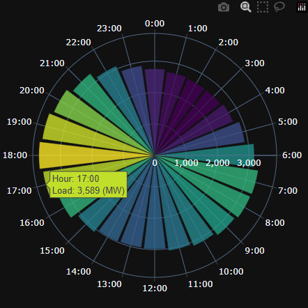
Inspired by some other Plotly users in the thread here, I married some of the ideas and added some of my own. Added a drop down selection for region, and sliding bar for the months. The app is using an average of the values associated with the selection in the Dash App. As you change the choices the illustration updates with the callback.
I really like the aesthetics of the polar chart.
#This app is used to illustrate the region energy use (mean) of chosen period using a polar chart and line chart below. As you select the region
#The region and month selection (slide bar) will adjust the illustrations on the dash app.
import dash
from dash import dcc, html, Input, Output
import plotly.graph_objects as go
from plotly.subplots import make_subplots
import pandas as pd

# Load the dataset
file_path = ()

# Preprocess data
data['Local Timestamp Eastern Time (Interval Ending)'] = pd.to_datetime(data['Local Timestamp Eastern Time (Interval Ending)'])
data['Hour Number'] = data['Hour Number'].astype(int)
data['Month'] = data['Local Timestamp Eastern Time (Interval Ending)'].dt.month_name()
data['YearMonth'] = data['Local Timestamp Eastern Time (Interval Ending)'].dt.to_period('M')

# List of regions to choose from
regions = [
    'Connecticut Actual Load (MW)',
    'Maine Actual Load (MW)',
    'New Hampshire Actual Load (MW)',
    'Northeast Massachusetts Actual Load (MW)',
    'Rhode Island Actual Load (MW)',
    'Southeast Massachusetts Actual Load (MW)',
    'Vermont Actual Load (MW)',
    'Western/Central Massachusetts Actual Load (MW)'
]

# Dash app setup
app = dash.Dash(__name__)

app.layout = html.Div([
    html.H1("Hourly Load Distribution by Region and Month", style={'text-align': 'center'}),
    html.Label("Select a Region:", style={'fontSize': '18px', 'padding': '10px'}),
    dcc.Dropdown(
        id='region-dropdown',
        options=[{'label': region, 'value': region} for region in regions],
        value=regions[0],
        style={'width': '50%', 'margin-bottom': '20px'}
    ),
    html.Label("Select Month(s):", style={'fontSize': '18px', 'padding': '10px'}),
    dcc.RangeSlider(
        id='month-slider',
        min=0,
        max=len(data['YearMonth'].unique()) - 1,
        step=1,
        marks={i: str(month) for i, month in enumerate(data['YearMonth'].unique())},
        value=[0, len(data['YearMonth'].unique()) - 1]
    ),
    dcc.Graph(
        id='combined-chart',
        style={'height': '90vh'}
    ),
], style={'padding': '20px'})

@app.callback(
    Output('combined-chart', 'figure'),
    [Input('region-dropdown', 'value'),
     Input('month-slider', 'value')]
)
def update_charts(region, month_range):
    # Handle None or invalid region values
    if not region or region not in regions:
        region = regions[0]

    # Filter data based on selected months
    unique_months = list(data['YearMonth'].unique())
    selected_months = unique_months[month_range[0]:month_range[1] + 1]
    filtered_data = data[data['YearMonth'].isin(selected_months)]

    # Aggregate data by hour for the selected region and months
    hourly_data = filtered_data.groupby('Hour Number')[region].mean().reset_index()

    # Create a subplot grid
    fig = make_subplots(
        rows=2, cols=1,
        subplot_titles=["Polar Chart (Hourly Load)", "Line Chart (Hourly Load)"],
        specs=[[{"type": "polar"}], [{"type": "xy"}]],
        row_heights=[0.6, 0.4]  # Allocate more space to the polar chart
    )

    # Add polar chart
    fig.add_trace(
        go.Barpolar(
            r=hourly_data[region],
            theta=hourly_data['Hour Number'] * 15,
            name="Polar View",
            marker=dict(color=hourly_data[region], colorscale='Viridis'),
        ),
        row=1, col=1
    )

    # Add line chart
    fig.add_trace(
        go.Scatter(
            x=hourly_data['Hour Number'],
            y=hourly_data[region],
            mode='lines+markers',
            name="Line View",
            marker=dict(color='blue'),
        ),
        row=2, col=1
    )

    # Update layout
    fig.update_layout(
        title={
            'text': f"Hourly Load Distribution for {region} ({', '.join(map(str, selected_months))})",
            'y': 0.97,  # Move the main title higher
            'x': 0.5,   # Center the title horizontally
            'xanchor': 'center',
            'yanchor': 'top'
        },
        polar=dict(
            angularaxis=dict(
                direction="clockwise",
                tickvals=list(range(0, 360, 15)),
                ticktext=[f"{i}:00" for i in range(0, 24)],
                tickfont=dict(size=12)  # Larger font for polar axis labels
            ),
            radialaxis=dict(
                title="Load (MW)",
                visible=True,
                tickfont=dict(size=12)  # Larger font for radial axis labels
            )
        ),
        annotations=[
            dict(
                text="Polar Chart (Hourly Load)",
                x=0.5,
                y=1.1,  # Move this above the polar chart
                xref="paper",
                yref="paper",
                showarrow=False,
                font=dict(size=14, color="white")
            ),
            dict(
                text="Line Chart (Hourly Load)",
                x=0.5,
                y=0.4,  # Adjusted for better positioning
                xref="paper",
                yref="paper",
                showarrow=False,
                font=dict(size=14, color="white")
            )
        ],
        margin=dict(
            t=250,  # Increase top margin to make space for title and avoid overlap
            b=50,
            l=50,
            r=50
        ),
        height=1100,  # Increase overall figure height for better scaling
        template='plotly_dark',
        font=dict(size=14)  # Larger default font size for better readability
    )

    return fig

if __name__ == '__main__':
    app.run_server(debug=True)
@ThomasD21M that’s a beautiful polar chart. Good job.
So 04-05 in range slider would me data for the month of April?
I’m not surprised to see how 2-4am are the lowest energy usage hours.
Great addition of the datepicker, @Ester .
This data set would have been perfect for an app challenge, where app creators are encouraged to integrate LLMs that can check the weather and find correlations between energy usage and weather events, like @Mike_Purtell was suggesting.
We could probably event predict energy usage based on future weather.
![]() Welcome to the community, @Donovan.Johnson . Thanks for sharing your figure and code with us.
Welcome to the community, @Donovan.Johnson . Thanks for sharing your figure and code with us.
And thank you @natatsypora for the very kind words; they make my day.
It is a good idea to add the RangeSlider- user can select a period of more than one month ![]()
In your performance it really looks beautiful! ![]()
I looked at the properties for ‘polar_angularaxis’, for theta is possible to set the hours as a string and then add suffix:
update_layout(polar_angularaxis=dict(ticksuffix=':00')
This format will also be used for hoverinfo.
By the way, data have one record with ‘Hour Number’ = 25.
@adamschroeder I saw your last video is about LLMs, i will watch it later. I saw only 2 videos from you.![]()
Absolutely love these charts and the data storytelling that comes with it! The Demand by hour of day is super interesting! ![]()
Thank you @li.nguyen
Hello guys… I’m struggling with an issue in the app. As you may see, the second bar_chart it’s update by data from the first one through the ‘clickData’ value. Everything works fine except for the first time it’s load with Quarter data, because the clikData carries with information and the app needs to perform some lookup with an updated clickData what throw a code error.
When the second bar_chart is already loaded and the first enter in Quarter mode, there is value lookup to update the second bar that needs data to be updated with clickData, but instead, as clickData has a value from previous clicks, that update throw an error. Anyway… there should be some way to prevent that update in the callback… but I haven’t found it yet… Any clues? Suggestions will be accepted!

As a New Englander myself (Live Free or Die!), this week’s challenge was too interesting to pass up. Had fun spending a few hours hacking on some new callbacks, creating some custom geojson polygons, and a successful trial run deployment to a Huggingface space, which can be accessed here! iso_ne_dash_app
![]() Hi guys… As you may see, I have deleted the previous code posted earlier since I have found the issue. The thing is that when having a callback that has more than one input, any of it could trigger the callback independently. In my case, I have two inputs but one is chained to the previous callback and the expected behavior occurs when only the second input triggers the callback since the first input serves to update the previous bar_chart (I will hope this is clear).
Hi guys… As you may see, I have deleted the previous code posted earlier since I have found the issue. The thing is that when having a callback that has more than one input, any of it could trigger the callback independently. In my case, I have two inputs but one is chained to the previous callback and the expected behavior occurs when only the second input triggers the callback since the first input serves to update the previous bar_chart (I will hope this is clear).
Adding content to elaborate and explain it better:
In a nutshell, there is a conditional statement inside the code (aka if) to check the id of the input that triggered the callback.
Posted code updated below.
"""Just importing"""
from dash import Dash, html, Output, Input, callback, dcc, no_update, ctx
import dash_vtk
import dash_mantine_components as dmc
import dash_bootstrap_components as dbc
from dash_bootstrap_templates import load_figure_template
import pandas as pd
import plotly.express as px
import plotly.io as pio
import pprint
# print(pio.templates.default)
pio.templates.default = 'plotly_white'
# loads the "bootstrap" template and sets it as the default
# load_figure_template("bootstrap")
# importing and preparing the data ++++++++++++++++++++++++++++++++++++++
data = pd.read_csv("https://raw.githubusercontent.com/plotly/Figure-Friday/refs/heads/main/2024/week-49/megawatt_demand_2024.csv")
# Convert the "Local Timestamp" column to a datetime format and filter for October data
data['Local Timestamp'] = pd.to_datetime(data['Local Timestamp Eastern Time (Interval Beginning)'])
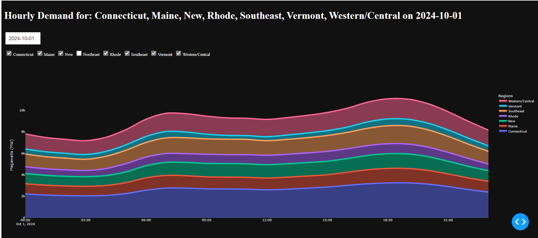
october_data = data[(data['Local Timestamp'] >= '2024-10-01') & (data['Local Timestamp'] < '2024-11-01')]
# Prepare the regional data for plotting
regions = [
"Connecticut Actual Load (MW)", "Maine Actual Load (MW)",
"New Hampshire Actual Load (MW)", "Northeast Massachusetts Actual Load (MW)",
"Rhode Island Actual Load (MW)", "Southeast Massachusetts Actual Load (MW)",
"Vermont Actual Load (MW)", "Western/Central Massachusetts Actual Load (MW)"
]
df = data.select_dtypes(include=['floating', 'datetime']).copy()
df.set_index('Local Timestamp', inplace=True) # for resampling
# renaming columns for shorter displays cols
old_values = df.columns.values.tolist()
new_values = [elem[:-17] for elem in old_values]
mapper = {old:new for old, new in zip(old_values, new_values)}
df.rename(mapper=mapper, axis=1, inplace=True)
# ++++++++++++++++++++++++++++++++++++++++++++++++++++++++++++++++++++++++++++++++++++++++++++++
app = Dash(__name__, external_stylesheets=[dbc.themes.BOOTSTRAP])
radio_group = dmc.RadioGroup(
id= 'radiogroup_period',
label='Select period to aggregate',
value=[],
size='sm',
# mb=5,
children= dmc.Group([
dmc.Radio(label='Year', value='YE'),
dmc.Radio(label='Quarter', value='QE'),
dmc.Radio(label='Month', value='ME'),
], className='m-2'), className='border ps-2 my-1',
)
# ++++++++++++++++++++++++++++++++++++++++++++++++++++++++++++++++++++++++++++++++++++++++++++++
app.layout = dbc.Container([
dbc.Row([
dbc.Col(html.H3("New England energy usage",
className="text-start text-primary my-3"),
width=11)
], justify='around'), #align='center',
dbc.Row([
dbc.Col(radio_group, width=6),
dbc.Col(html.H5('Radar Chart',
className='text-center text-primary my-2'),
width=5)
], align='center', justify='around'),
# dbc.Row([dmc.Text(id="radio_output")]), # added to see clickData, for debugging callback update_txt
dbc.Row([
dbc.Col(dcc.Graph(id="bar_chart_1", figure={}, className='shadow rounded'), width=6),
dbc.Col(dcc.Graph(id="radar_chart", figure={}, className='shadow rounded'), width=5),
], justify='around'), #align='center',
# ++++++++++++++++++++++++++++++++++++++++++++++++++++++++++++++++++++++++++++++++++++++++++++++
dbc.Row([
dbc.Col(html.H5('Bar Group - 1 level down on hover click',
className='text-center text-primary my-2'),
width=6),
dbc.Col(html.H5('Line chart - 1 level down on hover click',
className='text-center text-primary my-2'),
width=5)
], align='center', justify='around'), # align='center'
dbc.Row([
dbc.Col(dcc.Graph(id="bar_chart_2", figure={}, className='shadow rounded'), width=6),
dbc.Col(dcc.Graph(id="line_chart", figure={}, className='shadow rounded'), width=5),
], justify='around'), #align='center',
], fluid=True)
# # For debugging clickData ++++++++++++++++++++++++++++++
# @callback(
# Output("radio_output", "children"),
# Input('bar_chart_1', 'clickData')
# )
# def update_txt(value):
# return pprint.pformat(value)
# # ++++++++++++++++++++++++++++++++++++++++++++++++++++++
# Update bar_chart_1 & radar_chart => value=['YE', 'QE', 'ME']
@callback(
Output("bar_chart_1", "figure"),
Output('radar_chart', 'figure'),
Input("radiogroup_period", "value"),
prevent_initial_call = True
)
def update_bar_chart(value):
resample = (df
.resample(value)
.sum()
)
res_melted = (resample
.melt(var_name='state', value_name='Load_MW', ignore_index=False)
.reset_index()
.sort_values(by='Load_MW')
)
fig_bar = px.bar(res_melted, x='Load_MW', y='state', color='Local Timestamp',
labels={'state':''}, height=450,
title =f'Energy usage by Y2024 - {value}',
template='plotly_white', color_discrete_sequence= px.colors.qualitative.D3,
)
fig_bar.update_layout(showlegend=False)
fig_bar_polar = px.bar_polar(
res_melted,
r='Load_MW', theta='state',
color='Local Timestamp',
width=700, template='plotly_white',
color_discrete_sequence= px.colors.qualitative.D3
)
fig_bar_polar.update_layout(showlegend=False)
return fig_bar, fig_bar_polar
# Update bar_chart_2 according to clickData from bar_chart_1 and value from radiogroup_period
@callback(
Output('bar_chart_2', 'figure'),
Output('line_chart', 'figure'),
Input("radiogroup_period", "value"),
Input('bar_chart_1', 'clickData'), ## ++++ clickData
prevent_initial_call = True
# running=[(Output('bar_chart_2', 'figure'), fig_bar_2, {})]
)
def update_bar_chart_2(value, clickData):
# Printing some values to check data collected
# print(value)
# print(type(clickData['points'][0]['y']))
# print(f"Click Data:\n{clickData['points'][0]['y']}" if clickData else "No click data")
# print(f"Click Data:\n{clickData['points'][0]}" if clickData else clickData)
# print('the input: ', ctx.triggered_id)
# df resample by 'Day' for further usage
df_day = (df.resample('D').sum())
df_day_melted = (df_day
.melt(var_name='state', value_name='Load_MW', ignore_index=False)
.reset_index()
.sort_values(by='Local Timestamp')
)
df_qe = (df.resample('QE').sum())
dff_qe = (df_qe
.melt(var_name='state', value_name='Load_MW', ignore_index=False)
.reset_index()
.sort_values(by='Load_MW')
)
df_me = (df.resample('ME').sum())
dff_me = (df_me
.melt(var_name='state', value_name='Load_MW', ignore_index=False)
.reset_index()
.sort_values(by='Load_MW')
)
df_bar2 = (df.resample('W').sum())
dff_bar2 = (df_bar2
.melt(var_name='state', value_name='Load_MW', ignore_index=False)
.reset_index()
.sort_values(by='Load_MW')
)
if ctx.triggered_id == 'bar_chart_1': # to verify which input triggered the callback !!!
if clickData and value == 'YE': # Resample by Quarter to bar_chart_2 and px_line
var_state = clickData['points'][0]['y']
dff_bar2_filtered = dff_qe[dff_qe['state']== var_state]
fig_bar_2 = px.bar(dff_bar2_filtered, y='Load_MW', x='state', color=dff_bar2_filtered['Local Timestamp'].dt.strftime('%Y-%m'),
labels={'state':''}, height=450,
title = 'Energy usage by Quarter',
template='plotly_white', color_discrete_sequence= px.colors.qualitative.D3,
barmode='group',
)
temp = df_day_melted[df_day_melted['state'] == var_state]
fig_line = px.line(temp, x='Local Timestamp', y='Load_MW',
template='plotly_white', labels={'Local Timestamp':var_state})
return fig_bar_2, fig_line
elif clickData and value == 'QE':
var_state = clickData['points'][0]['y']
load_to_lookup = clickData['points'][0]['x']
# print(load_to_lookup)
temp_3 = dff_qe[dff_qe['state']== var_state]
temp_4 = temp_3[temp_3['Load_MW'] == load_to_lookup]
end_m = temp_4['Local Timestamp'].dt.strftime('%Y-%m').values[0]
to_rep = temp_4['Local Timestamp'].dt.strftime('%Y-%m').values[0][-2:]
if to_rep != '12':
start_m = end_m[:-2]+'0'+str(int(to_rep)-2)# >> '09'-'06'-'03'
else: start_m = end_m[:-2]+str(int(to_rep)-2)# >> '12'
df2_bar2_ff = df_me[start_m:end_m]
dff_bar2 = (df2_bar2_ff
.melt(var_name='state', value_name='Load_MW', ignore_index=False)
.reset_index()
.sort_values(by='Load_MW')
)
dff_bar2_filtered = dff_bar2[dff_bar2['state']== var_state]
fig_bar_2 = px.bar(dff_bar2_filtered, y='Load_MW', x='state', color=dff_bar2_filtered['Local Timestamp'].dt.strftime('%Y-%m'),
labels={'state':''}, height=450,
title = 'Energy usage by Month in sel Q',
template='plotly_white', color_discrete_sequence= px.colors.qualitative.D3,
barmode='group',
)
dff_day = df_day[start_m:end_m]
df_day_melted = (dff_day
.melt(var_name='state', value_name='Load_MW', ignore_index=False)
.reset_index()
.sort_values(by='Local Timestamp')
)
temp = df_day_melted[df_day_melted['state'] == var_state]
fig_line = px.line(temp, x='Local Timestamp', y='Load_MW',
template='plotly_white', labels={'Local Timestamp':var_state})
return fig_bar_2, fig_line
elif clickData and value == 'ME': # Month resample
var_state = clickData['points'][0]['y']
load_to_lookup = clickData['points'][0]['x']
temp_3 = dff_me[dff_me['state']== var_state]
temp_4 = temp_3[temp_3['Load_MW'] == load_to_lookup]
end_m = temp_4['Local Timestamp'].dt.strftime('%Y-%m').values[0]
df2_bar2_ff = df_day.loc[end_m]
dff_bar2 = (df2_bar2_ff
.melt(var_name='state', value_name='Load_MW', ignore_index=False)
.reset_index()
.sort_values(by='Load_MW')
)
temp = dff_bar2[dff_bar2['state']== var_state].sort_values(by='Local Timestamp').copy()
fig_bar_2 = px.bar(temp, y='Load_MW', x='state', color=temp['Local Timestamp'].dt.strftime('%b, %d'),
labels={'state':''}, height=450,
title = 'Energy usage by Day in sel Month',
template='plotly_white', color_discrete_sequence= px.colors.qualitative.D3,
barmode='group',
)
dff_day = df.loc[end_m]
dff_day_melted = (dff_day
.melt(var_name='state', value_name='Load_MW', ignore_index=False)
.reset_index()
.sort_values(by='Local Timestamp')
)
### # temp['Local Timestamp'].dt.strftime('%H:00') tickvals
temp = dff_day_melted[dff_day_melted['state'] == var_state]
fig_line = px.line(temp, x='Local Timestamp', y='Load_MW',
template='plotly_white', labels={'Local Timestamp':var_state},
title='Energy hourly-usage by sel Month')
return fig_bar_2, fig_line
else: return no_update, no_update
else: return no_update, no_update
if __name__ == "__main__":
app.run(debug=True, port=9999, jupyter_mode='external')