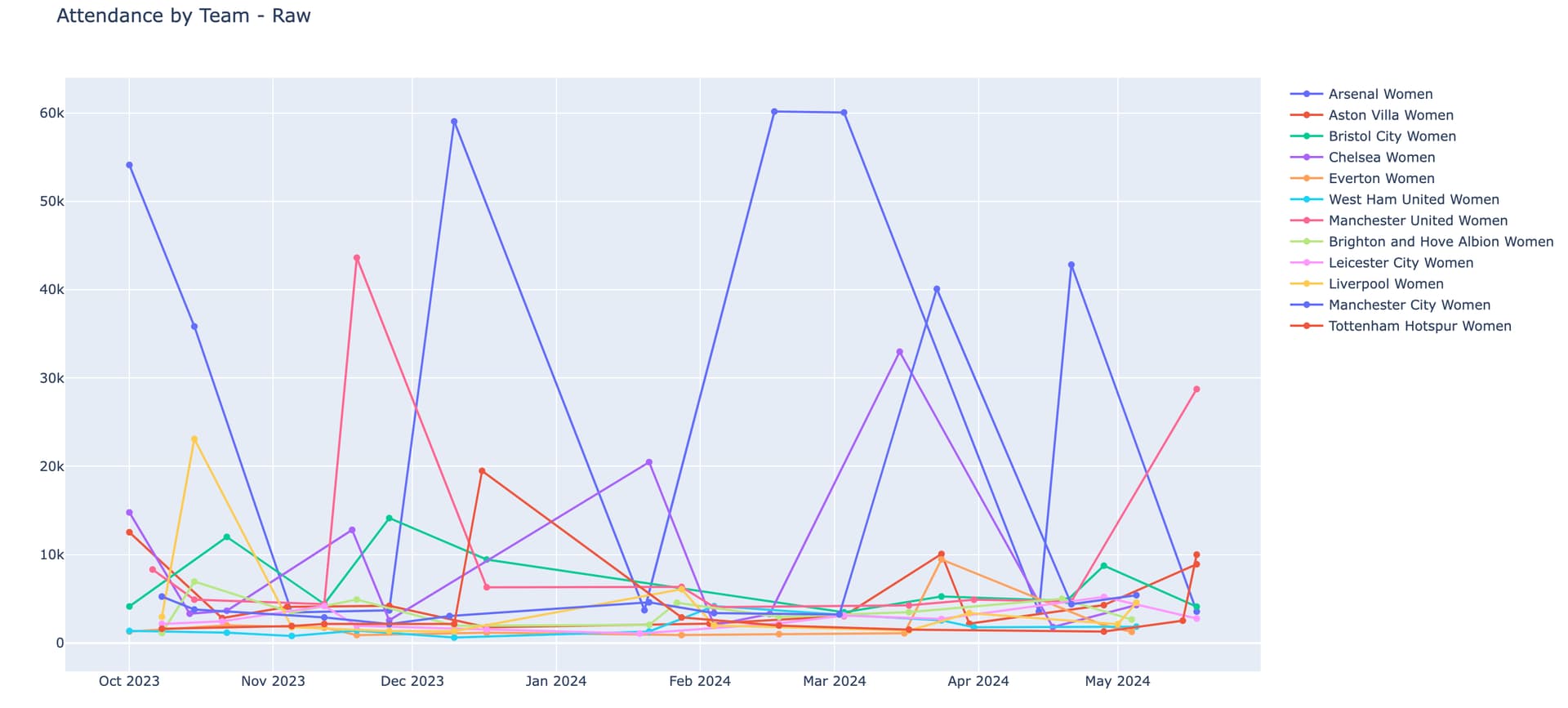
Some clear outliers made this plot hard to read. Arsenal’s attendance figures are so high that most of the other teams can drowned out. I decided to normalize by stadium capacity, and was able to grab some data for that. When exploring that figure, I learned that while my data was for the home stadium, some teams would have occasional games in a much larger stadium (the stadia used by the men’s teams). I was able to manually edit those dates and games.
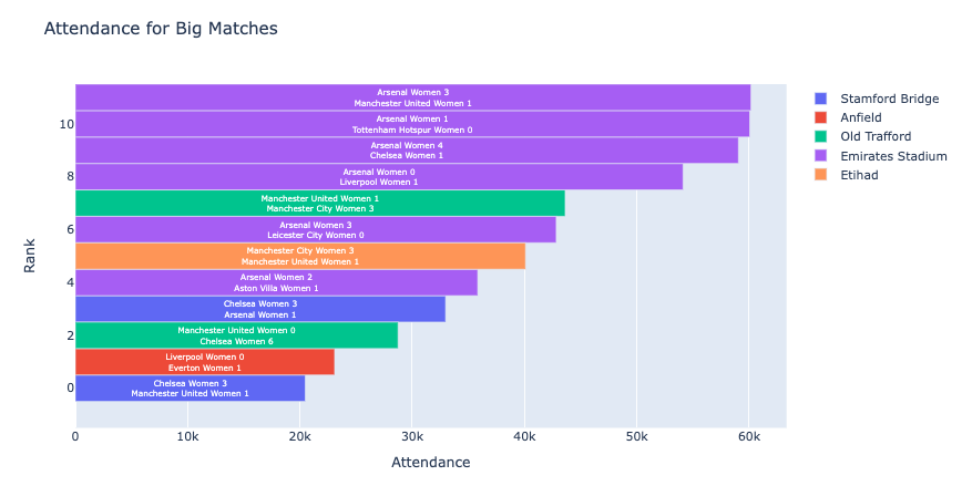
Interestingly, while Chelsea, Manchester United, Manchester City, Everton, Liverpool and Tottenham have a small home stadium and occasionally use a much larger one, Arsenal does the reverse, typically playing at Emirates and occasionally going to the tiny Meadow Park. The big stadium matches are invariably with the other big teams.
Here are the top big matches:
It’s crazy how different the values are for the different teams. Games in the league must feel uneven. I found this plot using aggregates for the teams helpful as well.
Arsenal is a clear outlier. Many of their matches are at a huge stadium and they get the fans. Generally whenever a match is at a big stadium, the fans come, although Aston Villa plays in a large stadium and can only fill 12% of it on average. Leicester also struggles to fill their big stadium. But for the other clubs, perhaps the stadium experience is also a draw for supporters and these teams should try to schedule games there as often as they can. I also did some exploration with day of week, but most of the big games are on weekends and I haven’t made a compelling visual.
Also, is there a way to drop html plots into these posts? Wasn’t able to figure that out so I’m sharing static screenshots.
Wow, I love this chart @Mike_Purtell ! Even though I don’t know much about football, the annotations make it really easy to understand. I haven’t used annotations much myself, so this is a fantastic example of how effective they can be.
I did have a small question about the background coloring. It looks like you visualized the summer schedule for 2012-2016 and then switched to the fall/spring season for 2016-2022. Is there a specific reason for that change?
@hebertodelrio - I completely agree with everything @adamschroeder mentioned. This animated bar chart is incredibly engaging!
I have a small suggestion, not related to code but to data visualization best practices, which I think could make this chart even more impactful.
I frequently reference this article about color best practices. The section on avoid unnecessary usage of color is particularly relevant here.
Because the chart is already animated and features many colors, it can be a bit challenging to track changes. I would suggest highlighting 1-2 teams with distinct colors only while keeping the others in grey. This way, your analysis shifts to: How has team X developed over time? How do Team X and Y compare in their development over time?
This selective use of color makes it much easier to identify key changes and could significantly enhance your visualization’s impact. Bonus suggestion: If you embed your visualization into an app and allow users to select which teams to highlight, it could become a very nice interactive app!
Awesome app, @jinnyzor! You’ve packed in many useful controls, leaving lots of room for analysis.
I like the KPI card – is that showing the total number of attendances? Btw, I’m a bigger fan of dark mode too, so hopefully more people will join us on the dark side soon…
Wow, what you’ve done with the heatmap is incredibly creative! I’ve never seen a visual like that before, and it’s a cool alternative to a pie chart It looks like different flags – I love it!
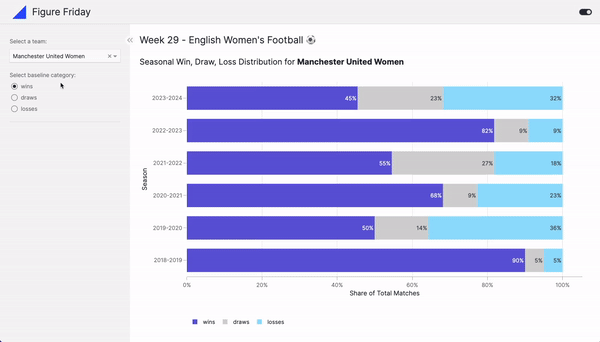
What does the light grey color represent in your bar chart? Does it represent a draw?
Really nice analysis you have done there! I don’t know of a way to embed HTML plots directly into these posts, but you could use py.cafe for this. This Plotly figure example shows you how to do that, it’s a current work-around until py.cafe natively supports this soon This is the code on py.cafe for that example.
Great idea @li.nguyen . Thanks for sharing.
I really like the idea of creating an app that allows the user to choose which 1-2 teams they would to see color for.
@hebertodelrio do you like the color suggestion? Do you have experience with Dash?
We often create graphs and apps that have a lot of information and we let the user explore. So the fact that you have also shared some conclusions about the data analysis is a helpful addition
@adamschroeder, I did like @li.nguyen suggestion, I thought about how to implement it. The issue is the following: since the original purpose was to see the evolution of all the teams during a season, then I decided to assign a fixed color per team. To follow only a group of teams you should select them and then assign different colors to all of these and a single color to the rest.
Since I am teaching a Data Visualization class during the fall in the university I adopted Quarto as the tool to write reports and Plotly (express and graph_objects) as the framework to build graphics, I am in the process of creating the dashboard using Quarto.
I am not too familiar with any of the framework to create web apps: Taipy, Streamline, Dash, Shiny for Python.
This week, I wanted to focus on improving the existing visualization again, mostly to refresh my data visualization knowledge
What could be improved?
As always, the right chart depends on what you want to analyze. The original grouped bar chart is great for comparing values across multiple categories but had a flaw: the number of games played changes each season. More wins might just mean more games. Grouped bar charts aren’t ideal for comparing totals across levels of individual categorical variables.
What I changed:
Switch to a stacked bar chart: A stacked bar chart is a better choice if you want to compare shares across different categories. For example, while the grouped bar chart showed more absolute wins in 2020/2021 than in 2019/2020, the stacked bar chart reveals a higher win ratio in 2019/2020 because fewer games were played. This highlights the importance of choosing the right chart depending on what you want to analyze.
Dynamic choice of baseline category: Stacked bar charts, however, make it hard to compare categories that don’t start at the baseline (0%), which is normally the case for all other color categories than the first one. To fix this, I added a parameter that lets users change the baseline category, making comparisons easier for the category they consider as the most important one.
Optimise color choices: Given that I wanted to focus on wins and losses, I gave them more prevalent colors, while greying out the draws.
Smart way of seeing the percentage difference between wins, losses, and ties. Thanks for sharing, @li.nguyen .
I also liked the color choice; makes it easy to visualize the wins and losses.
While playing around with your app, I was wondering what place did a team finish for each season. But I’m not sure how we would add that to the dashboard without it being information overload…
@adamschroeder - great question! I was debating whether to tweak the current chart or make a new one from scratch. I was also curious about where each team ended up. If I’d had more time, I would have made a bump chart for this! This could be a second chart in that dashboard.
I wonder if anyone else has ever tried to create a bump chart in Plotly? They are a great choice, and probably the best one, for showing changes in rankings over time, see this helpful article by the Flerlage Twins.
Something to notice is that the same team has changed name over time, that Is why the dataset used a team_id field. For example Arsenal Ladies and Arsenal Women are the same team, and to use them as different teams might produce the wrong idea.
These might be a bit more difficult because they are based on the d3 graphing framework but thought they looked similar to what a bump chart is in that article:
@hebertodelrio - I hope you don’t mind that I gave it a shot. Just wanted to show you how easy it is to use Vizro which is built on top of Dash for this. I’ve added less than 20 lines of code to your existing code and managed to create the app within 15 min, thanks to all the heavy groundwork you did on the chart!
I left most of your code unchanged so you can recognise it