Hi, Dash has been working nicely for a project I am working on :). The updates have been swift and exciting :).
I have encountered a few display bugs with dash rendering graphs that I though I should bring notice to:
-
When switching from scatter3d to Heatmap/Contour and back to scatter3d, a white band artifact shows on the scatter3d where the colorbar previously existed on the Heatmap/Contour.
-
Heatmap works as expected when switching to different data in the same plot (Level in this context). However, changing the Heatmap to a Contour plot displays incorrectly when switching the data (shows only a portion of the data).


- Box selection shows correctly in a Scatter plot (big blue dots). In Scattergl, the box selection does not update the graph(no blue dots). But refreshing the plot shows the previously made selection.
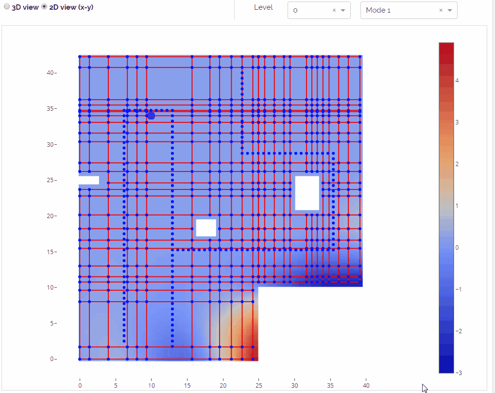
I am not sure if the three issues are connected. I am using dash-core-components 0.22.1 .
Thanks,
Vivek