Click here to view the Google Cloud Run-hosted version of this app. (If no one has accessed the app recently, it will take several seconds to load, as the app is set to run on demand in order to save costs.)
I am working on a ‘Python for Nonprofits’ project that shows how to use Python to manage, analyze, and visualize data. The Dash chapter will be the final part of this MIT-licensed project, which remains very much a work in progress.
This Dash app, whose source code is available here, demonstrates how to use Dash to create a series of interactive online visualizations, ranging from from simple charts to more complex interactive setups. This app also applies the flask-login Dash integration that @jinnyzor and Nader Elshehabi developed. My hope is that these dashboards can serve as a useful reference for developers who are evaluating different ways to represent data using Dash.
Dashboard overviews:
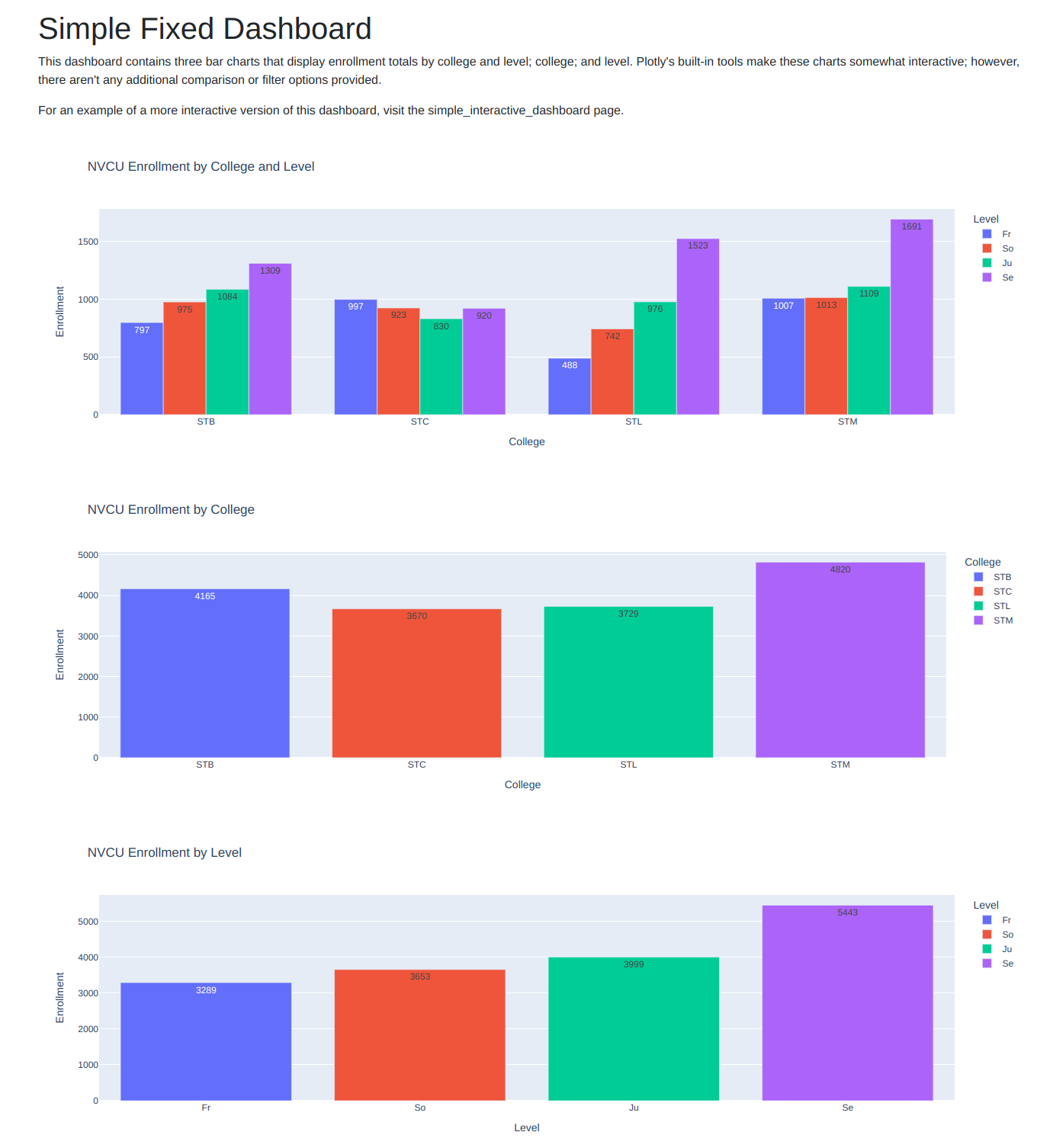
The Fixed Dashboard page shows a very simple dashboard setup that lacks user-defined filter and comparison settings.

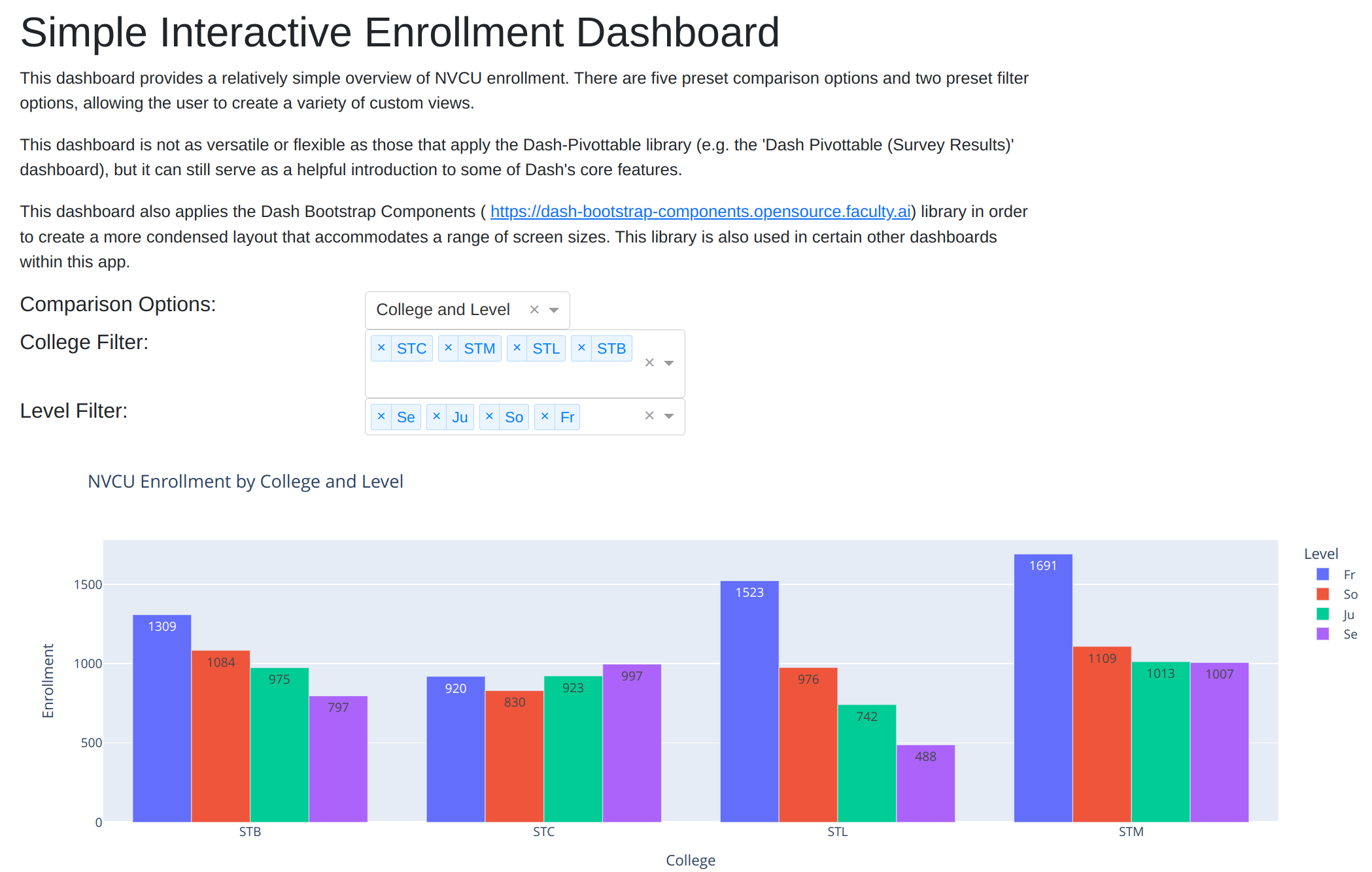
The Simple Interactive Dashboard page displays a relatively straightforward interactive enrollment dashboard. This dashboard didn’t require much code to write, but its functionality is rather limited.

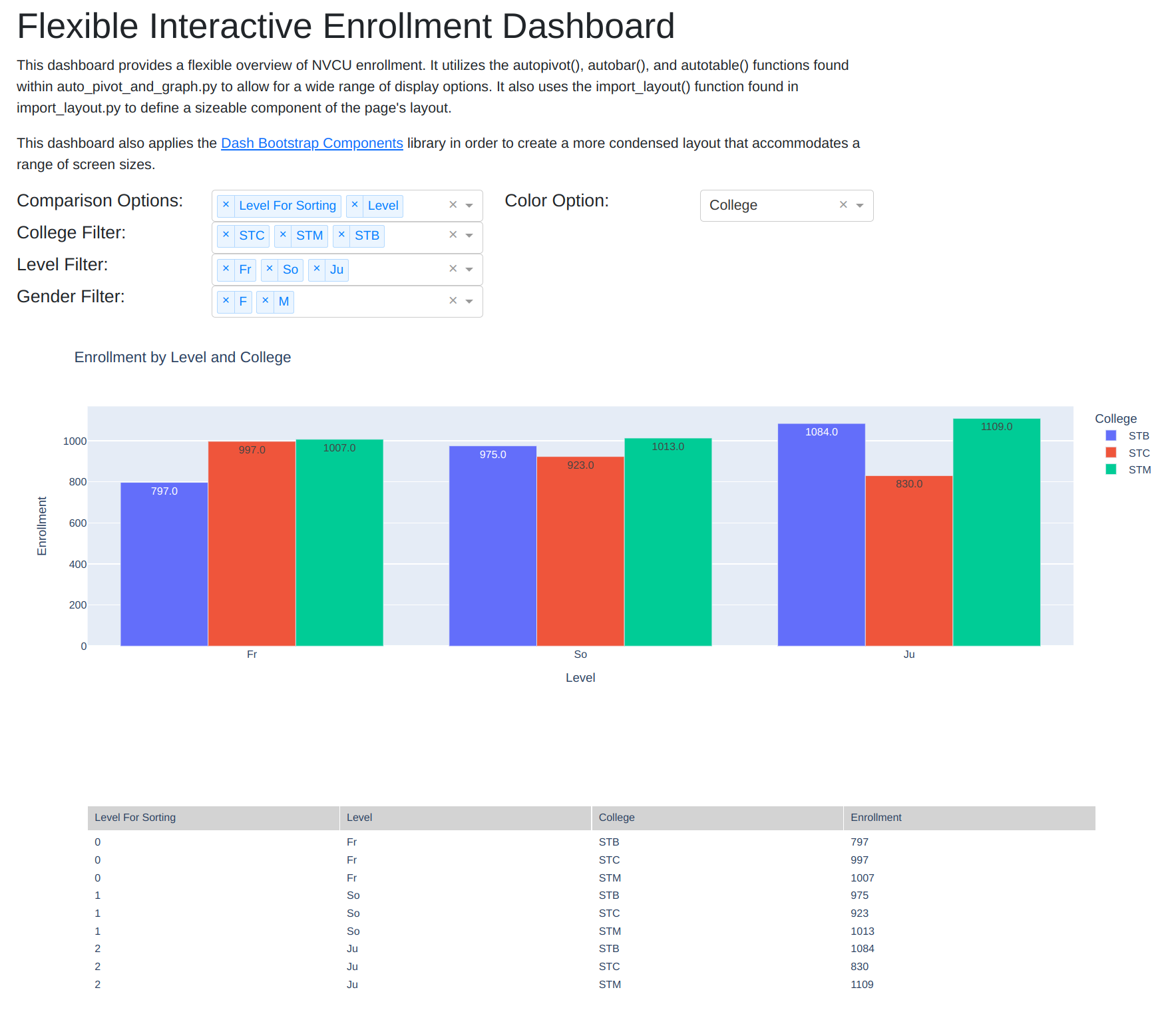
The Flexible Survey Results and Flexible Enrollment dashboard pages allow for a wide range of comparison and color options. These options are made possible by the autopivot() and autobar() functions found within auto_pivot_and_graph.py. (You may also find these functions useful for developing standlone Plotly charts.)
The Flexible Enrollment Dashboard also makes use of an import_layout() function (stored within import_layout.py) in order to reduce the amount of code needed to define the page’s structure and menu options. In addition, this dashboard applies the autotable() function in auto_pivot_and_graph.py to display a tabular view of the data featured in the graph.

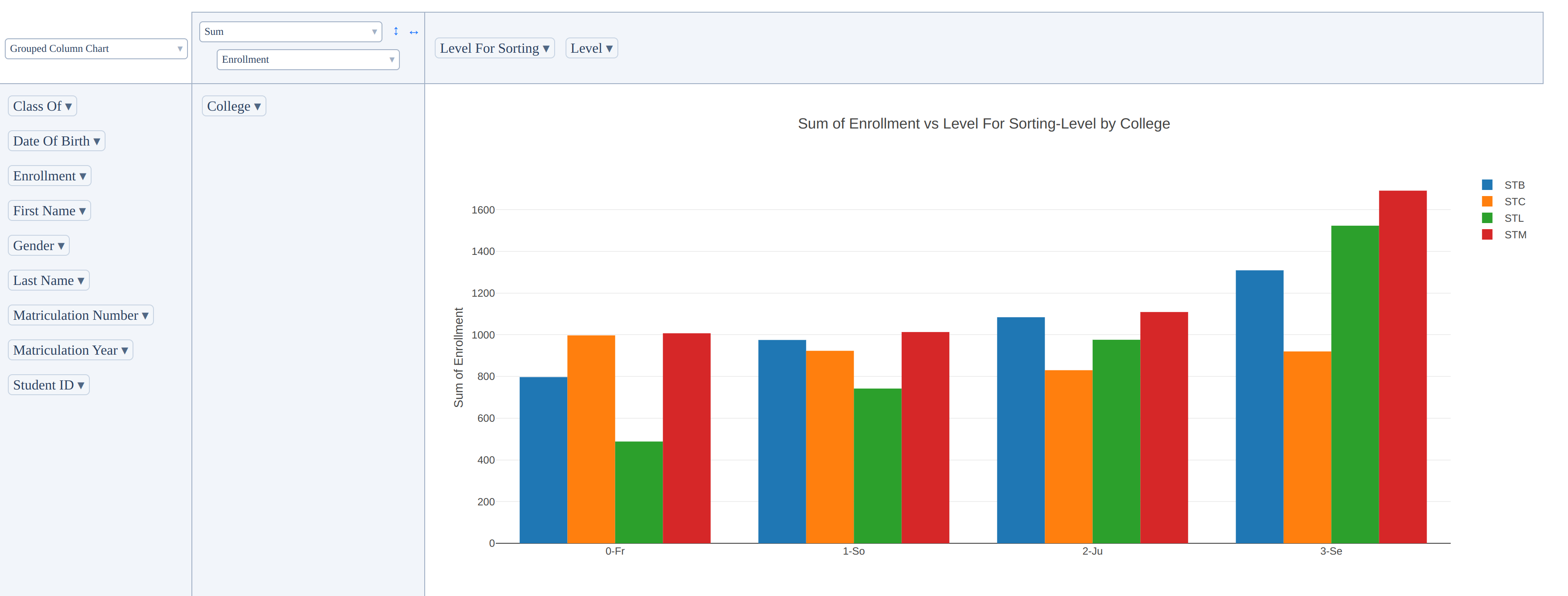
The dash-pivottable library makes it very easy to create interactive dashboards. Examples of this library in use can be found within the Dash Pivottable (Enrollment) and Dash Pivottable (Survey Results) pages.

Development notes:
-
I made use of a standalone Jupyter notebook (notebook_for_testing.ipynb) to test out code before integrating it into my Dash app files.
-
The source data is imported from GitHub. A more realistic approach would retrieve data from an online database; however, that would cause this project to incur a monthly database hosting expense.
-
The dash-bootstrap-components library is used extensively within many of these dashboards. It’s a great option for making your dashboards more aesthetically pleasing and more flexible.
-
This app is hosted on Google Cloud Run, though you can also host it locally by cloning this project. See the Simple App With Login Readme for more guidance on hosting Dash apps within Cloud Run.