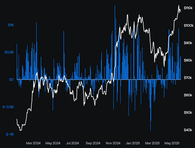
I have a Pandas DataFrame that has a DatetimeIndex with a business day frequency. When I plot it using rangebreaks the x-axis labels look fine when the entire range is shown, but they appear sparse when zoomed in to a few weeks or less. I don’t know the logic behind how these labels are selected, but I’m wondering if there’s a better way to show these labels programmatically? Ideally beyond a certain selected range threshold (~20 points), it would switch to showing labels at every point or every other point. I don’t mind which, as long as there wasn’t a cluster of labels as can be seen in the 2nd screenshot below.
I would like to keep the axis as a datetime type so that Plotly can still auto-adjust the tick density (the full range is a few hundred data points).
Here is a .tail(20) of my data, showing the DatetimeIndex frequency:
Date
2025-05-01    422500000.0
2025-05-02    674900000.0
2025-05-05    425500000.0
2025-05-06    -85700000.0
2025-05-07    142300000.0
2025-05-08    117400000.0
2025-05-09    321400000.0
2025-05-12      5200000.0
2025-05-13    -91400000.0
2025-05-14    319500000.0
2025-05-15    114900000.0
2025-05-16    260200000.0
2025-05-19    667400000.0
2025-05-20    329200000.0
2025-05-21    607100000.0
2025-05-22    934800000.0
2025-05-23    211700000.0
2025-05-26            0.0
2025-05-27    385400000.0
2025-05-28    432700000.0
Freq: B, Name: Total, dtype: float64
This is a plot of the full range:
and this is a zoomed-in view. Here is where the x-axis labels become sparse, and I can’t understand the logic behind choosing these labels:
If it matters, I am defining a figure via make_subplots.


