 What’s New
Dash Mantine Components 2.2.0 is here! Built on top of Mantine 8.2.7, this release brings:
RichTextEditorupgrades – source code edit mode + custom toolbar controlsBar Chartimprovements – pass props toLabelListwithvalueLabelProps- Expanded Styles API – add attributes to inner elements for testing & customization
Container– newstrategy="grid"option with breakout layoutsTooltip– newtargetprop for non-JSX elementsSelectnewclearSearchOnFocusprop so search works similar todcc.DropdownAccordion– newchevronIconSizeprop + smarter defaults
Docs updates – brand new Autocomplete section, Layout overview, with tips on when to use each layout component, and reorganized Theming & Styles docs
 Want to Try It Live?
This post shows screenshots only — for live interactive examples with code, check out the
 DMC 2.2.0 Release Announcement on the docs site.
Source edit mode in RichTextEditor
RichTextEditor You can now use the SourceCode control to see and edit source code of editor content:
Regular content:
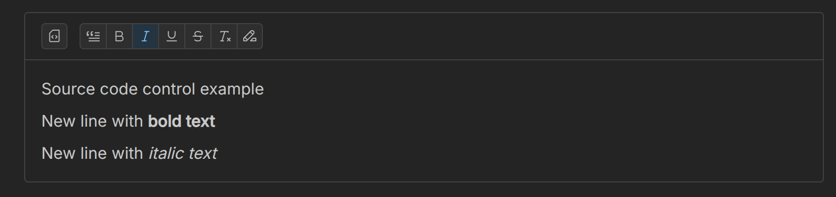
See and edit source code:

Custom controls in RichTextEditor
You can now add your own toolbar buttons with CustomControl in controlsGroups. Mantine wraps TipTap V2.9, so you have access to its full command API.
Thanks to @BSd3v for adding this feature in PR #629!
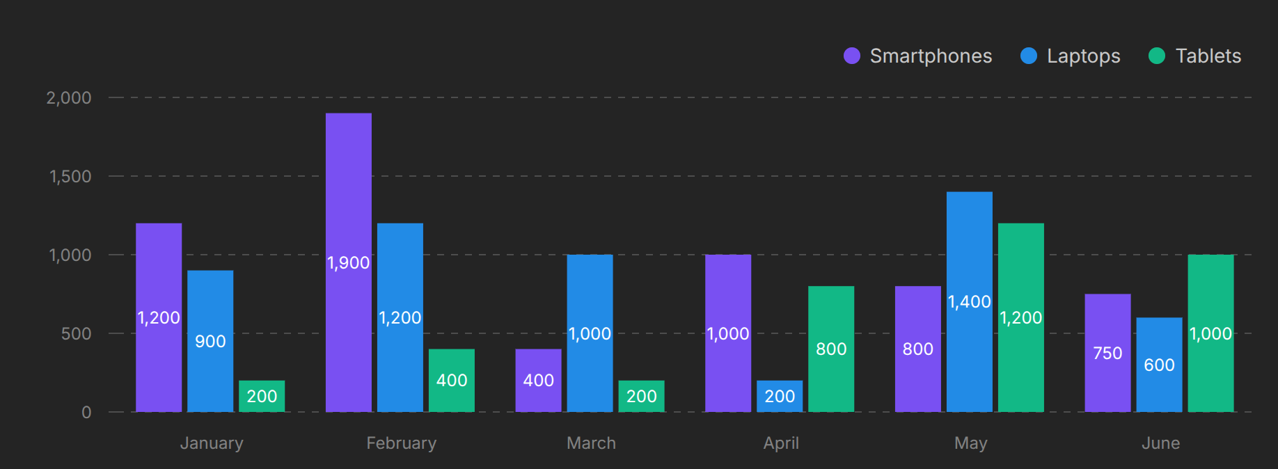
Bar value label props
Bar Chart now supports valueLabelProps to pass props down to recharts LabelList.
Thanks to first-time contributor @CGaul in PR #620!
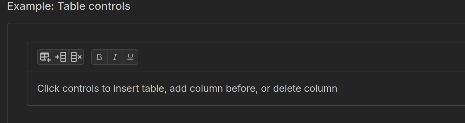
Styles API attributes
All Styles API components now support an attributes prop, letting you attach attributes (like data-*) directly to inner elements. Great for testing or customization.
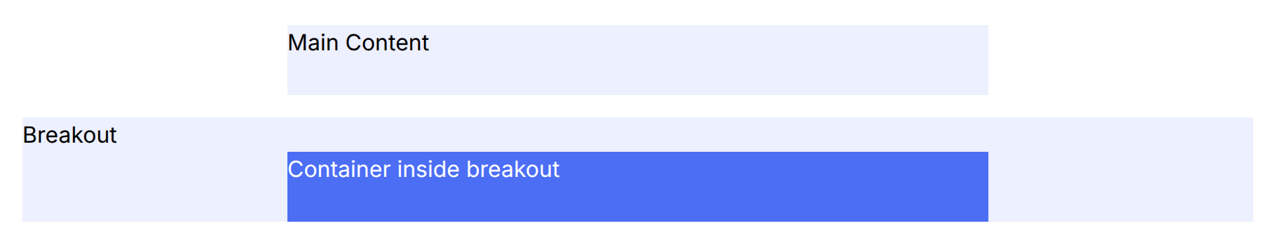
Container grid strategy
Container introduces a new strategy="grid" mode:
- Uses
display: gridinstead ofblock - No default padding
- No
max-width(uses grid template columns)
It supports breakout children (data-breakout) and nested containers.
Tooltip Target
New Tooltip target prop is an alternative to children. Use target prop when creating a Tooltip component clientside.
Seen an example of using target prop with a string selector in the docs
clearSearchOnFocus prop
For searchable Select component, you can now set clearSearchOnFocus=True to reset the search box whenever the field gains focus. This is useful when you want the user to start with an empty search box each time, without having to manually delete the existing text.
You won’t find this prop in the upstream Mantine docs. It’s a Dash-only prop to make the search similar to the dcc.Dropdown . This is helpful when migrating apps to DMC.
Thanks @vaughnfuelling1 for the feature request!
Take it for a test drive in the Clear Search on Focus Example in the docs
Accordion chevronIconSize prop
Check out how to use the new chevronIconSize prop using this dynamic example in the docs:

New in the Docs
-
Autocomplete now has its own section with examples and best practices.
-
A brand-new Layout Overview explains when to use
Grid,SimpleGrid,Group,Stack,Flex,Container,Paper,Box, andAppShell. -
The docs now separate Theming and Styles for clarity, plus a new Mantine Overview for API basics.
 Quick Start
Reminder:
- With Dash ≥ 3.0.0, no need to manually set React.
- With DMC ≥ 1.2.0, optional stylesheets like
dmc.styles.ALLare no longer required.
Here’s a minimal app to get started:
import dash_mantine_components as dmc
from dash import Dash

app = Dash()

app.layout = dmc.MantineProvider(
    dmc.Alert(
        "Welcome to Dash Mantine Components",
        title="Hello!",
        color="violet",
    )
)

app.run(debug=True)
 Thank You
Huge thanks to our contributors, especially @BSd3v (aka @Jinnyzor) and first-time contributor @CGaul.
Special thanks to @alexcjohnson for reviews and guidance.