This is the 3rd post in my series on Dash Enterprise. We kicked off the Dash Enterprise Fieldnotes series with Why Dash Enterprise?, followed by an essay on the App Manager.
The next essay in the series is on the motivation and people behind asynchronous Job Queues.
Dash Enterprise is the heart and soul of our work at Plotly and my recommended way forward with Dash & Python at any mid to large-sized company. Check if your company has already licensed Dash Enterprise or reach out to me to get started.
Midas Touch
UI is near and dear to my heart. At Plotly, our lead designer (Sidi) has the Midas Touch. Everything that Sidi touches - slide decks, mocks, concept art, Dash apps, stickers - is transformed after leaving her desk. Everyone who relies on our designer is so much more proud of their work after she’s applied her aesthetic prowess.
I wanted the same thing for Dash Enterprise customers. I had this belief that if our customer’s apps looked ![]() then they would be perceived as A players at their company. This is what’s so fun about Dash - elevating people’s work. Bringing advanced Python analytics from R&D departments to executive office mantlepieces.
then they would be perceived as A players at their company. This is what’s so fun about Dash - elevating people’s work. Bringing advanced Python analytics from R&D departments to executive office mantlepieces.
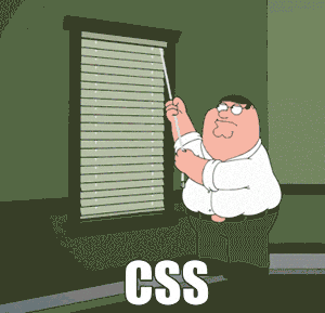
CSS & Bootstrap
CSS is hard. I’ve spent 7 years learning it and I’m still learning. This popular GIF sums it up:
I don’t love Bootstrap. I like things with more character. We built our first Chart Studio product with Bootstrap and it looked like every other Bootstrap thing out there. So we started overriding it with CSS overrides, then finally pulled Bootstrap out altogether. It was a massive waste of time.
Style guides
Over the years, I’ve talked to many orgs that have shared their style guides with me. We’ve built countless Dash apps in accordance with these style guides:


You can create these Dash apps without CSS
Dash apps should be able to match to any corporate style guide without mucking about in CSS.
This was the inspiration for Design Kit, the 2nd feature that we built for Dash Enterprise and perhaps the most popular.
Design Kit create magazine-quality layouts for your Dash app, in perfect harmony with your company’s brand, all without requiring CSS. Design Kit has a point-&-click theme editor for Dash app styling that separates the aesthetic work from the Dash app code. You can preview the Design Kit theme editor in this video.
It’s all about the details
With Design Kit, we sweat the small stuff for you. Typography, colorblind friendly palettes, intuitive UI controls, mobile responsiveness, print-ready formats, cross-browser support, and consistent whitespace padding are a just few of the countless details we’ve considered.
Below are a few of my favorite details.
-
Smart color picker: When you choose the primary accent colors of you Dash app, the theme editor automatically suggests colorblind friendly colorscales for your charts, so that the chart colors match the overall app theme.
-
Customized colorways: Create and save custom colorways for your charts that match your company brand:
-
Presentation mode: When presenting, any chart or Dash UI container can be expanded to full screen:
-
Mobile responsiveness that just works: All Dash apps built with Design Kit will work automagically and look fantastic on mobile screens:


- React & SVG component styling: Design Kit isn’t just modifying CSS - the Design Kit theme editor goes deep into modifying Dash component props, Plotly chart styles, and Dash DataTable:

Design Kit is all about elevating your work. Platforms like Dash Enteprise and Design Kit are helping advance Python analytics from company R&D departments to executive offices.
This is the 3rd post in my series on Dash Enterprise. The first post was Why Dash Enterprise?.
Stay tuned for next post on asynchronous Job Queues, key to scaling compute-intensive Dash apps and Dash Enterprise’s Analytic App Stack:
The Dash Enterprise Fieldnotes Series:
- Why Dash Enterprise?
- App Manager
- Dash Design Kit (you are here)
- Job Queues
