I am trying to replicate a bar chart I have made for a while using Matplotlib using the Plot.ly Python API.
- The bars are each a different width
- I thought using a combination of x0 with dx for the bar placement would work, but it doesn’t seem to offer any additional functionality to the current bar chart (x, y)
Code (Plotly Python API)
iplot({
    'data': [
        Bar(x0 = 0.38, dx = 1, y  = [12]),
        Bar(x0 = 0.5, dx = 1.5, y  = [6]),
        ],
    'layout': {
        'title': 'Aerosol Size Distribution using an Alphasense OPC-N2',
        'xaxis': {'title': 'Dp / um'},
        'yaxis': {'title': 'Counts / cm3'}
    }
})
In matplotlib, I can easily iterate over a list of items to generate the correct values, which ends up looking something like the following:

The syntax with matplotlib would be something like:
ax.bar(x0, y, dx)
Plotly doesn’t support bar charts with bars of varying width.
The dx attributes sets the x-data step, not the bar width. Together, x0 and dx form a linear space of coordinates.
You can specify the gap between the bars using the layout attribute bargap (example here).
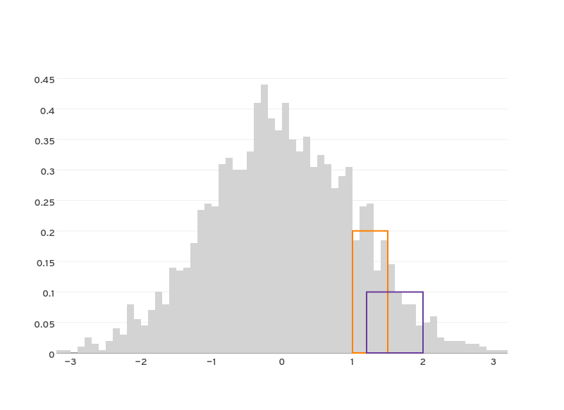
But, for your purposes, the best way forward would be to use shapes to draw the regions to highlight. For example, like in this graph (image below). More info about about shapes here and here.
1 Like
Thanks for the reply/help. It seems strange to me that this functionality isn’t built into Bars, but I guess that’s just how it is. I suppose I would have to generate a plot with just shapes…which means I will probably just stick with D3 itself.
Please subscribe to https://github.com/plotly/plotly.js/issues/80 for the latest development info
This 2015 answer is no longer correct, it is now possible to have variable widths. I am posting because google still brings me here in 2023;
The following snippet now works (using a pandas dataframe df);
note the width= parameter
import plotly.graph_objects as go
figure = go.Figure()
figure.add_trace(
    go.Bar(
        x=df["from"],
        y=df["barheight"],
        width=(df["to"]-df["from"]).to_list(),
    )
)
figure.show()
2 Likes
Thanks!
Note: x is actually the center of the bar, so you should actually do:
import plotly.graph_objects as go
figure = go.Figure()
figure.add_trace(
    go.Bar(
        x=((df["from"]+df["to"])/2).to_list(),
        y=df["barheight"],
        width=(df["to"]-df["from"]).to_list(),
    )
)
figure.show()