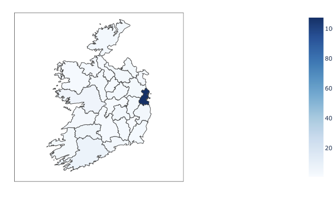
Choropleth map for european country?

The only functioning examples of choropleth maps are of US states.
Is there any example out there in python for a single EU country?
I want to do one for Ireland.
There is a post in relation to it, but its in R.

Can anyone provide or point to an example , in python, that would just draw the country from the geojson file?

https://gist.githubusercontent.com/pnewall/9a122c05ba2865c3a58f15008548fbbd/raw/5bb4f84d918b871ee0e8b99f60dde976bb711d7c/ireland_counties.geojson

I don’t even care about showing values on the chart at this stage… just being able to draw the map would be brilliant…

Thanks

1 Like

Think I might have some useful info from this page now…

https://chart-studio.plotly.com/~empet/15238/tips-to-extract-data-from-a-geojson-di/#/

Hi,

given a .geojson file this is extremely simple since plotly.py 4.5

import geojson
import pandas as pd
import plotly.graph_objects as go

with open("file.geojson", "r", encoding="utf-8") as f:
    geometry = geojson.load(f)

fig = go.Figure([
    go.Choropleth(
        geojson = geometry,
        locations = df["code"],
        z = df["crude_rate"],
        text = df["label"]
)])

fig.update_geos(
    fitbounds="locations",
    resolution=50,
    visible=False,
    showframe=False,
    projection={"type": "mercator"},
)

Good luck!

Ahh !! Thats BRILLIANT!
Thank you so much !!
That IS extremely simple. Dunno why there isn’t an example like that in the docs.

Can I please ask… when I set ‘visible’ = True… how do I control the colour of the sections without any data?
Currently they show up in a blue

Thanks again… brilliant…

You are welcome! :grin:
You can tranpose the code above to the ChoroplethMapbox trace type to include a basemap, or you can indeed fill the missing values in your dataframe with zeros.

Ahh thanks again… brilliant…

I am a bit afraid to use mapbox as it requires use of an access token etc…
So your example above is perfect.
I can add dummy data as needed…

Brilliant, thanks again.

The carto-positron and open-street-map tilemaps do not require an access token, so feel free to give them a spin!

Hi @peej,

In this Jupyter Notebook you can find how is defined the Choroplethmapbox for Swiss cantons, and Norway’s regions. You can download and run it:
https://chart-studio.plotly.com/~empet/15238.

1 Like

Thanks very much to you guys.
@empet, your info was the link I mentioned earlier and it was also very helpful.
I followed your great instructions to get a mapbox version working.

Thanks again. Great help. Really appreciated.

Actually @empet, could I ask your help?
I had this code working yesterday… and now I don’t know what I’ve changed but its not working …
Could you take a quick look and see if anything jumps out at you?
I’ve refreshed my mapboxtoken to see if that would make any difference…

Thanks


import plotly.graph_objects as go
import json
import urllib.request
import random


def read_geojson(url):
    with urllib.request.urlopen(url) as url:
        jdata = json.loads(url.read().decode())
    return jdata 

irish_url = 'https://gist.githubusercontent.com/pnewall/9a122c05ba2865c3a58f15008548fbbd/raw/5bb4f84d918b871ee0e8b99f60dde976bb711d7c/ireland_counties.geojson'

jdata = read_geojson(irish_url)

thelist = jdata['features']
locations =  [ item['id'] for item in thelist ] 
print('locations: ', locations)

randomlist = []
for i in range(0,26):
    n = random.randint(0,10)
    randomlist.append(n)

z = randomlist

print('z: ', z)
mapboxt = open("mapbox_token.txt").read().rstrip() #my mapbox_access_token  must be used only for special mapbox style
print('mapboxt: ', mapboxt)

fig= go.Figure(go.Choroplethmapbox(z=z, # This is the data.
                            locations=locations,
                            colorscale='reds',
                            colorbar=dict(thickness=20, ticklen=3),
                            geojson=jdata,
                            text=locations,
                            hoverinfo='all',
                            marker_line_width=1, marker_opacity=0.75))
                            
                            
fig.update_layout(title_text= 'Symptom Map',
                  title_x=0.5, width = 700,height=700,
                  mapbox = dict(center= dict(lat=53.425049,  lon=-7.944620),
                                 accesstoken= mapboxt,
                                 style='basic',
                                 zoom=5.6,
                               ));
fig.show()

Hi @peej,

Your code works:

Since I used my own file that stores mapbox access_token, I think your file or how it is read led to something that mapbox doesn’t accept.

My filename is .mapbox_token (without any extension) and
the file consists in the mapboxtoken, but not as a string i.e. not in the form:

'pk.manycharacters'

but just:

pk.manycharacters

Thanks @empet for your time on this…
I thought it might be the token too… but it worked yesterday… and now doesn’t so thats odd…
I have the token stored in a plain text file… and its not in quotes … is that what you mean?
Thanks again…

On another point… I am able to display a map using the Go.Chloropleth method.
But I’ve run into the fact that my data is really scewed towards one county…

image

So, Im wondering is there any way I can modify the ranges in the colorscale??

Thanks

@peej

  1. Do you really want to use the mapbox basic style? Otherwise you can set style=‘carto-positron’ which doesn’t require access token.

  2. The distribution of color over counties is nonuniform because only one county has assigned a big value mapped to the colorscale. Other counties have their corresponding values close to minimum.

To remedy this color distribution you can use a discrete colorscale. I explained here https://community.plotly.com/t/add-geojson-polygons-seaborn-colored-by-specific-feature/40464/2 how it is defined. Choose a number of distinct colors (not necessarily colors in a seaborn palette) and divide the interval of values in a few subintervals.

Hi @empet,
Thanks again for your patience.

No,I didn’t really want to use a style that required a token… but I just hate it when something stops working for no apparent reason. :face_with_raised_eyebrow: I will try the carto-positron style. Thank you.

On (2) yes, I understood why it was happening… Dublin was close to 100 while the other counties were down around 4 or 5… so I was looking at two approaches… I could either break Dublin into its constituent areas (Dublin1 to Dublin 24) and spread the data that way… (but I would need a new geojson file or learn how to convert .shp files to geojson as there are some with the extra areas in them)
Or, alternatively, see if there is a way to modify the scale.

And, looking at your answer there, it would appear that there IS a way to play with the scale.

Thank you very much for all this great info.
I’ll go away now and experiment with the scales and then might have a go at following your instructions for converting .shp files to geojson.
I’ll change the chart style too and see which works best.
You and @Batalex have been a great help and I really appreciate it.

Thanks again.,

@peej
The last example in this notebook https://chart-studio.plotly.com/~empet/15238/tips-to-extract-data-from-a-geojson-di/#/ defines a choroplethmapbox from a shapefile.

1 Like

Thanks for that @empet
I would like to suggest a small improvement to that notebook.
You could maybe emphasise that the ‘id’ field on the geojson file needs to be lowercase.
i had case 2, where I had to add the ‘id’ and did it as ‘ID’ … instead of ‘id’

I know, its probably obvious to a lot of people, but I thought that as long as the two matched (in the input dataframe and the geojson file that it’d be fine…)

But I just spent hours on this and finally figured out that my map wasn’t showing cos I had ‘ID’ to match the same column name in my input dataframe… noobie mistake… but still… I’m just saying it here in case it helps some other poor fool… heh heh…

I might as well also say that people could fall foul of what I had at the start which was a .shp file that was in Irish Transverse Mercator… and not WGS84…
That took up a few hours of head scratchin too…

Anyway, couldn’t have gotten this far without your help, so Thanks again.

Hi everybody, im trying to use this methods to build one map for Portugal, but somehow it doesnt even show colors, if somebody could help me it would be very appreciated. Here’s my code:

import plotly.graph_objects as go
import json
import urllib.request
import random

def read_geojson(url):
with urllib.request.urlopen(url) as url:
jdata = json.loads(url.read().decode())
return jdata
url=“https://raw.githubusercontent.com/nmota/caop_GeoJSON/8d86a69dd0ebc1f11316bc7d55bd56102b9e1e7c/DistritosGeoJSON_2015.geojson
r = requests.get(url)
decoded_data=codecs.decode(r.text.encode(), ‘utf-8-sig’)

jdata= json.loads(decoded_data)
thelist = jdata[‘features’]
locations = [ item[‘properties’][‘DI’] for item in thelist ]
print('locations: ', locations)

randomlist =
for i in range(0,len(locations)):
n = random.randint(0,10)
randomlist.append(n)

z = randomlist

print('z: ', z)
mapboxt = open(".mapbox_token").read().rstrip()
print('mapboxt: ', mapboxt)

fig= go.Figure(go.Choroplethmapbox(z=z, # This is the data.
locations=locations,
colorscale=‘reds’,
colorbar=dict(thickness=20, ticklen=3),
geojson=jdata,
text=locations,
hoverinfo=‘all’,
marker_line_width=1, marker_opacity=0.75))

fig.update_layout(title_text= ‘Portugal Map’,
title_x=0.5, width = 700,height=700,
mapbox = dict(center= dict(lat=39.425049, lon=-7.944620),
accesstoken=mapboxt,
style=‘carto-positron’,
zoom=5.6,
));
fig.show()

@empet i’m new to this forum, but i found your comments very helpful, if you could help me it would save my life :grinning: