Changing scatter graph legend icon/colour with colorscale

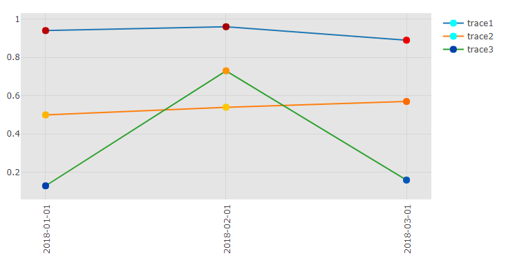
Hi, I’d like to know what determines the legend marker colour for each trace when using colorscale in a scatter graph. It doesn’t seem to be based on the first value of the list, or an average, yet as seen in the example below the traces have different legend marker colours which seems misleading. I googled quite a bit and checked the scatter reference but couldn’t find a way to set the colour myself. Hope someone can help me out!

import dash
import dash_core_components as dcc
import dash_html_components as html
import plotly.graph_objs as go
app = dash.Dash(__name__)
app.layout = html.Div([
    html.Div([
        dcc.Graph(
            id='graph',
            figure={
                "data": [
                    go.Scatter(
                        x=['2018-01-01', '2018-02-01', '2018-03-01'],
                        y=[0.94, 0.96, 0.89],
                        name='trace1',
                        mode="markers+lines",
                        marker=dict(
                            line=dict(
                                width=0,
                            ),
                            size=10,
                            colorscale='Jet',
                            color=[0.94, 0.96, 0.89],
                            cmin=0,
                            cmax=1,
                        ),
                    ),
                    go.Scatter(
                        x=['2018-01-01', '2018-02-01', '2018-03-01'],
                        y=[0.5, 0.54, 0.57],
                        name='trace2',
                        mode="markers+lines",
                        marker=dict(
                            line=dict(
                                width=0,
                            ),
                            size=10,
                            colorscale='Jet',
                            color=[0.7, 0.68, 0.77],
                            cmin=0,
                            cmax=1,
                        ),
                    ),
                    go.Scatter(
                        x=['2018-01-01', '2018-02-01', '2018-03-01'],
                        y=[0.13, 0.73, 0.16],
                        name='trace3',
                        mode="markers+lines",
                        marker=dict(
                            line=dict(
                                width=0,
                            ),
                            size=10,
                            colorscale='Jet',
                            color=[0.13, 0.73, 0.16],
                            cmin=0,
                            cmax=1,
                        ),
                    ),
                ],
                "layout": go.Layout(
                    # hovermode='closest',
                    plot_bgcolor="#e5e5e5",
                    xaxis=dict(
                        tickangle=-90,
                        type='category',
                    ),
                ),
            },
        ),
    ]),
])

if __name__ == "__main__":
    app.run_server(debug=True)

Have you found an answer to this? Having a tough time getting the legend entries to look right…