Hi everyone ,
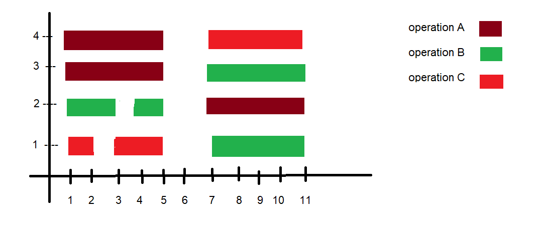
I want graphs as shown in the image above . I think it is some broken bar charts kind of graph , is it possible to plot something like this ?
just explaining my what this image represents , we have different kind of operations(i.e A,B,C) and want to plot the starting and ending of those operations according to values on x axis with operation specific colors.
Please if someone could help me in plotting these graphs it would be a great help.
Thanks in advance .