Behavior of tickformatstops - what is zoom level?

Can any please explain the behaviour of tickformatstops?

In the example “Time series and date axes in Python”, it says; “The tickformatstops attribute can be used to customize the formatting of tick labels depending on the zoom level.”

In the reference, the ‘dtickrange’ argument defines the “min”, “max” - dtick values which describe some zoom level.

What value needs to be inbetween the min/max interval to actually set the “zoom level”?
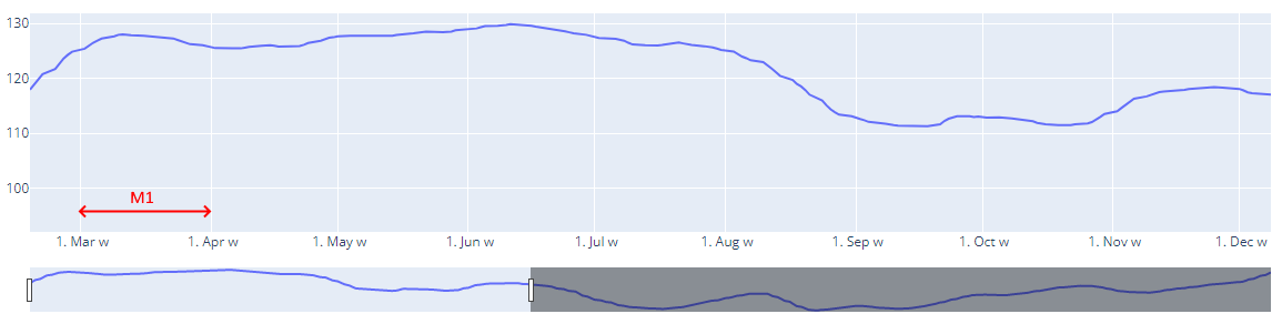
I would have thought it would be the x range of the axis, i.e. if there is more than one month and less than twelve months of data shown then it would be this level;

dict(dtickrange=["M1", "M12"], value="%b '%y M"),

but instead it seems to be this level;

dict(dtickrange=[604800000, "M1"], value="%e. %b w"),

It looks like this;

Can anyone please help me with the logic here? What is greater than one week (604800000) and less than one month (M12)?

Hey @shoops !
(Yes me again :grin:)
Actually I think dtickrange is the range between ticks not x axis range.

Setting dtick="M1", dtickrange=[604800000, "M1"], value="%e. %b w" will be used

Setting dtick="M2", dtickrange=["M1", "M12"], value="%b '%y M" will be used

Thanks @Skiks. You are setting dtick in the code, but isn’t the point of tickformatstops that the user can using the mouse cursor to set the “zoom level” to a given range?

So at first, when you’re looking at the full span of the whole time series, it makes sense for the range between x ticks to be wide. But as you zoom in, you want to see smaller (and more meaningful) x tick ranges. I.e;

My question is more like the following;
When the user manually chooses the x range, which “zoom level” in tickformatstops applies?

Hi @shoops

Yes you are right, dtick and tickformatstops are not meant to work together, it was only for demonstration purpose :slight_smile:

tickformatstops probably works with tickmode='auto', the range between 2 ticks is calculated automatically.
As you zoom, this range will change automatically if needed, and when you see it change, it can be in a different dtickrange you defined in tickformatstops and thus adapt the tick label format by the value corresponding to this dtickrange.

When you start:

The range between 2 ticks is 3 month, we are in dtickrange=["M1", "M12"], the tick label format “%b '%y M” applies like “Apr '15 M”

When you zoom in, the range between ticks changes:

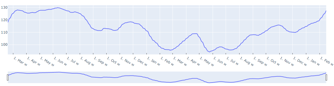
The range between 2 ticks switch automatically to 2 month, we are still in dtickrange=["M1", "M12"], the tick label format “%b '%y M” still applies like “Mar '15 M”

Still zoom in:

The range between 2 ticks switch automatically to 1 month, this time we are in dtickrange=[604800000, "M1"], (seem to be left side of range excluded and right side included), thus the tick label format “%e. %b w” still applies like “1. Mar w”

I think you get it :grin:

Thanks again @Skiks, I really appreciate your help.

Tbh, your answer has just raised more questions for me!
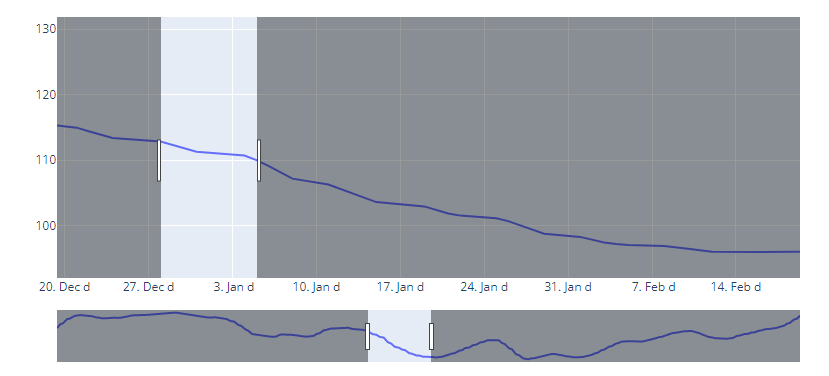
-Why did it go from tick spaces being ‘M3’ to ‘M2’? - who said anything about ‘M2’ spacing?
-When it is ‘M2’ why is it Mar, May, Jul etc rather than Apr, Jun, Aug etc
-When you zoomed from ‘M2’ to ‘M1’, what was it that prompted plotly just choose the next dtickrange? Was it because it is trying to fit 7-9 full tick spaces?

Actually, the last question is what I’m trying to understand/control.

^This is what I’m trying to control.

How do I tell plotly that at a given zoom level (i.e. x range), I want tick spacing to be XYZ, with formatting ABC and (as a bonus, what the first tick should be; i.e. start of the calendar quarter, or calendar month, or ISO week or whatever)

It’s plotly the boss :smile:
When you don’t set specific constrains (like dtick=“M1”), plotly is programmed to make a nice looking axis.
It kind of set for you tick0 the starting position and dtick the range between two ticks.
You can constrain a little the automatic mode by setting nticks the max number of ticks, plotly will still set the starting position and the tick range, but will manage to have as many ticks as possible to be close to nticks

No it is exactly because of the ranges dtickrange defined in tickformatstops.
But ‘M1’ is not obvious as is, as it is a boundary of 2 ranges [604800000, "M1"] and ["M1", "M12"],
as I stated above

by looking on the result on the displayed plot, meaning ‘M1’ seems to be considered in range [604800000, "M1"]

Like suggested in your other post, I think the solution is to use Dash and Graph prop relayoutData as input of a callback, which is triggered with zoom/pan.

I am going to try to cook you an example :cook:

How about something like:

from datetime import timedelta, datetime

from dash import Dash, dcc, html, Input, Output, Patch, State
import plotly.express as px

df = px.data.stocks()
fig = px.line(df, x="date", y=df.columns)
fig.update_xaxes(
    rangeslider_visible=True,
    ticklabelmode="period",
    ticks="inside",
    minor=dict(
        ticks="outside",
        tickwidth=2,
        ticklen=30,
    ),
)

app = Dash(__name__)
app.layout = html.Div([
    dcc.Graph(id='fig', figure=fig),
])

# little helper to convert in ms
to_ms = {
    'H': 1000 * 60 * 60,
    'D': 1000 * 60 * 60 * 24,
    'W': 1000 * 60 * 60 * 24 * 7,
}

@app.callback(
    Output('fig', 'figure'),
    Input('fig', 'relayoutData'), # Triggered by zooming/panning on figure
    State('fig', 'figure'),
)
def update_xticks(_, figure):
    # find x_range
    start_datetime = datetime.fromisoformat(figure["layout"]["xaxis"]["range"][0])
    end_datetime = datetime.fromisoformat(figure["layout"]["xaxis"]["range"][1])
    range_timedelta = end_datetime - start_datetime

    # 5Y <= x_range
    if timedelta(days=365 * 5) <= range_timedelta:
        xaxis = dict(dtick="M12", tickformat="%Y\n ", minor_dtick="M12")

    #  1.5Y <= x_range < 5Y
    elif timedelta(days=365 * 1.5) <= range_timedelta < timedelta(days=365 * 5):
        xaxis = dict(dtick="M3", tickformat="Q%q\n%Y", minor_dtick="M12")

    #  4M <= x_range < 1.5Y
    elif timedelta(days=30 * 4) <= range_timedelta < timedelta(days=365 * 1.5):
        xaxis = dict(dtick="M1", tickformat="%b\nQ%q '%y", minor_dtick="M3")

    #  30D <= x_range < 4M
    elif timedelta(days=30) <= range_timedelta < timedelta(days=30 * 4):
        xaxis = dict(dtick=to_ms['W'], tickformat="S%U\n%b '%y", minor_dtick="M1")

    #  7D <= x_range < 4M
    elif timedelta(days=7) <= range_timedelta < timedelta(days=30):
        xaxis = dict(dtick=to_ms['D'], tickformat="%e\nS%U %b '%y", minor_dtick=to_ms['W'])

    #  1D <= x_range < 7D
    elif timedelta(days=1) <= range_timedelta < timedelta(days=7):
        xaxis = dict(dtick=12 * to_ms['H'], tickformat="%p\n%e. %b '%y", minor_dtick=to_ms['D'])

    #  x_range < 1D
    else:
        xaxis = dict(dtick=to_ms['H'], tickformat="%H:%M\n%p</br>%e. %b '%y", minor_dtick=12 * to_ms['H'])

    # Partial figure update using brand new Patch() feature :)
    patched_figure = Patch()
    patched_figure["layout"]["xaxis"]["dtick"] = xaxis["dtick"]
    patched_figure["layout"]["xaxis"]["tickformat"] = xaxis["tickformat"]
    patched_figure["layout"]["xaxis"]["minor"]["dtick"] = xaxis["minor_dtick"]

    return patched_figure


if __name__ == '__main__':
    app.run_server(debug=True)

Enjoy! :grin:
:sushi:

1 Like