I would like the x axis ticks horizontal, but then they overlap. It seems the procedure to show less ticks doesn’t work when an angle is set.
Here the situation.
here the code: https://codepen.io/ajoposor/pen/jBjWxm
I would like the x axis ticks horizontal, but then they overlap. It seems the procedure to show less ticks doesn’t work when an angle is set.
Here the situation.
here the code: https://codepen.io/ajoposor/pen/jBjWxm
Hmm. That’s a strange use case. By design, we always show all tick labels on category axes (as by your x input).
I’d recommend changing the x values to date strings e.g. 2018-01-01 instead.
It may not be available in the current versions, but the following could be typical issues for people working with time series, which may be addressed in future versions
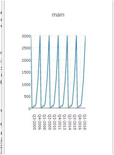
1.- showed labels: If an angle is not forced, not all tick labels are shown, which is good, so as to accommodate for space. For instance:
In the case above, a selection of category ticks are displayed. The same behavior should happen if a different angle is selected, but is not.
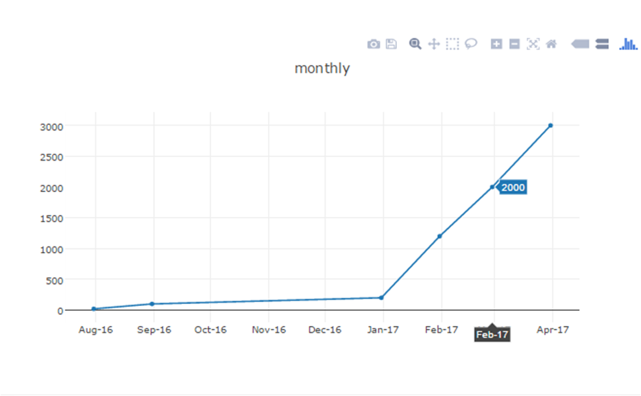
2.- dates or categories. Actually I had to move away from dates because they have some undesirable behaviors: (1) They are displayed at the end of the period, which would require manipulating dates. For instance, to properly display a yearly value, instead of yyyy-12-31, yyyy-01-01 should be used, otherwise it is displayed end of the period, close to the next period label,
Date positioning (date for february, displayed at end)
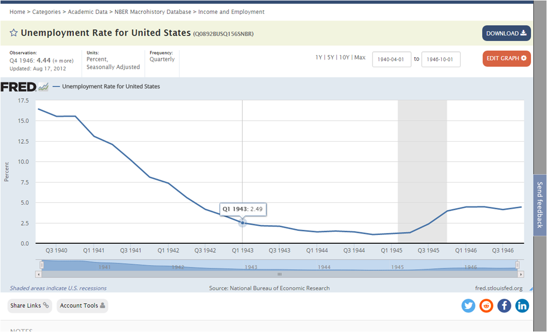
and (2) when zoomed, there is more granularity than desirable. For instance, if values are monthly, I wouldn’t like days, or hours being displayed. For example:
Excess granularity:(I wanted monthly. So, I formated dates as %m-%y, but it has problems when zoomed)
3.- horizontal labels. Well, it is not so strange to want to have the tick labels horizontal. It should be an option subject to user preferences. In my case, I would like to have labels horizontal.