2 graphs, 1 hover

I have 2 graph.

graph 1 : latitutudes and longitudes plotted and each plot is labelled with time.

graph 2 : analysis graph where x-axis is the time(labels of 1st graph’s plot)

If I hover on my 2nd graph analysis, it should reflect on 1st graph and show the location (lat and long plot)

Is it possible with plotly and python?. Please suggest some ideas

Take a look at the second example in the Dash interactive graphing user guide which has hover events on one plot linked to two adjacent ones:

https://dash.plot.ly/interactive-graphing

Does that achieve what you’re looking for?

The link you shared has common x axis for all data. Mine is completly different. Below is the data of 1st graph.

time=df[‘rasp_time’]
latitude=df[‘latitude’]
longitude=df[‘longitude’]

data = [go.Scattermapbox(lat=latitude, lon=longitude, mode=‘markers’, marker=dict(size=8), text=time)]
layout = go.Layout(autosize=True, hovermode=‘closest’, mapbox=dict(accesstoken=mapbox_access_token, bearing=0,
center=dict(lat=48.5069, lon=9.2038),
pitch=0, zoom=12.5))

And also I have 2nd data. where x axis values are text data of above map. I also not finding the way to plot a normal analysis graph with google map graph.

If I hover on analysis graph the hover on map should automatically shown.

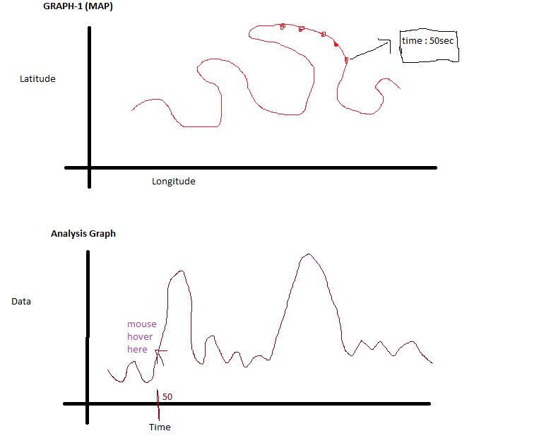
Something like this. If you hover on 2nd graph, 1st graph’s plot with label should be shown.

Hi @ankush.nagaraju,

It sounds like what you have in mind is something like this Plotly.js linked hover example, but spread across multiple graphs.

It’s not possible to trigger tooltips programmatically from Python at the moment. But with the FigureWidget class in version 3 you can register Python callback functions to run on hover events, and you could make a hover event that updates the styling of the other plot (e.g. changes the color of the corresponding point or something).

Though not exactly what you have in mind, here’s an example notebook that demonstrates how to register Python callbacks to run on hover events. Here the hover callbacks are used to update an HTML table and to update an image widget, but you could also update the properties of another FigureWidget graph using property assignment.

Hope that helps you understand your options a bit better!
-Jon

1 Like

Thank you so much for the suggestion and examples. I will try to implement this way and see if it works :slight_smile:

1 Like

To use FigureWidget, Jupyter is necessary? Is it possible using pycharm and plottly online account?

Hi @ankush.nagaraju,

FigureWidget is a custom Jupyter ipywidget (https://ipywidgets.readthedocs.io/en/stable/), so it only works in a Jupyter context. Generally that means using it directly from the notebook (classic notebook or JupyterLab).

If you’d rather do your development in PyCharm there are two options I’m aware of:

  1. Use Dash. Here you would use the standard Figure class and Dash’s callback mechanism. See the “Update Graphs on Hover” example at https://dash.plot.ly/interactive-graphing for a general idea of what a hover interaction dashboard looks like.

  2. Use the ipywidgets server project. Here you write code with FigureWidget just the example notebooks I linked above, but you write the code in a *.py script file. Then you run the ipywidgets-server command from the command line to display a widget layout in a standalone browser.

Dash is much more flexible and powerful, because you have full access to the HTML and CSS structure of the resulting web page. ipywidgets server is less flexible, but a bit simpler. Here you’re working with a predefined set of widgets and layout elements with limit styling options.

Dash is also a project that the Plotly team is very invested in, whereas ipywidgets-server is a smaller (and less mature) project out of the ipywidgets community.

Whether or not either of these options are a good fit for you, I would be interested to hear about the ideal workflow you have in mind. I am interested in looking at options for making it easier to use plotly.py outside of the notebook.

-Jon

Hi Jimmease, I could achieve something by using dash. But if I hover on 2nd graph, plot on 1st graph with label =(x axis value of 2nd graph) should be shown. Could you please help me with completing the callback function. Below is the complete code.

import dash
import dash_core_components as dcc
import dash_html_components as html
import pandas as pd
import plotly.graph_objs as go
from dash.dependencies import Input, Output

mapbox_access_token = ‘pk.eyJ1IjoiYW5rdXNoYW5hZzE0IiwiYSI6ImNqa2t2cWV0bDBta2Eza3BqMTJlaWZ6MzgifQ.FLGqwV1pQAKoNAxKBhmqNA’

class MapPlot:

def plot_map(self):

app = dash.Dash()
df = pd.read_csv(‘csv_files\combine.csv’)
df.head()

time = df[‘time’]
rasp_time = df[‘rasp_time’]
latitude = df[‘latitude’]
longitude = df[‘longitude’]

data = [
go.Scattermapbox(
lat=latitude,
lon=longitude,
text=time,
mode=‘markers’,
marker=dict(size=8))
]

layout = go.Layout(
autosize=True,
hovermode=‘closest’,
mapbox=dict(
bearing=0,
accesstoken=mapbox_access_token,
center=dict(lat=48.5069, lon=9.2038),
pitch=0,
zoom=12.5)
)

fig = dict(data=data, layout=layout)

app.layout = html.Div([
dcc.Graph(id=‘graph’, figure=fig),
dcc.Graph(id=‘sa’, figure={‘data’: [{‘x’: time, ‘y’: rasp_time}],
‘layout’: go.Layout(autosize=True, hovermode=‘closest’)})
])

app.run_server(debug=True)

@app.callback(
Output(‘graph’, ‘children’),
[Input(‘sa’, ‘hoverData’)]
)
def display_hover_data(hoverData):

Below is the 2 graphs on dash.

grafik

Hi @ankush.nagaraju,

As I mentioned above for the FigureWidget approach, I don’t think it’s possible to use Dash to trigger the hover tooltip on a point that’s not actually being hovered over. What you could do is highlight a point on the other graph by making the associated point larger, or a different color.

If you’re interested in perusing this, here’s what I recommend:

  • Update your code example to include both the Map Box plot (which you already have) and the Scatter plot (which I didn’t see). Also put the code in a fenced code block so the code formatting doesn’t get messed up.
  • Post this updated code in a new thread under the “Dash” category (as opposed to the API/Python category that we’re in right now).
  • In the post, describe what kind of highlighting effect you’d like to achieve (size, color, or marker shape are the options that come to mind for me)
  • Mention me in the post so I see it as well.

Hope that makes sense!
-Jon

@jmmease If you created a function let’s called my_plot that encapsulates the functions like the following. Could I import this from Pycharm, and run it on jupyter notebook? would the on_hover work? to update the other plots? is there a way to do it?

Thank you so much

def my_plot(df):

fig = go.FigureWidget(
    data=[
        dict(
            type='scattergl',
            x=df['Torque'],
            y=df['City mpg'],
            mode='markers',
            )
        ],
    )
scatter = fig.data[0]
print(scatter)

def set_opacity(opacity, size):
    scatter.marker.opacity = opacity
    scatter.marker.size = size
    
opacity_slider = interactive(set_opacity,
                         opacity=(0.0, 1.0, 0.01),
                         size=(1, 10, 0.25))
details = HTML()

def hover_fn(trace, points, state):
    ind = points.point_inds[1]
    details.value = df.iloc[ind].to_frame().to_html()

scatter.on_hover(hover_fn)

return VBox([fig,opacity_slider,details])

Hi @bixin,

Yes, defining any or all of the widget construction logic in a function developed in PyCharm will work fine as long as you’re calling it and displaying it from the notebook.

-Jon