Hi All,
I have made a dash app using Plotly and I am having the following issue.
The data being plotted using Plotly in these images is in a SQL database on computer B.
Below are two images of the same graph but taken on two different computers. Picture A is from a computer which connects to computer B’s SQL database. And picture B is from the same computer as the database.
Picture A:

Picture B:
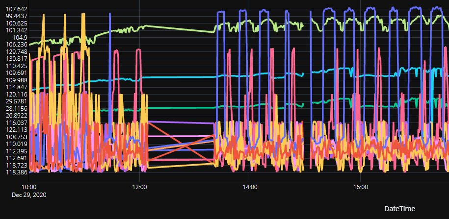
The Y-axis values on Picture A are displayed correctly while the Y-axis on Picture B are all over the place.
The X-axis is fine on both pictures
The source code has no difference between the two computers other than the connection string of the SQL server as Computer A has to connect to Computer B where the Database is. And Computer B uses localhost to connect as its on the same computer.
Is there any particular reason as to why computer B has the Y-axis all over the place compared to computer A where it is organized? These images were obtained by running the python scripts on each computer to display the graphs.
Thank you