X-axis title is above the graph after upgrade from dash version 2.7 to 2.9

I have upgraded dash from version 2.7 to 2.9. Everything works as before.
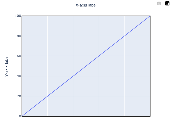
However, the x-axis title now appears above the graph instead of below it.
Any idea why?

I use Plotly Express and my x and y values are Numpy arrays.

    fig = px.line(x=x_values, y=strength_values_in_percent)

    fig.update_layout(
        xaxis=dict(title="Water",),
        yaxis=dict(title="Strength (%)",),
        plot_bgcolor="white",
        hovermode="closest",
        font_size=16,
    )
    fig.update_xaxes(
        showline=True,
        linecolor="black",
        mirror=True,
        range=[x_values.min(), x_values.max()],
        fixedrange=True,
        showticklabels=False,
    )
    fig.update_yaxes(
        showline=True,
        linecolor="black",
        mirror=True,
        range=[0, 100],
        fixedrange=True,
        gridcolor="lavender",
    )

hi @Andr
:wave: welcome to the community.

I ran this test code below on Dash 2.9 and Dash 2.7, and in both cases I got the same image with the x-axis title appearing below the graph.

import plotly.graph_objects as go

fig = go.Figure()

fig.add_trace(go.Scatter(
    x=[0, 1, 2, 3, 4, 5, 6, 7, 8],
    y=[0, 1, 2, 3, 4, 5, 6, 7, 8],
    name="Name of Trace 1"       # this sets its legend entry
))


fig.add_trace(go.Scatter(
    x=[0, 1, 2, 3, 4, 5, 6, 7, 8],
    y=[1, 0, 3, 2, 5, 4, 7, 6, 8],
    name="Name of Trace 2"
))

fig.update_layout(
    title="Plot Title",
    xaxis_title="X Axis Title",
    yaxis_title="Y Axis Title",
    legend_title="Legend Title",
    font=dict(
        family="Courier New, monospace",
        size=18,
        color="RebeccaPurple"
    )
)

fig.show()

Can you please show us your complete code that is creating that issue and an image of your graph?

Sorry. I did not provide enough information. I’ll give you a sample code and the corresponding graph:

import numpy as np
import plotly.express as px

x_values = np.linspace(0, 100, 10)
y_values = np.linspace(0, 100, 10)

fig = px.line(x=x_values, y=y_values, labels={"x": "X-axis label", "y": "Y-axix label"})

fig.update_xaxes(
    showline=True,
    linecolor="black",
    mirror=True,
    range=[x_values.min(), x_values.max()],
    fixedrange=True,
    showticklabels=False,
)
fig.update_yaxes(
    showline=True,
    linecolor="black",
    mirror=True,
    range=[0, 100],
    fixedrange=True,
)
fig.show()

Package Version


dash 2.9.2
dash-bootstrap-components 1.4.1
dash-core-components 2.0.0
dash-html-components 2.0.0
numpy 1.24.1
plotly 5.12.0

And with these …
dash 2.7.1
dash-bootstrap-components 1.4.1
dash-core-components 2.0.0
dash-html-components 2.0.0
numpy 1.24.1
plotly 5.11.0

… I get this:

Maybe its not the dash upgrade, but plotly?
If I upgrade plotly to 5.14.0 and stay with dash 2.7.1 the x-axis title is again on top:

This might be a bug, I’m looking into it.

In the meantime, one option is to remove showticklabels=False, or turn it to True.

Hi @adamschroeder! Did you end finding a fix to this bug? I am experiencing exactly the same thing in plotly 5.14.1. When I put showticklabels=False I get the title above the plot.

hi @tcharland13
I have not found the fix to this bug. But I just opened a new issue to follow this bug more closely.

Thank you for reporting it as well.