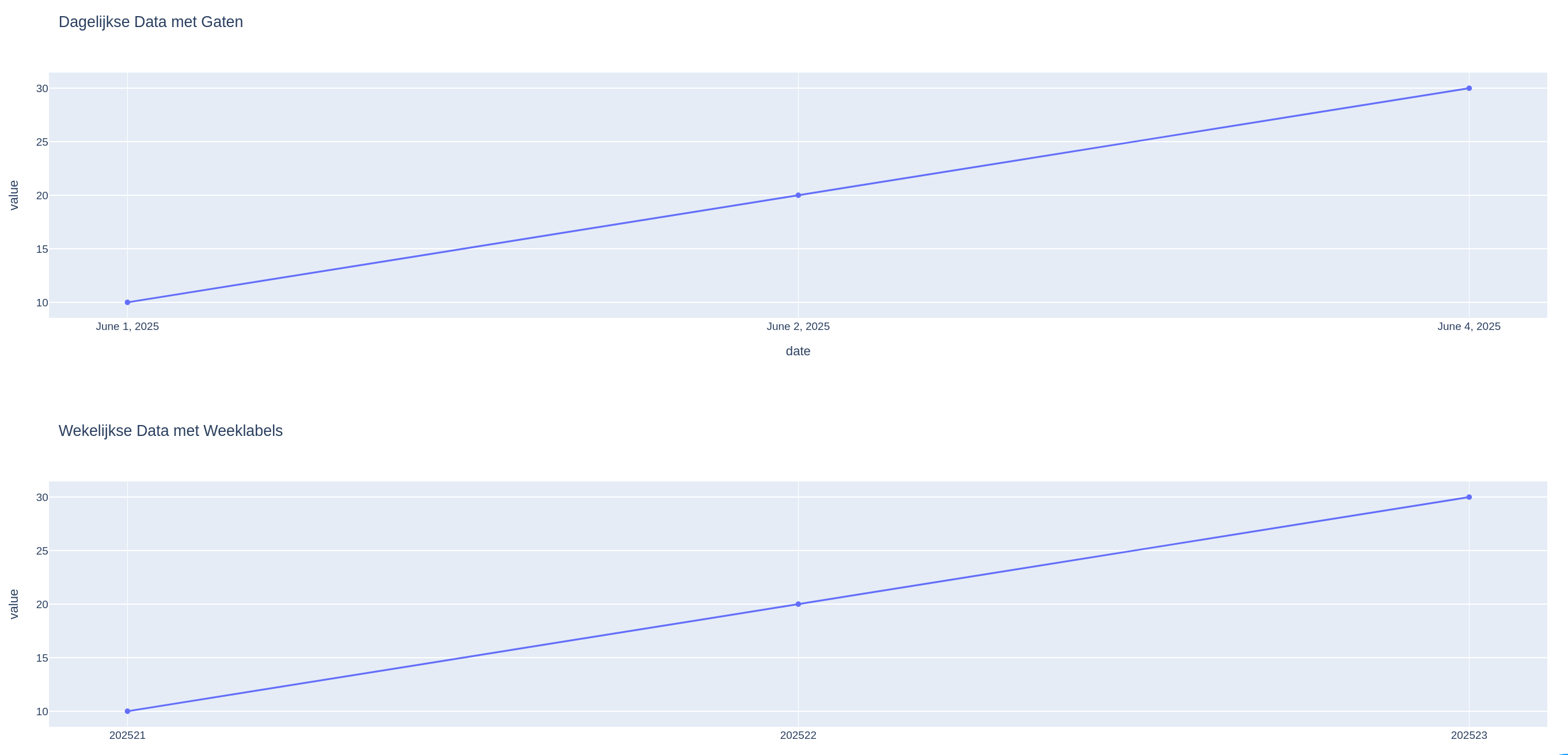
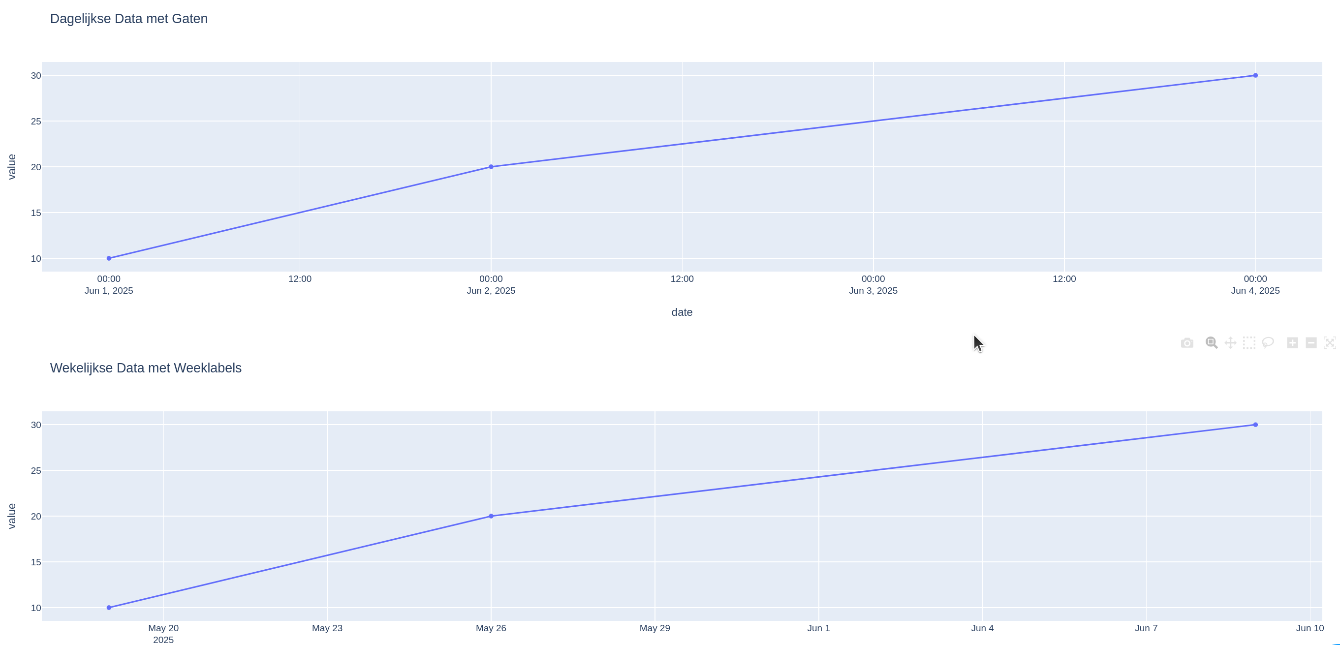
I’m creating a line chart based on weekly data, using a custom week calendar (not the ISO standard). However, for weeks with no data, those timespans are not shown on the chart. This can be fixed, but what’s the best way to ensure that all weeks—regardless of whether they contain data—are still displayed on the timeline?
import plotly.express as px
import pandas as pd

#
daily_df = pd.DataFrame({
    "date": pd.to_datetime(["2025-06-01", "2025-06-02", "2025-06-04"]),
    "value": [10, 20, 30]
})

fig1 = px.line(daily_df, x="date", y="value", markers=True, title="Dagelijkse Data met Gaten")

# --- Weekdata met weeklabels op de x-as ---
week_labels = ["202521", "202522", "202523"]
week_df = pd.DataFrame({
    "weeknr": week_labels,
    "value": [10, 20, 30]
})

fig2 = px.line(week_df, x="weeknr", y="value", markers=True, title="Wekelijkse Data met Weeklabels")

fig1.show()
fig2.show()