I’ve been testing the newly redesigned core components in Dash 4 and I had to share a preview. Plotly has done some amazing work here. The new components have a consistent look and feel, they’re loaded with new features, and are much easier to theme.
It’s still in pre-release, so you can give it a try.
pip install dash==4.00rc4
Check out all the new components at Plotly’s DCC Redesign app hosted on Plotly Cloud
When you use a component library like Dash Mantine Components (or Dash Bootstrap Components), it’s usually best to stick with that library’s components for a consistent design and UI. But the new DCC components include features you won’t find in DMC or DBC, so you might want to mix them in. This post shows how to style Dash v4 DCC components so they match your library’s theme in both light and dark mode.
Here are a few components you may want to add to your DMC or DBC apps:
Dropdowns
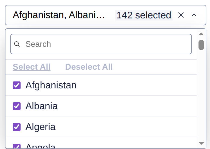
Dropdowns have been completely redesigned. They still support virtualization for large option lists, and now include a separate search input inside the menu, “Select all” and “Deselect all” buttons, and checkboxes or radio indicators for each option. When multi=True, the input shows the number of selected items for a cleaner look.
Check out this post to see it in action Dash 4.0.0 rc1 with refreshed dcc.Dropdown now available
Sliders
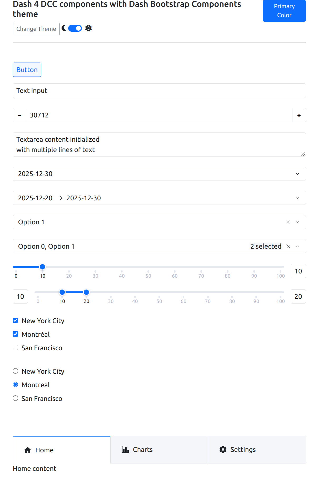
Sliders now include built-in responsive input fields that appear when there is space and hide when there isn’t. Marks are generated automatically based on min, max, and width, so sliders adapt well to different layouts.
There’s also a vertical slider option, which you won’t find in DMC or DBC.

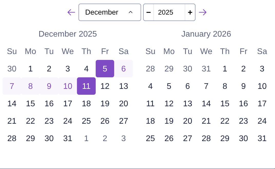
DatePickers
The new DatePickers are a fantastic upgrade especially for apps using DBC, since that library does not include their own DatePickers. The new components make it much easier to navigate months and years. You can also set the locale, which is great for international apps.
Tabs
If you use DBC Tabs, you may want to try the new DCC Tabs since they now support components in labels. This makes it easy to include icons or styled text instead of plain strings.

Other new components
There’s a new dcc.Button that uses the Plotly theme. The Checklist, RadioItems, and Input components have also been updated so everything has a consistent Plotly look.
Accessibility improvements
All components are now accessible. This means clicking a label will focus its associated component when you use the html.Label or Label(html_for=...) pattern. It’s a small change that makes the UI more usable and screen-reader friendly.
Theming
The new DCC components use CSS variables for colors, which makes them easy to theme. The default accent color is Plotly Purple, but you can override it on the outer container of your app.
For example, to switch the accent to green:
style={"--Dash-Fill-Interactive-Strong": "green"}
Styling DCC components with a DBC or DMC theme
You only need a small amount of CSS to make DCC components match your theme in light and dark mode and to set the accent color to the primary color of your library.
light themes
If you are just using a light theme, you can set the accent color to your app’s primary theme like the example above, but instead of “green” you can change it to your app’s primary color:
for the DBC apps:
style={"--Dash-Fill-Interactive-Strong": "var(--bs-primary)"}`
For DMC apps
style={"--Dash-Fill-Interactive-Strong": "var(--mantine-primary-color-filled)"}
That’s it!
dark themes
If you are using a dark theme, it takes a little more CSS, but I made a simple stylesheet to help get you started. You can include it in your app as an external stylesheet lik this:
app = Dash(external_stylesheets=[ "https://cdn.jsdelivr.net/gh/AnnMarieW/dash-bootstrap-templates/dbc.min.css" ])
Then add className="dbc" or className="dmc" to the outer container of your app.
# DBC app
app.layout = dbc.Container(
    [
        # ...
    ],
    className="dbc"
)
For tips on using dark mode or adding a theme toggle in DBC, see: Dash Bootstrap Theme Exporer
# DMC app
app.layout = dmc.MantineProvider(
    dmc.Container(
        [
            # ...
        ],
        className="dmc"
    )
)
For tips on adding a light/dark toggle in DMC: DMC docs theme switch
Instead of using an external stylesheet, you can add it to a .css file in assets:
See the CSS file for DMC here
.dmc {
    --Dash-Stroke-Strong: var(--mantine-color-default-border);
    --Dash-Stroke-Weak: var(--mantine-color-disabled);
    --Dash-Fill-Interactive-Strong: var(--mantine-primary-color-filled);
    --Dash-Fill-Inverse-Strong: var(--mantine-color-body);
    --Dash-Text-Primary: var(--mantine-color-text);
    --Dash-Text-Strong: var(--mantine-color-text);
    --Dash-Text-Disabled: var(--mantine-color-dimmed);
    --Dash-Text-Weak: var(--mantine-color-dimmed);
}

:root[data-mantine-color-scheme="dark"] .dmc {
     --Dash-Fill-Inverse-Strong: var(--mantine-color-dark-6); /*input fields */
     --Dash-Fill-Weak: rgba(255, 255, 255, 0.06);
     --Dash-Fill-Primary-Hover: rgba(255, 255, 255, 0.08);
     --Dash-Fill-Primary-Active: rgba(255, 255, 255, 0.12);
     --Dash-Fill-Disabled: rgba(255, 255, 255, 0.15);
     --Dash-Shading-Strong: rgba(0, 0, 0, 0.6);
     --Dash-Shading-Weak: rgba(0, 0, 0, 0.35);
}
See the CSS file for DBC here
.dbc {
    --Dash-Stroke-Strong: var(--bs-border-color);
    --Dash-Fill-Interactive-Strong: var(--bs-primary);
    --Dash-Fill-Inverse-Strong: var(--bs-body-bg);
    --Dash-Text-Primary: var(--bs-body-color);
    --Dash-Text-Strong: var(--bs-body-color);
}


:root[data-bs-theme="dark"] .dbc {
    --Dash-Stroke-Weak: rgba(255, 255, 255, 0.15);
    --Dash-Fill-Weak: rgba(255, 255, 255, 0.06);
    --Dash-Fill-Primary-Hover: rgba(255, 255, 255, 0.08);
    --Dash-Fill-Primary-Active: rgba(255, 255, 255, 0.12);
    --Dash-Fill-Disabled: rgba(255, 255, 255, 0.2);
    --Dash-Text-Disabled: rgba(255, 255, 255, 0.3);
    --Dash-Text-Weak: rgba(255, 255, 255, 0.3);
}
See live examples hosted on Plotly Cloud!
These apps show a sample of the new v4 DCC components used in a DMC and DBC app. They are currently hosted on my Plotly Cloud account. I recently started using Plotly Cloud and it has been great. It’s an easy way to share a Dash app.
DBC app: https://dbc-dcc4.plotly.app/
DMC app: https://dmc-dcc4.plotly.app/
Bootstrap light mode
Bootstrap dark mode

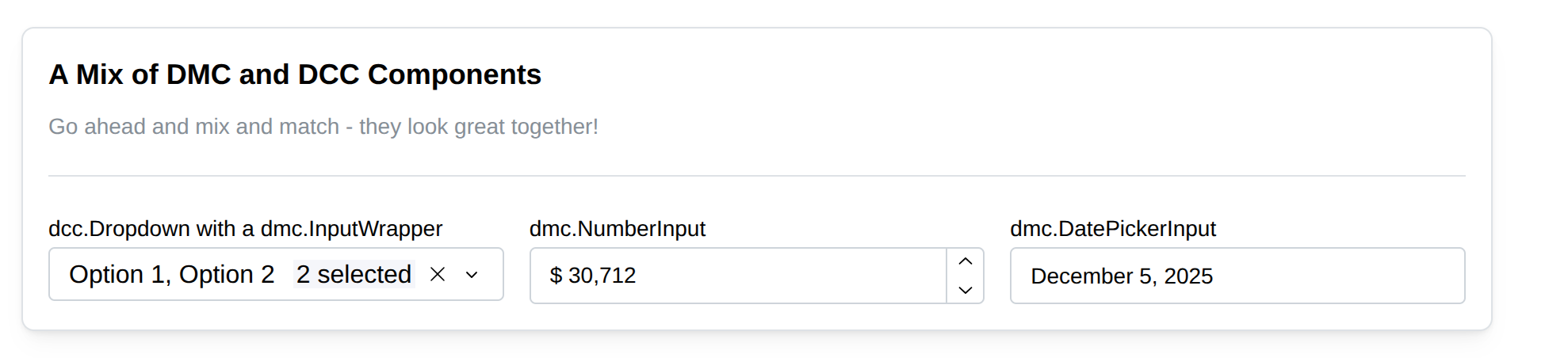
A Dash Mantine Component Card with a mix of DMC and DCC components
Migrating to v4
The good news: all props are the same, so upgrading shouldn’t introduce errors. You will see layout and style changes, though.
If you wrote custom CSS for DCC v3, it won’t work with v4. The components were fully rewritten, so the selectors are different. I recommend starting with the stylesheet provided here and customizing it for your project.
Feedback
Give them a try and let us know how it goes. Your feedback and ideas will help make the final release even better.