Hi guys
I’m new in plotly and I’m trying to plot a large dataset using an heatmap.
The problem I am finding is related to the large values visualized on the ticktext.
I have more than 300 dates, and all text is overlapped
This is my graph
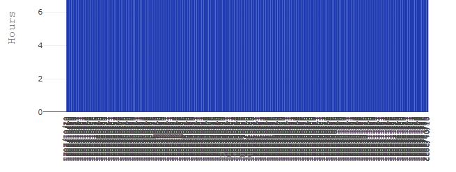
How I could avoid text overlap ?
Thanks