Hello,
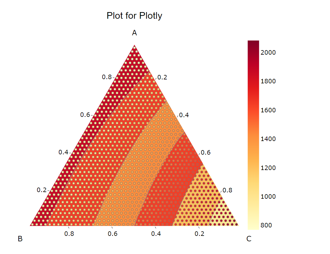
I’m trying to plot some data for a ternary system using Plotly’s ternary contour plot. I’ve followed all the instructions and am able to generate a plot. However, I see that the colour of the markers and the contour map do not line up at all (Figure attached, called Plotly_fullrange). The maximum value points are in the bottom right corner, whereas the contour colour is the lightest there. Am I doing something wrong here?
Also attached is a second plot where I have plotted some filtered results from the original dataset. The markers are the data points that satisfy the constraints I set. The contour is generated beyond these points for some reason. I use the “ilr” method of interpolation for this figure.Using cartesian makes this even worse. Is there a way to generate contours only in the areas the markers exist?

Thanks!