Subplots | How to add master axis titles

I’ve created a subplot where all of the plots share the same x/y-axis type (Energy for the y-axis and voltage for the x-axis). I’d like to add a master axis title for the y- and x-axis (see the attached figure), but haven’t found a solution.

Is this capability not currently supported?

Is there any way to emulate the behavior I’m interested in?

Thank you in advance.

Hi @flores12,

The best way to accomplish this is to use annotations in paper coordinates. Here’s an example that I think does almost exactly what you want (https://plot.ly/python/text-and-annotations/#adding-annotations-with-xref-and-yref-as-paper)

Hope that helps!
-Jon

Hey @jmmease, thank you for the recommendation.

This works well, the only downside is that the text needs to manually placed and it doesn’t respond well to changes in the plot dimensions.

But otherwise, I’m happy with the results.

Raul

image

1 Like

Did plotly ever implement a solution?

Hi @jvdh,

Starting with Plotly 4.0.0 you can add master axis titles as x_title respectively y_title:

from plotly.subplots import make_subplots
fig = make_subplots(rows=2,
                    cols=2,
                    #print_grid=True,
                    vertical_spacing=0.085,
                    horizontal_spacing=0.085,
                    x_title='Your master x-title',
                    y_title='Your master y-title',
                    subplot_titles=('Subplot title1',  'Subplot title2', 
                                    'Subplot title3', 'Subplot title4')))

The function make_subplots() has the following parameters:

def make_subplots(
    rows=1,
    cols=1,
    shared_xaxes=False,
    shared_yaxes=False,
    start_cell="top-left",
    print_grid=False,
    horizontal_spacing=None,
    vertical_spacing=None,
    subplot_titles=None,
    column_widths=None,
    row_heights=None,
    specs=None,
    insets=None,
    column_titles=None,
    row_titles=None,
    x_title=None,
    y_title=None,
    **kwargs
)
3 Likes

Is it possible to customize the font, size, color, etc of these master titles?

So internally the new x_title, y_title arguments are just creating annotations internally, so if you look into your figures layout you’ll see entries like these under annotations

layout.Annotation({
    'font': {'size': 16},
    'showarrow': False,
    'text': 'X axis title created by plotly for subplots',
    'x': 0.5,
    'xanchor': 'center',
    'xref': 'paper',
    'y': 0,
    'yanchor': 'top',
    'yref': 'paper',
    'yshift': -30
})

From here you can update or add properties in this list as so

fig.layout.annotations[0]["font"] = {'size': 22}

Although at this point I think you’re better off just creating the annotations yourself by hand, which is what I’ve been doing

Wow, awesome! Thanks Raul. I love understanding the inner workings of things.

Does this work for express graphs? E.g. I use a graph like this

fig = px.line(all_cost_plots, x='Norm. Zeit [t/t_max]', y='Sprungantwort', color='System', range_x=[0,0.1], facet_col='System', render_mode='auto')
fig.update_layout(annotations=[
        go.layout.Annotation({
            'showarrow': False,
            'text': 'Norm. Zeit [t]',
            'x': 0.5,
            'xanchor': 'center',
            'xref': 'paper',
            'y': 0,
            'yanchor': 'top',
            'yref': 'paper',
            'yshift': -30}
        )
    ])

which renders

which is far from ideal. if i just use the normal options however, well:

that’s even worse. did i miss the solution somewhere?

Hello @klnrdknt,

Can you explain more why the first figure you posted isn’t ideal? What does the plot intentioned look like?
This post is about adding a x/y axis title to a figure composed of subplots, but your first figure seems to satisfy that.

Yes it adds one, but the standard typo and styling of the label is not the same as default axis desciptions, thus, I have two different labels for the axis and cannot print the plot. :confused:

I was just wondering whether there was a less hacky way of adding an overall axis label in plotly_express

I understand now

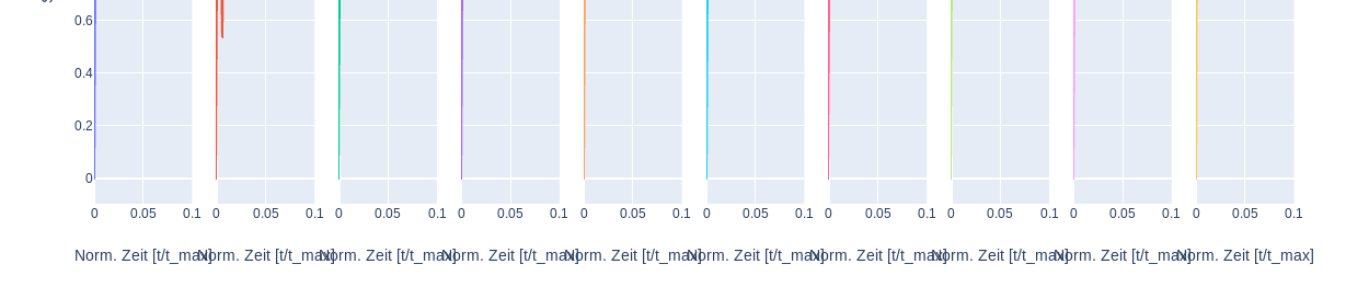
I’m not sure if there is a more straightforward way of adding the 1 master x-axis title with plotly express, I think probably not at the moment although I’ll admit that I don’t use plotly express that often.

As far the the mismatched fonts go, the way to address this would be to edit the font properties of the annotation to match with the default settings with a attribute like this:

            font=dict(
                family="Courier New, monospace",
                size=16,
                color="#ffffff"
            )

Also see:

This will work assuming you know the default text properties which is used for the y-axis label

Frankly, after a few minutes trying to match the y and x-axis formatting (and failing) it’s less effort to just use a custom annotation for both the x and y-axis titles

For reference I’ll attach a reproducible code snippet here of my work.

# #############################################################################
# Import Modules
import pandas as pd
import plotly.express as px
import plotly.graph_objs as go

# #############################################################################
# Import a default dataframe from plotly
df = px.data.tips()

# #############################################################################
# Set up figure with plotly express
fig = px.scatter(
    df,
    x="total_bill",
    y="tip",
    facet_col='day')

# #############################################################################
# I needed these line to get rid of the default x-axis labels
fig.layout["xaxis"].title.text = ""
fig.layout["xaxis2"].title.text = ""
fig.layout["xaxis3"].title.text = ""
fig.layout["xaxis4"].title.text = ""

# #############################################################################
# IMPORTANT | Set the global font properties of the figure
fig.update_layout(
    font=dict(
        family="Time New Roman",
        size=18,
        color="red"))

fig.update_layout(
    annotations=[
        go.layout.Annotation(
            {
                'showarrow': False,
                'text': 'tip',
                'x': 0.5,
                'xanchor': 'center',
                'xref': 'paper',
                'y': 0,
                'yanchor': 'top',
                'yref': 'paper',
                'yshift': -30,
            
                "font": dict(
                    # family="Courier New, monospace",
                    size=18,
                    # color="#ffffff"
                    ),

            })
        ]
    )

fig.show()

Hey man, thanks a lot for the effort. I figured that would be what I had to do as well. I’m not sure if plotly lists its’ default style properties somewhere, but I could not find it, so it’s not as accessible as it could be.

Maybe some of the mods could comment on that. It would be neat in general to have the default style of stuff listed somewhere! EDIT: Maybe it is and I am just blind…

The problem is that it has to be consistent for a whole work, so I would have to manually style ALL the axis titles of all plots… buuuut time constraints.

I am using Plotly version 5.6.0 and I have tried using x_title=‘Your master x-title’, y_title=‘Your master y-title’ to set the master x and y axis labels of the subplot, but it gives me KeyError. How can I fix it? please do let me know.

@Suwaid

This is a complete example with Plotly v 5.6.0:

from plotly.subplots import make_subplots
import plotly.graph_objects as go
fig = make_subplots(rows=2,
                    cols=2,
                    #print_grid=True,
                    vertical_spacing=0.1,
                    horizontal_spacing=0.085,
                    x_title='Your master x-title',
                    y_title='Your master y-title',
                    subplot_titles=('Subplot title1',  'Subplot title2', 
                                    'Subplot title3', 'Subplot title4'))

tr = go.Scatter(x=[0, 1], y=[0,1])
for i, j in [(m, n) for m in [1,2] for n in [1,2]]:
    fig.add_trace(tr, i, j)
fig.update_layout(height=600, title_text="Global title", title_x=0.5)
fig.show()

I tried the exact code, but it did not work on my side.