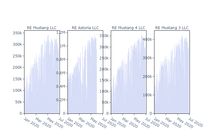
When I create subplots, their color becomes a lot more faded when there is a lot of data points, as shown in the photo below. This doesn’t happen when only creating a single plot, just subplots.
I’m using the first standard Plotly color, #636EFA.
I create the subplots by using make_subplots and then adding subplots to the figure by using add_bar. If anyone can help, that’d be awesome!


 You were a big help.