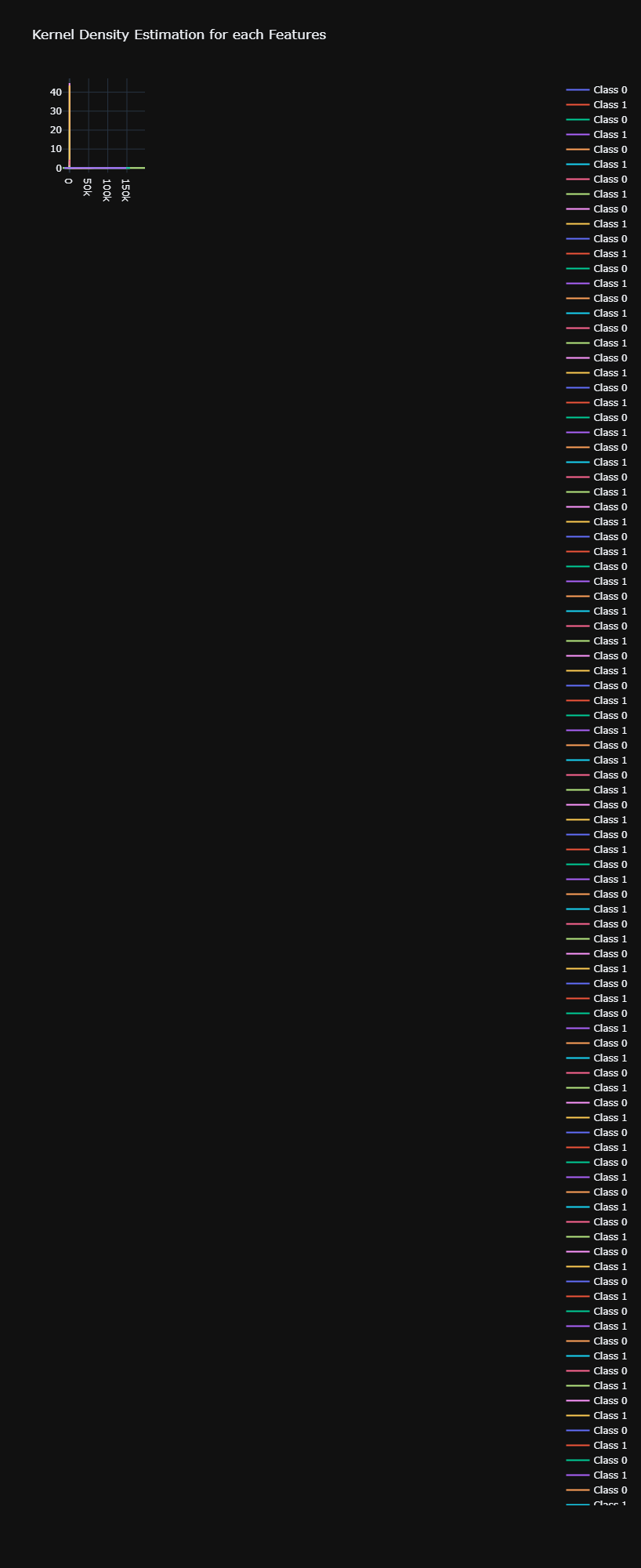
Hello all, I am trying to plot the Kernel Density Estimator for each feature of my dataset. In this dataset, I have a target feature, “Class” that is a binary variable, either 0 or 1. For each plot of the KDE there is a line for the KDE for Class = 0 and Class = 1. I try to make subplots of these plots, I have 55 feature so 55 plots and I would like 5 plots per rows so 11 rows and 5 columns. Yet, when I try to do my subplot, it seems that all the 55 plots are stacke on each others on the subplot. Any help would be appreciated. I am new in Plotly and English is not my native language, forgive me for that.
Here is my code:
# Isolate each targeted class as a new dataframe, remove categorica variable EJ
# and remove the Class target.
class_0 = df[df["Class"]==0].drop(["Class", "EJ"], axis=1).dropna()
class_1 = df[df["Class"]==1].drop(["Class", "EJ"], axis=1).dropna()

# 55 plot since I have 55 features, 5 plot per row
fig = make_subplots(rows=11, cols=5)

# Iterate through both dataframe
for (col_name0, col_data0), (col_name1, col_data1) in zip(class_0.items(), class_1.items()):

    # Index to know where to place each plot on the subplot
    index = 0

    # Class 0 KDE
    kde_data0 = gaussian_kde(class_0[col_name0])
    kde_range0 = np.linspace(
        class_0[col_name0].min() - class_0[col_name0].max() * 0.1,
        class_0[col_name0].max() + class_0[col_name0].max() * 0.1,
        len(class_0[col_name0]),
    )

    estimated_values0 = kde_data0.evaluate(kde_range0)
    estimated_values_cum0 = np.cumsum(estimated_values0)
    estimated_values_cum0 /= estimated_values_cum0.max()


    # Class 1 KDE
    kde_data1 = gaussian_kde(class_1[col_name1])
    kde_range1 = np.linspace(
        class_1[col_name1].min() - class_1[col_name1].max() * 0.1,
        class_1[col_name1].max() + class_1[col_name1].max() * 0.1,
        len(class_1[col_name1]),
    )

    estimated_values1 = kde_data1.evaluate(kde_range1)
    estimated_values_cum1 = np.cumsum(estimated_values1)
    estimated_values_cum1 /= estimated_values_cum1.max()

    # Get the correct row number and col number to place each kde plot on the subplot
    row_num = (index % 11) + 1
    col_num = (index // 11) + 1

    # First KDE plot with class 0
    kde_plot = go.Scatter(name='Class 0', x=kde_range0, y=estimated_values0)
    fig.add_trace(kde_plot, row=row_num, col=col_num)

    # We add on the same plot the KDE for class 1
    kde_plot = go.Scatter(name='Class 1', x=kde_range1, y=estimated_values1)

    # We add the kde plot to the subplot
    fig.add_trace(kde_plot, row=row_num, col=col_num)

    # Increment the index
    index += 1

fig.update_layout(template='plotly_dark', height=2000, title_text='Kernel Density Estimation for each Features')
fig.show()
You can find the result of this code:
And here a single KDE plot:
