Hi!
I feel I have a fairly simple question, but can’t seem to find the answer, either here, in the documentation, on in Google.
I have a stacked line chart that shows new oil production from various countries forecast into the future. Out of all the countries, only one country has a negative forecast (Russia- due to sanctions).
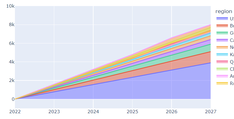
In the stacked line graph, I would like to show the Russian output as negative. However, in the stacked line chart in plotly express, it doesn’t show the Russian volume as negative unless you isolate it. (it does show up inside the positive volumes without affecting the total)

I’ve tried setting the y range to -1000, setting the error_y_minus value, but haven’t been able to display the negative volume as distinctly negative , nor have it to impact the total stacked amount.
`fig = px.line(df7, error_y_minus=‘value’, x=“year”, y=“value”, color=“region”,
title=“hello”)
fig.update_traces(stackgroup=“value”)
fig.update_yaxes(range=[-1000, 10000])`
Does anyone have any experience with this issue, and can please share some insight? Thanks,
Rob