Hey there,
I’m trying to recreate Horizon Plots [1, 2] in Plotly to integrate them in a Dash-App later. It’s a way to condense a Scatter Plot by dividing the values into bands and layering them in a smaller area.
I couldn’t find a native implementation of it in Plotly, so I built it as a Figure of layered Scatters - each Scatter added as a trace. In the following code, bands_df is a table of bands with headers e.g. [-2, -1, 1, 2] and integer values.
import plotly.graph_objects as go

lower_band_color = f'rgba(255, 255, 0, {1.0 / num_lower_bands})'
upper_band_color = f'rgba(0, 0, 255, {1.0 / num_upper_bands})'
transparent = 'rgba(0, 0, 0, 0.0)'

fig = go.Figure()
for band in bands_df.columns:
    fillcolor = lower_band_color if band < 0 else upper_band_color
    fig.add_trace(
        go.Scatter(x=df['x'], y=bands_df[band], fillcolor=fillcolor,
                   fill='tozeroy', line={'color': transparent}, showlegend=False)
    )
fig.show()
The result looks something like this for example:

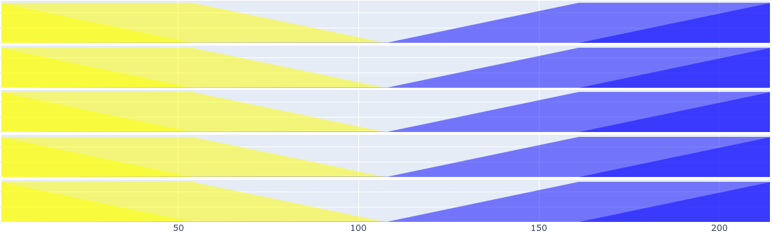
Now I would like to produce a few Horizon Plots and stack them vertically as subplots with a shared x-axis, like this for example:
The issue I run into is, that I can’t add figures in a subplot (only traces) or I don’t know how to implement a Horizon Plot as a trace. I also can’t use ipywidgets (VBox, etc.). So my questions are:
- Is there a way to add figures to a subplot?
- Is there a way to implement a Horizon Plot as a trace?
- If I was to ‘manually’ edit the html code of the figures in order to make a single plot out of it, could it still be embedded in Dash?
- Any other solutions?
Thank you for your help 