Hi all
in this this plotly themed blog it says that plotly has a version of sparklines.
in section 6
How did they do this please? I have a dataframe from which I can select rows and send the results to a graph. I want to plot sparklines of the data but can’t see how they did it in the blog???
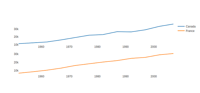
Hi @comicpilsen sparklines are scatter plots inside subplots, with gridlines, axislines and ticks removed. You can take a look at
Here is a code sample of something looking like sparklines to get you started, and then you can customize more the different parts of the plot.
import plotly.express as px
from plotly.subplots import make_subplots
df = px.data.gapminder()
fig = make_subplots(2, 1)
df1 = df.query("country == 'Canada'")
fig.add_trace(go.Scatter(x=df1['year'], y=df1['gdpPercap'], mode='lines', name='Canada'), 1, 1)
df2 = df.query("country == 'France'")
fig.add_trace(go.Scatter(x=df2['year'], y=df2['gdpPercap'], mode='lines', name='France'), 2, 1)
fig.update_layout(template=None, height=400)
fig.update_xaxes(showgrid=False)
fig.update_yaxes(showgrid=False)
fig.show()
or the equivalent
plotly.express code
import plotly.express as px
df = px.data.gapminder().query("continent == 'Oceania'")
fig = px.line(df, x='year', y='gdpPercap', facet_row='country')
fig.update_layout(template=None, height=400)
fig.update_xaxes(showgrid=False)
fig.update_yaxes(showgrid=False)
fig.show()
2 Likes
@Emmanuelle
NOW that’s what I call a GREAT reply. I would NOT have got to your solution as I anchored on the wrong approach which is pretty par for the course in my case. Thank you so much.
@Emmanuelle
sorry to trouble you again on this topic but if I wanted to print out ALL the columns of the df how would I do that? So the data from gapminder has the following columns and you are plotting ‘gdpPercap’ what if I wanted to plot ALL the columns using the same code. I am new to all this plotting stuff so if this is a silly question I apologise.
the columns in the dataset are:
Index([‘country’, ‘continent’, ‘year’, ‘lifeExp’, ‘pop’, ‘gdpPercap’,
‘iso_alpha’, ‘iso_num’],
dtype=‘object’)
I tried looping through the columns but it didn’t work 
import plotly.express as px
df = px.data.gapminder().query("continent == 'Oceania'")
#fig = px.line(df, x='year', y='gdpPercap', facet_row='country')


for col in df.columns:
    print(col)
    fig = px.line(df, x='year', y= col, facet_row='country')
    fig.update_layout(template=None, height=400)

fig.update_xaxes(showgrid=False)

fig.update_yaxes(showgrid=False)

fig.show()
@Emmanuelle
Sorry about this. I figured out how to do this by ACTUALLY reading some thing 
in my case ( I build my dataframe on the fly so I don’t know what the column names will be) so list_chosen_symbols changes based on choosing from the datatable.
list_chosen_symbols = ['AAPL','SPX','XOM']

df_melt = df_plot.melt(id_vars='date', value_vars= list_chosen_symbols )
line_chart = px.line(df_melt, x='date' , y='value' , color='variable')
again sorry to have bugged you on this. I am TRYING to get better at this Web stuff.


