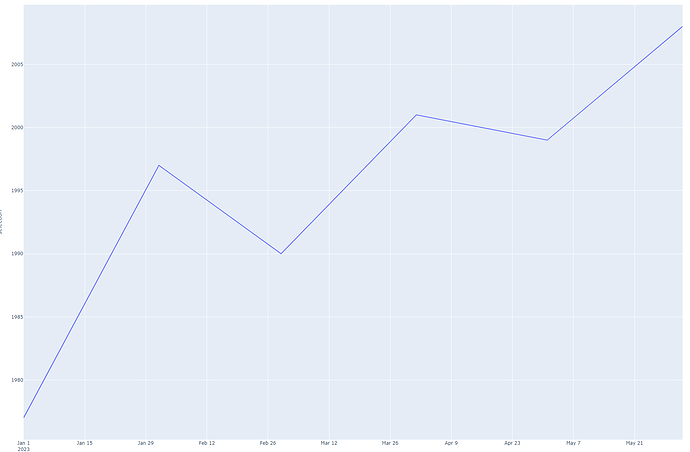
Hi @Peilin ,
Sorry, it’s been take a while to response your reply.
I found that I could do your requirement by creating your data into 2 data frames.
By doing thi,s you don’t have to create subplot.
df is the first dataframe.
df1 is the second dataframe, it is a copy df but with sorted selection column .
you can sort selection column values by using sort_values function in pandas.
By doing this way, it will make the ‘year’ plot is displayed little bit different, because it was sorted by value to achieve sorted y axis.
if this meet your requirement, the code shown below.
import pandas as pd
import plotly.express as px

data = {
    'start': ['2023-01-01', '2023-02-01', '2023-03-01', '2023-04-01', '2023-05-01', '2023-06-01'],
    'selection': [1977, 1997, 1990, 2001, 1999, 2008],
    'category': ['A', 'B', 'C', 'A', 'D', 'H']
}
df = pd.DataFrame(data)

# new dataframe with sorted 'selection' column
df1 = df.sort_values(['selection'])

fig = px.line(df, x='start', y="category")
selection_traces = px.line(df1, x='start', y="selection")
selection_traces = selection_traces.data

for trace in selection_traces:
    fig.add_trace(trace)

fig.show()
Another alternative is update category order after second traces combined.
import pandas as pd
import plotly.express as px

data = {
    'start': ['2023-01-01', '2023-02-01', '2023-03-01', '2023-04-01', '2023-05-01', '2023-06-01'],
    'selection': [1977, 1997, 1990, 2001, 1999, 2008],
    'category': ['A', 'B', 'C', 'A', 'D', 'H']
}
df = pd.DataFrame(data)

fig = px.line(df, x='start', y="category")
selection_traces = px.line(df, x='start', y="selection")
selection_traces = selection_traces.data

for trace in selection_traces:
	fig.add_trace(trace)

fig.update_layout(yaxis={'categoryorder':'category ascending'})
fig.show()
the result will be well ordered , but put category column above selection column like shown image below.
Hope this help.


