Hello!
I’m trying to build a dash app that lets the user select counties on a choropleth map to get information. I’ve got it all working except being able to show on the map the currently selected county. I started building with plotly.px, but I’m working on transitioning to plotly.go because I don’t think plotly.px can do what I want.
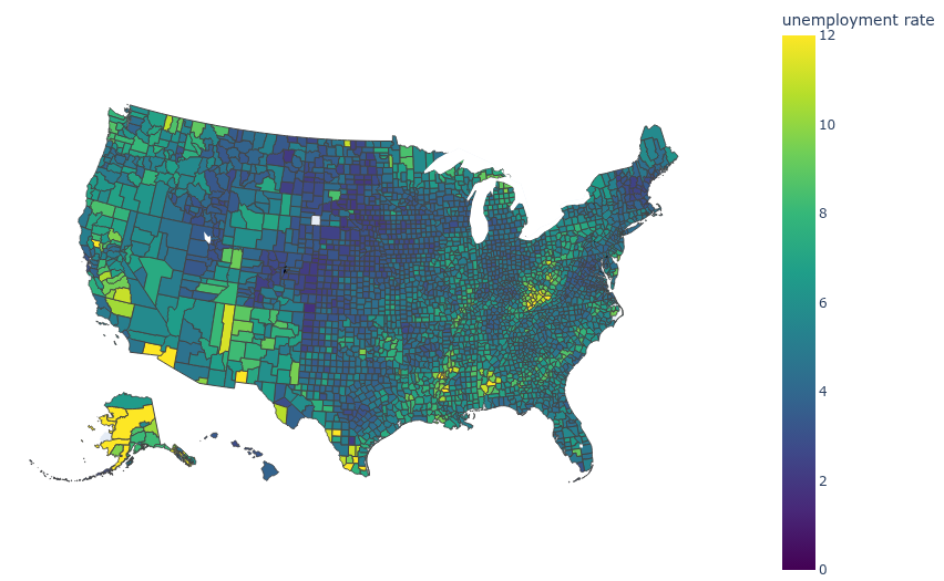
Here is my plotly.px plot:
fig = px.choropleth_map(housing, geojson=counties, locations="fips", color='HousingScore',
                        color_continuous_scale='greens',
                        # range_color=(min_value, max_value),
                        map_style='carto-darkmatter-nolabels',
                        zoom=3, center={'lat': 37.0902, 'lon': -95.7129},
                        opacity=1.0,
                        title="Average Home Value By County",
                        hover_name="RegionName",
                        hover_data={'AverageHomeValue': ':,.2f', 'fips': False,}
                        )


fig.update_layout(margin={"r":0,"l":0,"t":0,"b":0})
fig.update_coloraxes(showscale=False)
fig.show()
I don’t know of any way to make this work, but I’d love to stick with plotly.px if what I want is possible.
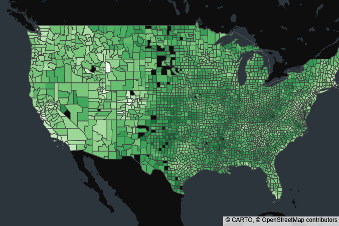
And here is what I’ve come up with with plotly.go:
''' In this plot, a column called "Selected" has been added to the df
with selected counties having a value of 1 and others having a value of None.'''
fig = go.Figure(go.Choroplethmap(geojson=counties, locations=housing["fips"], z=housing['HousingScore'],
                        colorscale='greens',
                        marker_opacity=1.0,
                        customdata=["RegionName", "StateName", "AverageHomeValue"],
                        showscale=False
                        )
                )
fig.add_trace(go.Choroplethmap(geojson=counties, locations=housing["fips"], z= housing['Selected'],
                        colorscale = 'Reds',
                        marker_opacity=.5,
                            )
                        )
fig.update_layout(
    map_style='carto-darkmatter-nolabels',
    map_zoom=3,
    map_center={'lat': 37.0902, 'lon': -95.7129},
    )
fig.update_layout(margin={"r":0,"l":0,"t":0,"b":0})
fig.update_coloraxes(showscale=False)
fig.show()
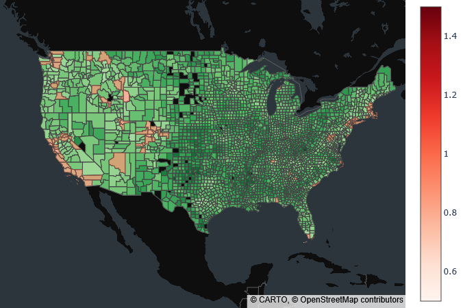
I think this method will work, but I would rather be able to choose a specific color for selected counties and have all other counties uncolored in the second trace.
I also tried using the selected/unselected arguments, but I am using two plots on the same dash page, and I won’t be able to update both plots when a county is selected because they don’t share the same index. Doing it with two traces instead, I think I can use callbacks to reassign the value of “Selected” and update both plots based on that.
Thanks!