Thank you for your interest in submitting your Dash app to the Plotly Explore Page platform, visited by thousands of Dash users daily.
Current submissions cycle will go until May 31, 2026.
To submit your app, please reply to this thread directly.
Please refer to the following suggestions when building and submitting your app. The more suggestions your app adheres to, the more likely it is to be added to the Explore Page.
- Apps in the following categories are encouraged: Energy & Utilities, Business, Predictive Analytics & Forecasting, NLP, Connecting to APIs
- App should look as good or better than the current apps on the platform
- App should use different data than the other apps and try to cover a unique story
- Content/story should be neutral or positive
- App with live data that updates itself is encouraged
- App that goes beyond exploratory analysis – app that perform advanced analytics
- App that uses 3rd-party libraries (e.g., SciPy, spaCy, TensorFlow, Scikit-learn)
- App that solves real-life problems, app that could have practical use cases
- App content and results should be easy to access (we discourage requiring log-ins or uploading data as a precursor to seeing the full app).
The Plotly Example Apps team will review the apps submitted and update this post with the name of the app that has been selected.
Happy Dash app building!
I would like to submit a Dash app:
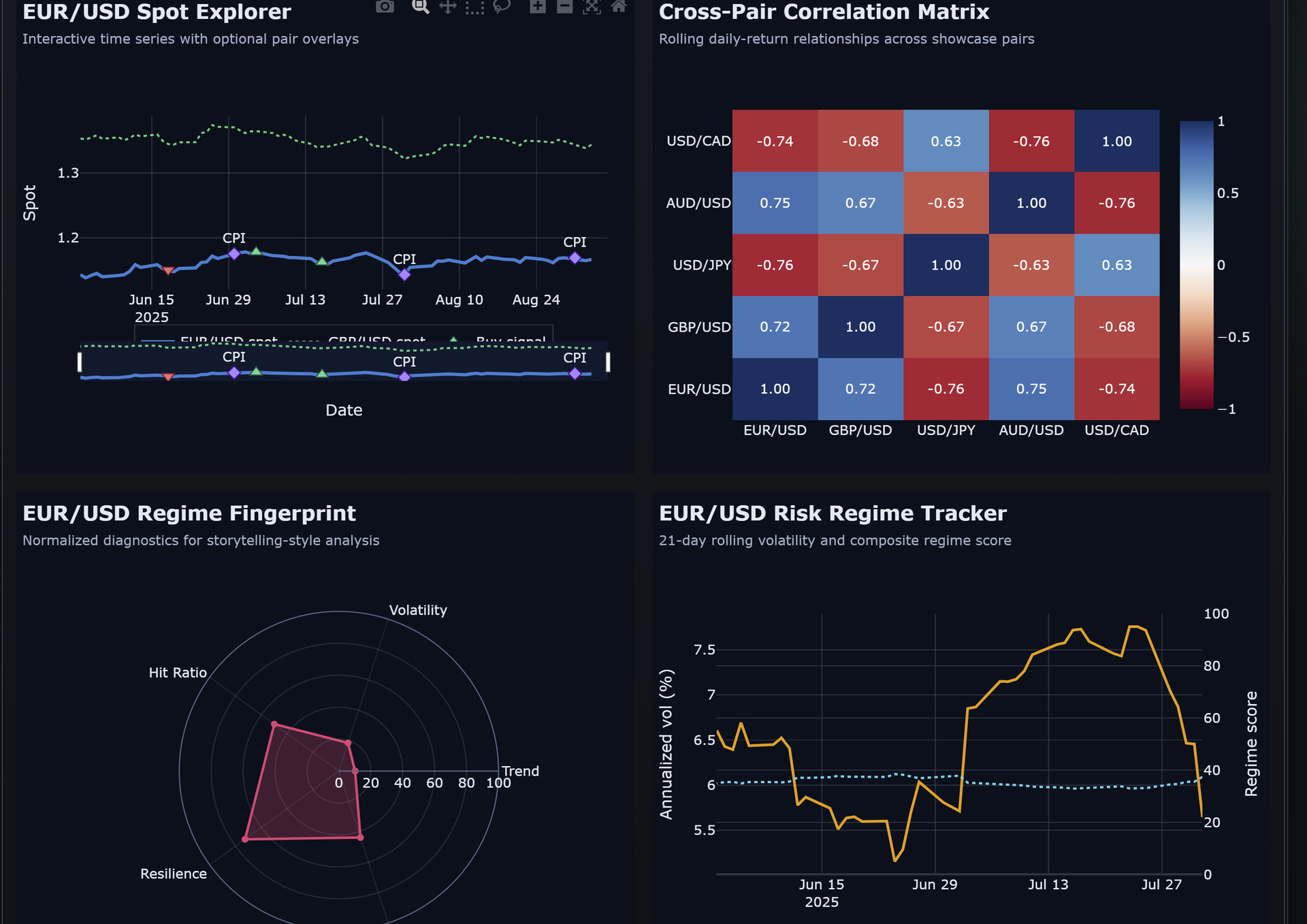
FXMacroData Public Macro Monitor is a live Dash app for exploring FX-relevant macroeconomic data across currencies, central banks, and market sessions. It helps users quickly compare indicators, spot trends, and understand how macro conditions differ across countries in a clean, practical, and publicly accessible interface.
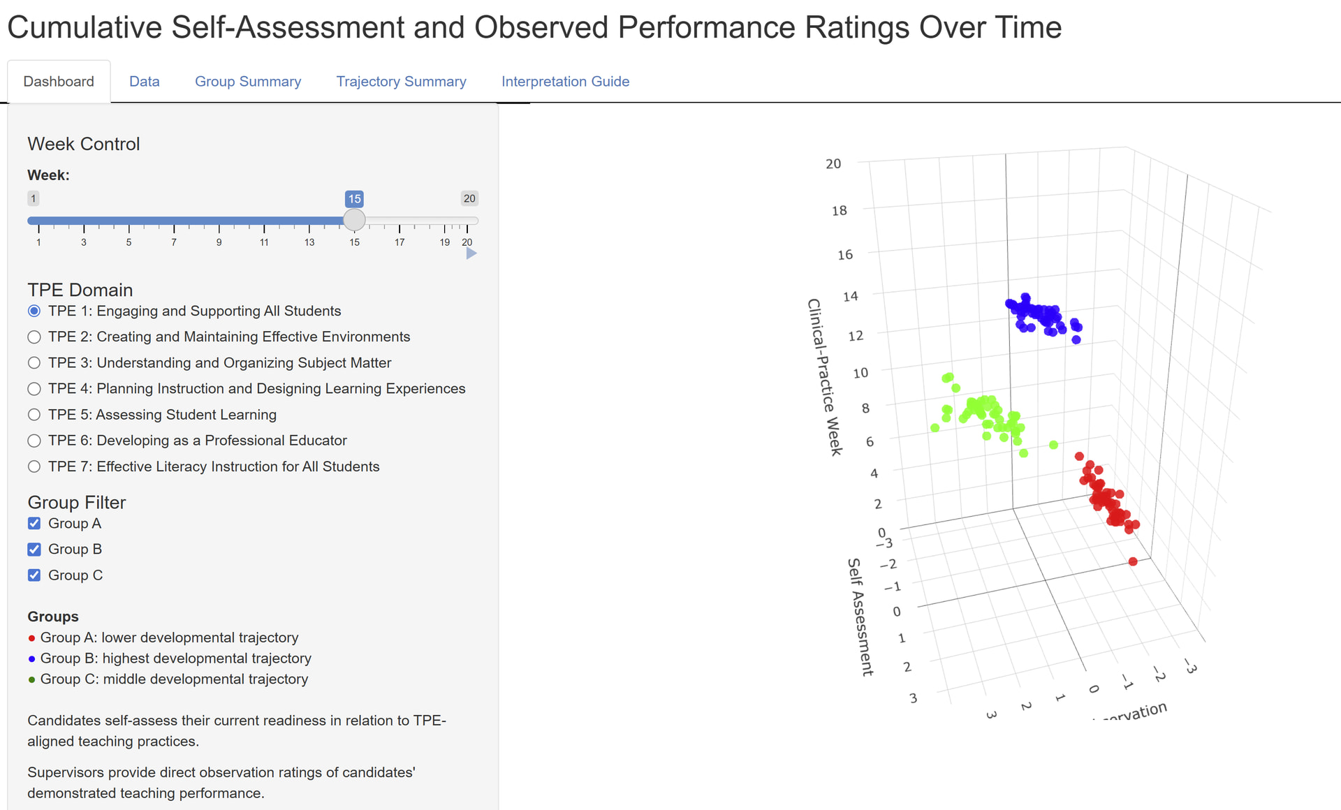
Cumulative Self-Assessment and Observed Performance Ratings Over Time
The 4D Cube is an interactive Plotly/Shiny visualization designed to model student teaching progress over time. The cube plots supervisor observation ratings on one axis, candidate self-assessment ratings on another, and clinical-practice week on the vertical axis. A fourth dimension is introduced through animation, allowing users to watch candidate cohorts move through the space from Week 1 to Week 20.
The demonstration uses fictitious data to show how student teachers may begin clustered around a common foundation and then separate into different developmental trajectories over time. The model is intended to help teacher education programs visualize alignment and misalignment between how candidates perceive their own teaching abilities and how supervisors observe their performance. This makes it possible to identify patterns such as calibrated growth, overconfidence, underconfidence, plateauing, or the need for targeted support. The larger purpose of the 4D Cube is to turn clinical assessment data into a dynamic, reflective, and program-improvement tool for supervision, candidate reflection, and longitudinal cohort analysis.
@Chris_B , @roberttidball thank you both for these great app. I’ll write you direct messages so we can talk about publishing them on Plotly Examples page.
Thank you very much. It is the same app. I uploaded it twice, because I didn’t see it render.
I will await instructions later.
Thanks,
Chris