Hi, I’m trying to plot a chart similar to the last chart in this link https://plot.ly/python/line-charts/
What I want is to shade the area around the mean line (dotted line). So I calculated a standart deviation and plotted two separated lines (above and bellow).

When I try to use the same code from the link’s example it plots a large rectangle in my chart:

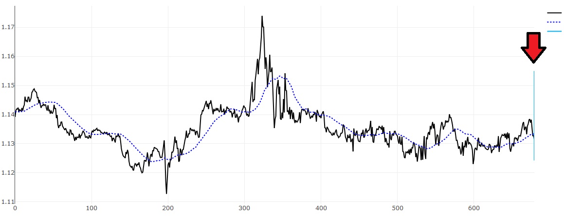
After some tests, I noticed that if i remove the fill='tozerox', fillcolor='rgb(0,176,246)' parameter it just plot a big vertical line in the end of the chart:
Now here is my code. Note that since I can plot the lines separately (commented lines = chart1), I’m assuming it isn’t a data issue.
 def plot_chart(ratio, mean, time, up_close, low_close):
 	time_rev = time[::-1]
 	low_close = low_close[::-1]

 	plotly.offline.plot({
 	    "data": [
 	    go.Scatter(x=time, y=list(reversed(ratio[:len(mean)])), name='Ratio', line=dict(color='rgb(0, 0, 0)')),
 	    go.Scatter(x=time, y=mean, name='Mean',line=dict(color='rgb(0, 0, 255)', dash='dot')),
 #This causes a rectangle (CHART 2):
 	    go.Scatter(x=time+time_rev, y=up_close+low_close, fill='tozerox', fillcolor='rgb(0,176,246)', name='Close Area',line=dict(color='rgb(255,255,255,0)')),

 #This plots the lines separately with no problem (CHART 1)
 #        go.Scatter(x=time, y=up_close, name='Close Area (Upper)',line=dict(color='rgb(0,176,246,0.2)')),
 #	    go.Scatter(x=time_rev, y=low_close, name='Close Area (Lower)',line=dict(color='rgb(0,176,246,0.2)'))

 #This plots the vertical line at the end of the chart (CHART 3)
 #        go.Scatter(x=time+time_rev, y=up_close+low_close, name='Close Area',line=dict(color='rgb(0,176,246,0.2)')),

 	    ], "layout": go.Layout(title='Test with Mean + STD')
 	    }, auto_open=True)
I’m kind of new at plotly (and plotting libraries) so it might be something simple that I’m overseeing. Can someone shed some light?
Thanks in advance.