I used following code in a notebook:
df = pd.read_csv('day_wise.csv')
fig = go.Figure()
fig.add_trace(go.Scatter(x=df['date'], y = df['tot'],
                            mode='lines+markers',
                            connectgaps=True
                        )
             )
fig.show()
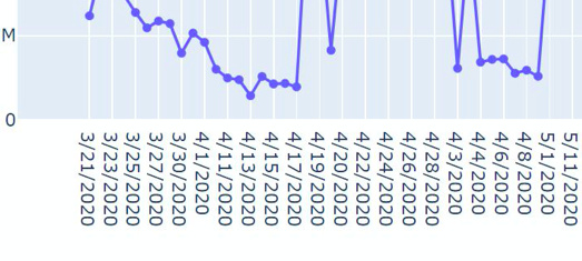
And the plot looked liked this:
And when I used the same code in dash app, then the plot changed to this:
I tried many methods but it remains the same, What should I do?
The dataset can be found here: day_wise.csv
could you try upgrading dash? pip install dash —upgrade
also it looks like the data might be different because the date formatting on the xaxis is different and our libraries don’t auto convert date formats. are you sure there isn’t anything different in your code?
No, the code is as it is and for the date column, I even added df['date'] = pd.to_datetime(df['date']), but nothing changed.
I already have up to date dash, I checked for libs and dependencies. And, that’s why I have also opened an issue for the same. But, I need a solution urgently.
Hi @avats-dev
I tried your figure in a simple dash app, and it worked fine for me. If you run my test app do you get the same results? If so it’s likely something not being up to date (I know you said you checked that). Or maybe you have something else in your dash app that is conflicting? (I can’t think of what that might be…just guessing). I’m also running Windows10.
# -*- coding: utf-8 -*-
import dash
import dash_core_components as dcc
import dash_html_components as html
import plotly.graph_objects as go
import pandas as pd

external_stylesheets = ['https://codepen.io/chriddyp/pen/bWLwgP.css']

app = dash.Dash(__name__, external_stylesheets=external_stylesheets)

df = pd.read_csv('day_wise.csv')
df= df.sort_values(by='date')

fig = go.Figure()
fig.add_trace(go.Scatter(x=df['date'], y = df['tot'],
                           mode='lines+markers',
                           connectgaps=True
                       )
            )

app.layout= dcc.Graph(figure=fig)

if __name__ == '__main__':
   app.run_server(debug=True
2 Likes
Thanks for creating the reproducible example @AnnMarieW!
@avats-dev Another sanity check re versions: You can also verify the versions within the dash app itself rather than the environment by printing dash.version and dcc.version.
Actually, I just had an idea, and was able to reproduce the error.
I converted the date to datetime and got the same strange results
df['date']= pd.to_datetime(df['date'])
The problem is with the sort. The initial df the date was a string, and if you sort that, the order is:
58   4/19/2020  2393006  574473  250443  1568090  0.056478
88    4/2/2020   826271  192420  103347   530504  0.050594
59   4/20/2020  2227579  542880  240036  1444663  0.056889
60   4/21/2020
It looked fine in the first example, because the x-axis was also in this same date order.
Now if you convert to datetime and then plot, you will get the strange looking chart - the x axis has the correct date order, but the df is still sorted like a string.
If you sort the df after converting to datetime, the problem is solved!
3 Likes
Yes! One clue when we see datetime charts is that whenever the date axis is a series of repeated strings like this: 
Then the axis is being treated as a categorical axis instead of a date axis. You’ll notice how in the other chart the axis is like this:

which is a date axis with nicer formatting that automatically updates when you zoom in etc.
Plotly only auto-formats these dates if the x data is in the form 2015-02-01 or if it’s a datetime. If data is passed in like 4/19/2020, then plotly will assume it’s a string.
That’s why I brought up:
1 Like
Thanks @AnnMarieW and @chriddyp, I have sorted the df after converting to datetime and now it’s working fine as I wanted.
Hey @chriddyp, What should I do about the issue I have opened?
1 Like
Glad it’s working for you!
And @chriddyp had the solution in the first reply (of course). Note to others: This was a good demonstration of why it’s helpful to include with your post a small app that reproduces the error. It makes it much easier to see what’s causing the problem.
1 Like
nothing! i already closed it 

1 Like


