Same color assigned to same level of factor in R

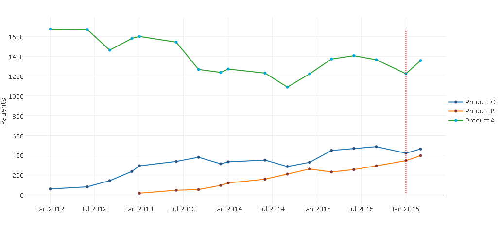
I have a Shiny app with several plotly visualisations. The user is allowed to choose several products and I would like each product to have the same unique color throughout the entire app. One of my visualisations could e.g. look like this:

plot_ly(df, x = variable, y=value, type = “bar”, color = Product, hoverinfo = “text”,
colors = colpal, text = paste0(df$value,"%")) %>%
layout(xaxis=ax, yaxis=yx, legend=list(x=1, y = 0.5))
Is is possible to make sure that the first level of Product ALWAYS get the first value of colpal?

In ggplot I think this can be achieved by specifying the color pallette like this:

c(“Product A” = “#00AADC”, “Product B” = “#843532”,“Product C” = “#2C5481”, “Product D” = “#CADFE1”)

But this doesnt seem to work in plotly.

Any help would be greatly appreciated.

Hi, there is an argument colorscale but I am not sure how to use it apart from heatmaps. But you can do the following:


# Scatter plot ----
set.seed(123)
df <- diamonds[sample(1:nrow(diamonds), size = 1000),]

cols <- RColorBrewer::brewer.pal(length(unique(df$color)), name = "Set3")

# Map to a color
df$color <- factor(df$color, labels = cols)

plot_ly(df, x = carat, y = price, mode = "markers", marker = list(color = color))

# Barplot ----
df <- mtcars

# Map to a color
df$color <- factor(df$gear, labels = RColorBrewer::brewer.pal(length(unique(df$gear)), name = "Set1"))

plot_ly(df, x = gear, y = mpg, type = "bar", marker = list(color = color))

Essentially, in your data map all unique values to a color and refer to that color vector every time you call plot_ly()

Hope this helps

Ah, yes of course. I will try this and let you know if it works!

@royr2 This works! But how do I set the line color in a mode = “markers + line” plot?
I’ve tried line=list(color=Color), but this won’t work.

Hi ! unfortunately, the marker argument controls color for markers as well lines in this case. So the only way for the points and lines to have different colors is to have separate traces using add_trace()

Example:

library(plotly)

df <- data.frame(x = 1:10,
                 y = sample(10:30, size = 10))

plot_ly(df, x = x, y = y, mode = "markers", marker = list(color = "red", size = 10)) %>% 
  add_trace(x = x, y = y, mode = "lines", marker = list(color = "green"))

@royr2 Thank you so much for your help! Actually, I was looking for a way to get the lines and markers the same color, but if I specify it as this:

plot_ly(df, x = carat, y = price, mode = "lines + markers", marker = list(color = color))

It is only the markers that get colored.

I believe doing what should change the color of the line as well points not just the points (markers). Works for me. Are you seeing otherwise? Can you share a screenshot?

Yes. But this may be due to my group argument:

plot_ly(x = Date, y=Patients, mode=" lines + markers", group=Product, marker=list(color=Color))

Either way the lines are colored with default plotly colors while the markers have the color I have specified.

EDIT: Screenshot:

EDIT: Actually I’m not even interested in the markers - I just want a basic line chart.

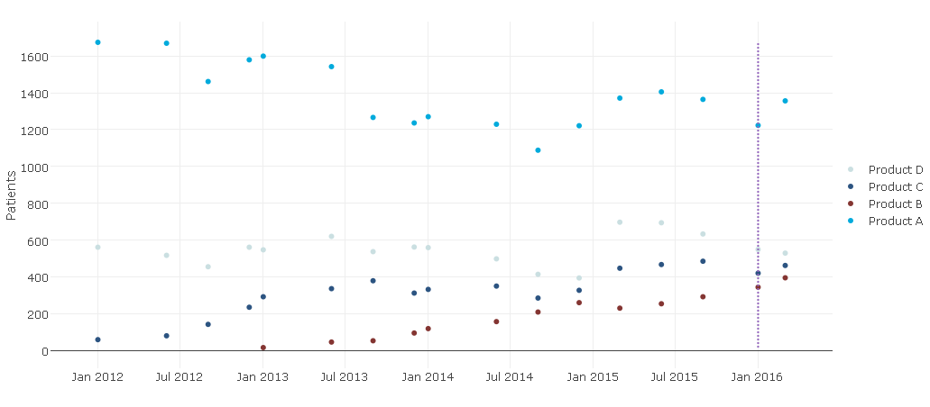
Unfortunately doesn’t seem like the color argument used in line takes multiple colors. If you keep the group argument as an ordered factor, I think plot_ly() will keep the color scheme consistent across charts.

Thank you either way. It’s a shame that it cannot be done, since it would seem like a trivial thing to go from:

To a line plot.