Hi @matti, to remove the “x” you can try to add title="" to your update_xaxes.
Also, if you wish to remove the xticks, you can add ticks="".
I’m not sure why the opacity of your hrect doesn’t work though.
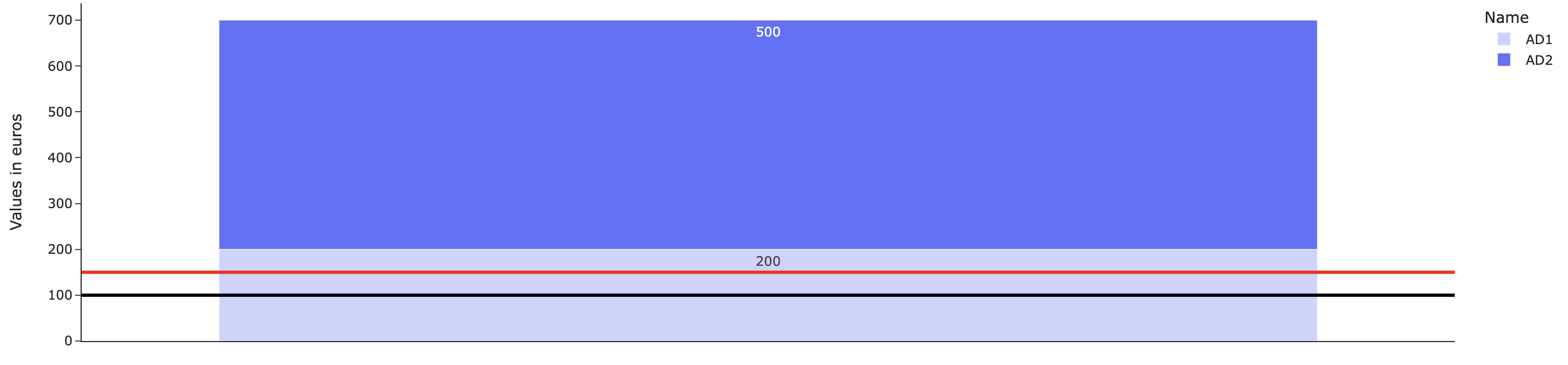
Here’s the code I used to generate the plot below:
fig = px.bar(df, x=[0,0], y="Values in euros", color = "Name", barmode='relative', template="simple_white", text_auto=True, color_discrete_map={'AD2': '#636efa', 'AD1': '#ced1fd'})
fig.update_xaxes(showticklabels=False, ticks="", title="")
fig.update_layout(coloraxis_showscale=False)
fig.add_hline(y=150, line_width= 3, line_color='red', opacity=1)
fig.add_hline(y=100, line_width= 3, line_color='black', opacity=1)
Hope that helps.