Remove x at top of bar chart and make hrect color darker

My bar chart looks like this:
image

Is there any way to remove the “x” at the top of the chart.

And I also want to make the hrect color stronger / more colorful. I used h_line before, but the color is not really stronger there.

This is the code that generates the chart:

fig = px.bar(df, x=[0,0], y='Values in €', color='Name', barmode='relative', template="simple_white", text_auto=True, color_discrete_map={'AD x W+I': '#636efa', 'AD': '#ced1fd'})
        fig.update_xaxes(showticklabels=False)
        fig.update_layout(coloraxis_showscale=False)
        fig.add_hrect(y0=ad_part-1000, y1=ad_part+1500, fillcolor='red', opacity=1, annotation_text=f'{ad_perc}%', annotation_position='bottom right')
        fig.add_hrect(y0=y_value-1000, y1=y_value+1500, fillcolor='black', opacity=1, annotation_text=f'durchschn. AD-Anteil {y}%', annotation_position='top left')

Hi @matti, to remove the “x” you can try to add title="" to your update_xaxes.
Also, if you wish to remove the xticks, you can add ticks="".

I’m not sure why the opacity of your hrect doesn’t work though.
Here’s the code I used to generate the plot below:

fig = px.bar(df, x=[0,0], y="Values in euros", color = "Name", barmode='relative', template="simple_white", text_auto=True, color_discrete_map={'AD2': '#636efa', 'AD1': '#ced1fd'})
fig.update_xaxes(showticklabels=False, ticks="", title="")
fig.update_layout(coloraxis_showscale=False)
fig.add_hline(y=150, line_width= 3, line_color='red', opacity=1)
fig.add_hline(y=100, line_width= 3, line_color='black', opacity=1)

Hope that helps.

2 Likes

Hi @jhupiterz , thank you for your reply. Your suggested solution works.
I have a question regarding the title.

If I write my code as follows, then the title appears below the x, but the x does not disappear:

fig = px.bar(df, x=[0,0], y='Values in €', color='Name', title='Incremental Sales: „AD Anteil“ und „AD x W+I', barmode='relative', template="simple_white", text_auto=True, color_discrete_map={'AD x W+I': '#636efa', 'AD': '#ced1fd'})
        fig.update_xaxes(showticklabels=False, ticks='')
        fig.update_layout(coloraxis_showscale=False, title_x=0.5)

But if I add the title inside the fig.update_xaxes() function, the title takes the place of the “x”. Why is that?

fig = px.bar(df, x=[0,0], y='Values in €', color='Name', barmode='relative', template="simple_white", text_auto=True, color_discrete_map={'AD x W+I': '#636efa', 'AD': '#ced1fd'})
        fig.update_xaxes(showticklabels=False, ticks='', title='Incremental Sales: „AD Anteil“ und „AD x W+I')
        fig.update_layout(coloraxis_showscale=False, title_x=0.5)

You’re dealing with two different titles here.
If you define the title inside px.bar() then this is your figure title.
If you define it inside .update_xaxes() then it’s the title of the x-axis.

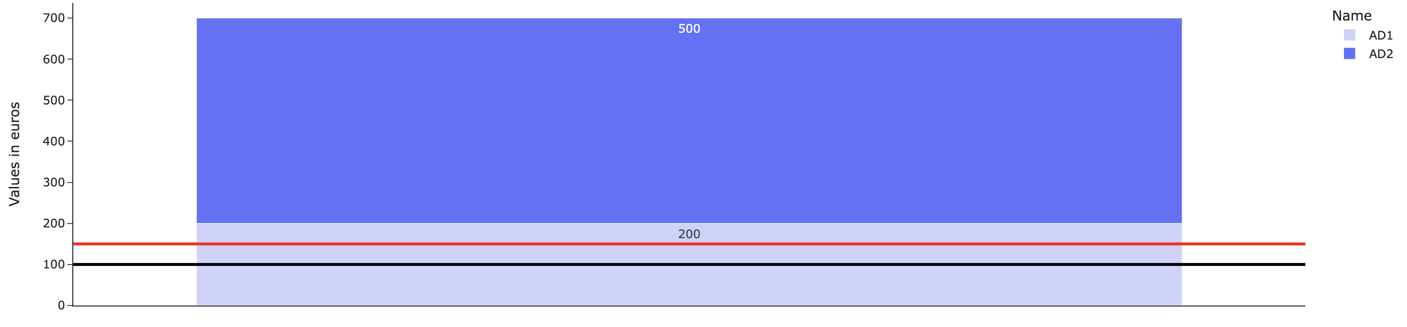
In the first code snippet, you defined a figure title as "Incremental Sales..." but didn’t define any title for the x-axis, which by default will be set to x since you didn’t pass a column name as x in your px.bar() (otherwise x would have been replaced by the column name). The reason it appears at the top of the figure is because of showticklabels=False, which prevents any x-axis label to be displayed below your x-axis:

fig = px.bar(df, x=[0,0], y="Values in euros", color = "Name", barmode='relative', template="simple_white",
             text_auto=True, color_discrete_map={'AD2': '#636efa', 'AD1': '#ced1fd'}, title = "Figure Title")
fig.update_xaxes(showticklabels=False, ticks = "", title='X-axis Title')
fig.update_layout(coloraxis_showscale=False)
fig.add_hline(y=150, line_width= 3, line_color='red', opacity=1)
fig.add_hline(y=100, line_width= 3, line_color='black', opacity=1)

In the second code snippet, you don’t define a figure title but only a title for your x-axis, which here again will appear at the top of the figure because of showticklabels=False. If you wish to hide the ticks and their labels but keep the title below, here’s a work around:

fig = px.bar(df, x=[0,0], y="Values in euros", color = "Name", barmode='relative', template="simple_white",
             text_auto=True, color_discrete_map={'AD2': '#636efa', 'AD1': '#ced1fd'}, title = "Figure Title")
fig.update_xaxes(tickvals=[0], ticktext=[" "], ticks = "", title='X-axis Title')
fig.update_layout(coloraxis_showscale=False)
fig.add_hline(y=150, line_width= 3, line_color='red', opacity=1)
fig.add_hline(y=100, line_width= 3, line_color='black', opacity=1)

1 Like