R Pie charts: how to remove axes in plotly in version 4.5.2?

Using a slightly altered version of the code in the pie chart example, I get axes appearing behind the pie chart. How can I get rid of these?

Code:
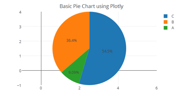
ds <- data.frame(labels = c(“A”, “B”, “C”),
values = c(10, 40, 60))
plot_ly(ds, labels = ~labels, values = ~values, type = “pie”) %>%
layout(title = “Basic Pie Chart using Plotly”)

Just Add this to your code :

ax <- list(
title = “”,
zeroline = FALSE,
showline = FALSE,
showticklabels = FALSE,
showgrid = FALSE
)
plot_ly(dat, labels = queryType, values = total, type = “pie”) %>%
layout(title = “Basic Pie Chart using Plotly”,xaxis = ax, yaxis = ax)

This should work.

1 Like