Hello all,
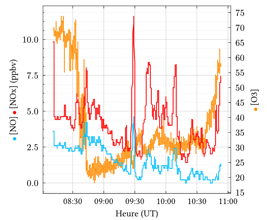
I am considering switching from other Python plotting libraries to Plotly. I will likely make the jump if I can replicate this specific layout :
It seems straightforward, but I have one specific question: would I be able to use Plotly’s capabilities to add colored markers next to or between the axis labels?
Thanks!
AIMPED
February 5, 2026, 6:43am
2
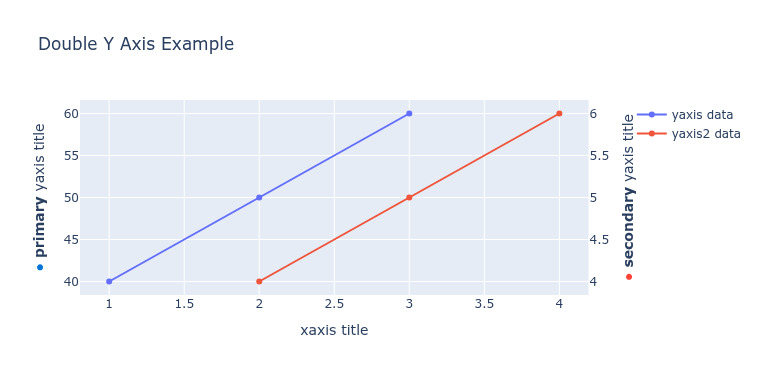
Hello @natrist , welcome to the forums.
I am not aware of a builtin function to do that, but you could do something like that:
import plotly.graph_objects as go
from plotly.subplots import make_subplots

# Create figure with secondary y-axis
fig = make_subplots(specs=[[{"secondary_y": True}]])

# Add traces
fig.add_trace(
    go.Scatter(x=[1, 2, 3], y=[40, 50, 60], name="yaxis data"),
    secondary_y=False,
)

fig.add_trace(
    go.Scatter(x=[2, 3, 4], y=[4, 5, 6], name="yaxis2 data"),
    secondary_y=True,
)

# Add figure title
fig.update_layout(
    title_text="Double Y Axis Example"
)

# Set x-axis title
fig.update_xaxes(title_text="xaxis title")

dot_primary = '<span style="color: #0074D9;">●</span>'
dot_secondary = '<span style="color: #FF4136;">●</span>'

# Set y-axes titles with the dots
fig.update_yaxes(
    title_text=f"{dot_primary} <b>primary</b> yaxis title",
    secondary_y=False
)
fig.update_yaxes(
    title_text=f"{dot_secondary} <b>secondary</b> yaxis title",
    secondary_y=True
)

fig.show()
mrep axis