Putting Two Graph in Custom Buttons

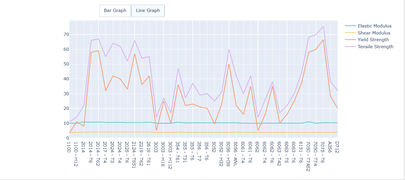
Hello! I’m new to using Plotly, and I’m trying to show two different graph using custom buttons., but I’m stack what’s the next step. I was able to show it before, but when I run my code again, it doesn’t appear in the end. Here’s the current code that I’m writing:

import numpy as np
import pandas as pd
import seaborn as sns
import matplotlib.pyplot as plt
import plotly as ply
import plotly.express as px
import plotly.graph_objects as go

%matplotlib notebook

url = "https://raw.githubusercontent.com/m23chaffee/DS100-Repository/main/Aluminum%20Alloy%20Data%20Set.csv"
alloy = pd.read_csv('https://raw.githubusercontent.com/m23chaffee/DS100-Repository/main/Aluminum%20Alloy%20Data%20Set.csv')
del alloy['temper']
alloy = alloy.rename(columns={'aluminum_alloy':'Alloy Number',
                              'modulus_elastic': 'Elastic Modulus',
                              'modulus_shear': 'Shear Modulus',
                              'strength_yield': 'Yield Strength',
                              'strength_tensile': 'Tensile Strength'
                             })

bar1 = px.bar(alloy,
            x = "Alloy Number",
            y = ["Elastic Modulus", "Shear Modulus","Yield Strength","Tensile Strength"],
            barmode = 'group',
            width = 1100,
            height =500,
            orientation = 'v',
            color_discrete_sequence = px.colors.qualitative.Pastel,
            labels={"value": "Data Values"},
            template = 'seaborn').update_traces(legendgroup="group").update_layout(showlegend=False)

line1 = px.line(alloy,
            x = "Alloy Number",
            y = ["Elastic Modulus", "Shear Modulus","Yield Strength","Tensile Strength"],
            width = 1100,
            height =500,
            orientation = 'v',
            color_discrete_sequence = px.colors.qualitative.Pastel,
            labels={"value": "Data Values"},
            template = 'seaborn').update_traces(legendgroup="group").update_layout(showlegend=False)

# Add buttom
fig.update_layout(
    updatemenus=[
        dict(
            type = "buttons",
            direction = "left",
            buttons=list([
                dict(
                    args=['type', 'bar'],
                    label="Bar Graph",
                    method="restyle",
                ),
                dict(
                    args=["type", "line"],
                    label="Line Graph",
                    method="restyle"
                )
            ]),
            pad={"r": 10, "t": 10},
            showactive=True,
            x=0.11,
            xanchor="left",
            y=1.1,
            yanchor="middle"
        ),
    ]
)

fig.show()

but previously, I tried to run this code. it works on what I intended, but the legends got duplicated

HI @lynmanalpha welcome to the forums.

Where do you define the figure fig?

is that the fig = go.Figure line?

:slight_smile:

That wasn’t a trick question, this line is not in the code snippet you posted. The provide code throws an error when executing it.

EDIT: is this the expected result?

import numpy as np
import pandas as pd
import plotly as ply
import plotly.express as px
import plotly.graph_objects as go


url = "https://raw.githubusercontent.com/m23chaffee/DS100-Repository/main/Aluminum%20Alloy%20Data%20Set.csv"
alloy = pd.read_csv('https://raw.githubusercontent.com/m23chaffee/DS100-Repository/main/Aluminum%20Alloy%20Data%20Set.csv')
del alloy['temper']
alloy = alloy.rename(columns={'aluminum_alloy':'Alloy Number',
                              'modulus_elastic': 'Elastic Modulus',
                              'modulus_shear': 'Shear Modulus',
                              'strength_yield': 'Yield Strength',
                              'strength_tensile': 'Tensile Strength'
                             })

bar1 = px.bar(alloy,
            x = "Alloy Number",
            y = ["Elastic Modulus", "Shear Modulus","Yield Strength","Tensile Strength"],
            barmode = 'group',
            width = 1100,
            height =500,
            orientation = 'v',
            color_discrete_sequence = px.colors.qualitative.Pastel,
            labels={"value": "Data Values"},
            template = 'seaborn').update_traces(legendgroup="group").update_layout(showlegend=False)

line1 = px.line(alloy,
            x = "Alloy Number",
            y = ["Elastic Modulus", "Shear Modulus","Yield Strength","Tensile Strength"],
            width = 1100,
            height =500,
            orientation = 'v',
            color_discrete_sequence = px.colors.qualitative.Pastel,
            labels={"value": "Data Values"},
            template = 'seaborn').update_traces(legendgroup="group").update_layout(showlegend=False)

b1 = [trace for trace in bar1.select_traces()]
l1 = [trace for trace in line1.select_traces()]

fig=go.Figure(data=b1+l1)

# Add buttom
fig.update_layout(
    updatemenus=[
        dict(
            type = "buttons",
            direction = "left",
            buttons=list([
                dict(
                    args=['type', 'bar'],
                    label="Bar Graph",
                    method="restyle",
                ),
                dict(
                    args=["type", "line"],
                    label="Line Graph",
                    method="restyle"
                )
            ]),
            pad={"r": 10, "t": 10},
            showactive=True,
            x=0.11,
            xanchor="left",
            y=1.1,
            yanchor="middle"
        ),
    ]
)

fig.show()

It did! It shows the same result that appeared in the code hours before I post this question in this forum; however, the legends are now duplicated

OK, you can set the showlegend argument to False for the barplot traces. Just add this line after the first b1 = ... line

b1 = [trace.update({'showlegend':False}) for trace in b1]

1 Like

It works! Here’s the final code:

import numpy as np
import pandas as pd
import seaborn as sns
import matplotlib.pyplot as plt
import plotly as ply
import plotly.express as px
import plotly.graph_objects as go

%matplotlib notebook

#reading the csv file form github, and cleaning the data table for our use

url = "https://raw.githubusercontent.com/m23chaffee/DS100-Repository/main/Aluminum%20Alloy%20Data%20Set.csv"
alloy = pd.read_csv('https://raw.githubusercontent.com/m23chaffee/DS100-Repository/main/Aluminum%20Alloy%20Data%20Set.csv')
del alloy['temper']
alloy = alloy.rename(columns={'aluminum_alloy':'Alloy Number',
                              'modulus_elastic': 'Elastic Modulus',
                              'modulus_shear': 'Shear Modulus',
                              'strength_yield': 'Yield Strength',
                              'strength_tensile': 'Tensile Strength'
                             })

# setting up bar chart

bar1 = px.bar(alloy,
            x = "Alloy Number",
            y = ["Elastic Modulus", "Shear Modulus","Yield Strength","Tensile Strength"],
            barmode = 'group',
            width = 1100,
            height =500,
            orientation = 'v',
            color_discrete_sequence = px.colors.qualitative.Pastel,
            labels={"value": "Data Values"},
            template = 'seaborn').update_traces(legendgroup="group").update_layout(showlegend=False)

# setting up line graph

line1 = px.line(alloy,
            x = "Alloy Number",
            y = ["Elastic Modulus", "Shear Modulus","Yield Strength","Tensile Strength"],
            width = 1100,
            height =500,
            orientation = 'v',
            color_discrete_sequence = px.colors.qualitative.Pastel,
            labels={"value": "Data Values"},
            template = 'seaborn').update_traces(legendgroup="group",visible='legendonly').update_layout(showlegend=False)

b1 = [trace for trace in bar1.select_traces()]
l1 = [trace.update({'showlegend':False}) for trace in l1]

fig=go.Figure(data=b1+l1)

# Add button
fig.update_layout(
    updatemenus=[
        dict(
            type = "buttons",
            direction = "left",
            buttons=list([
                dict(
                    args=['type', 'bar'],
                    label="Bar Graph",
                    method="restyle",
                ),
                dict(
                    args=["type", "line"],
                    label="Line Graph",
                    method="restyle"
                )
            ]),
            pad={"r": 10, "t": 10},
            showactive=True,
            x=0.11,
            xanchor="left",
            y=1.1,
            yanchor="middle"
        ),
    ]
)
fig.update_layout(legend=dict(groupclick="toggleitem"))

fig.show()

with result:


Thank you soo much!!! :heart_eyes:

edit: I add some lines of code to hide the line graph when running the notebook

1 Like