Hello Guys,
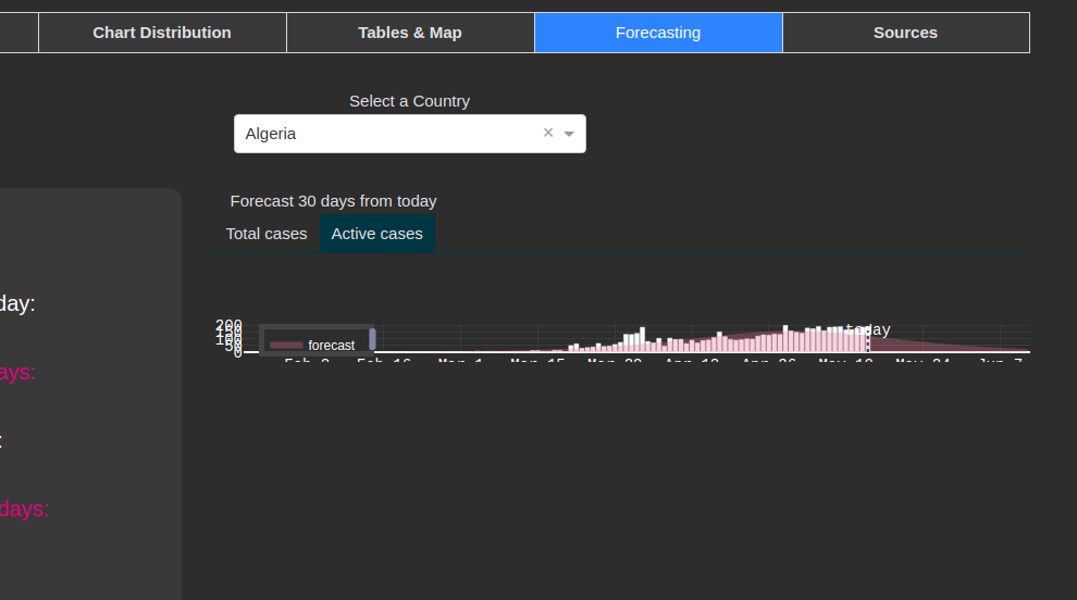
I have developed a COVID-19 web app and I realized that on the “Forecasting” tab it renders the Total Cases graph but when I click on Active Cases, it shows a weird smashed graph.
When I the country again, it will render correctly, but now, if I back to “total cases”, now, the total cases will be smashed.

If you want to try for yourself: https://trich-coronavirus.herokuapp.com/
I thought that it was some mistake from me, and I lose a lot of time trying to solve it without success but today, when reading the New Dash documentation about callbacks I got a similar problem
It’s a bug or what?! Someone can give me more information about how to solve it or even if I should report on Dash/Plotly issues?
Thank you in advance.
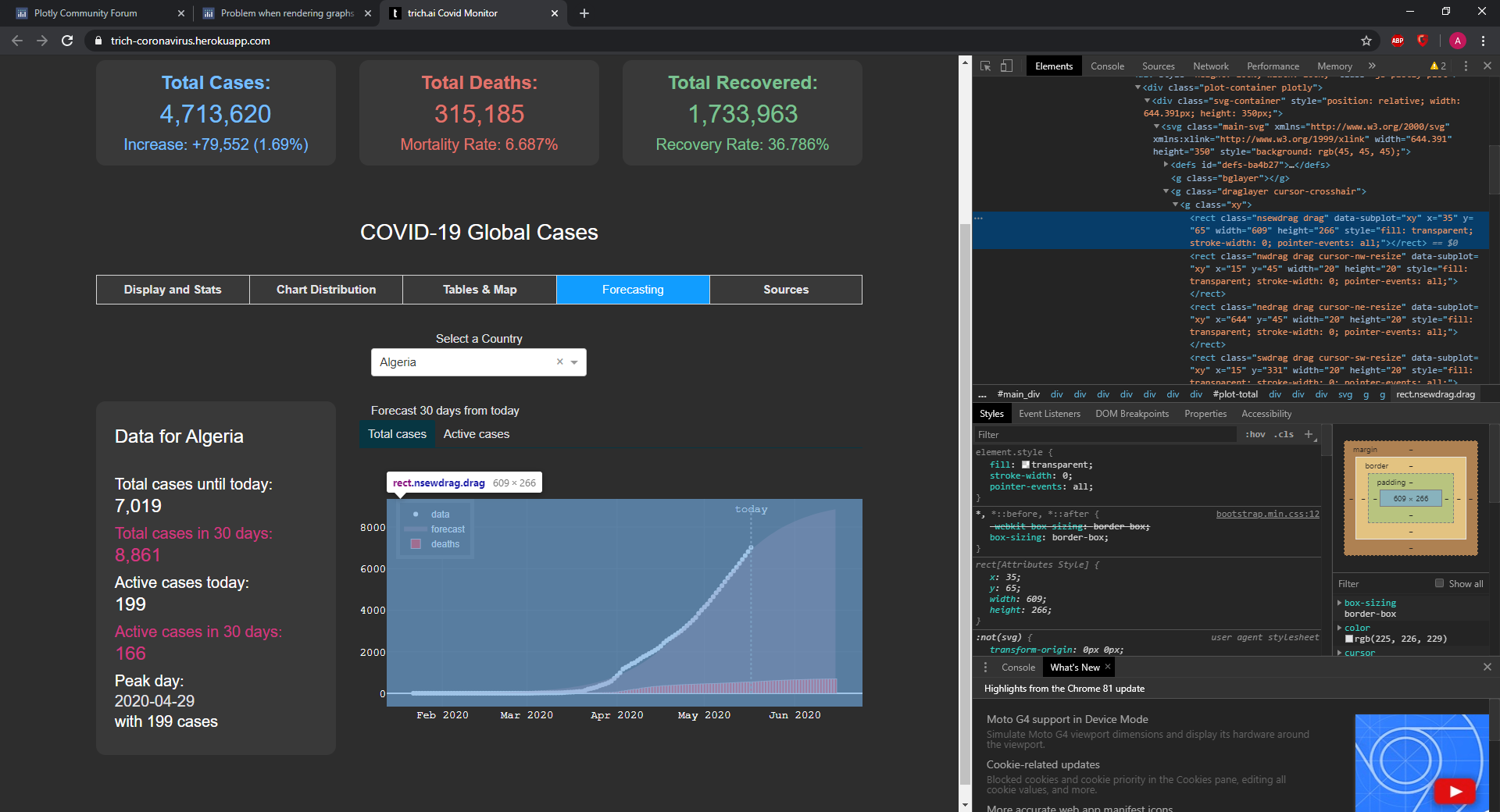
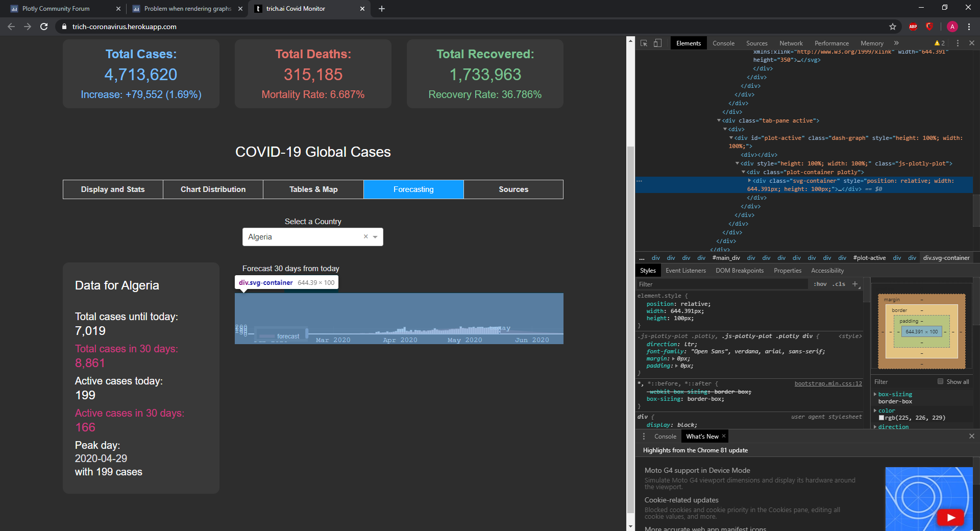
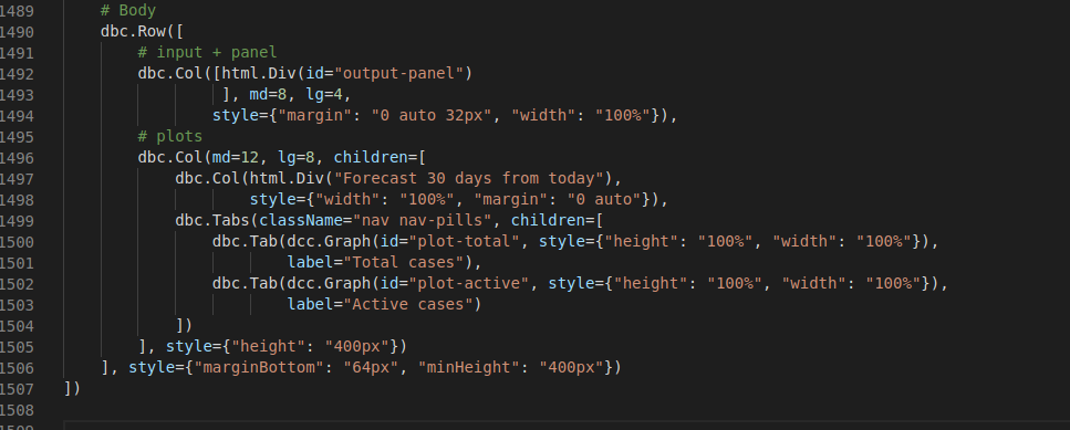
It looks like that the height property of the html-div where you put the graph is not definde properly.
In the “total cases” instance, the height is 266 pixels, in the “active cases”, the height is a mere 100 pixels.
I suggest looking at the div-container where the graphs are outputted to, and make it a static 266 pixels (for example).
Or, look into your callback. If the callbacks is sending the div, make sure to declare the height of the div coming out of that particular callback.
Total cases height:
Actual cases height:
Hi Blaceus, thank you for answer!
I tried to implement what you said, but it apparently don’t worked.
This problem don’t make sense because of sometimes it works, and sometimes it doesn’t.
I have set sizes on the chart, on the Div Col, and also on the Div Row, but it still giving a small chart when switching the tabs
Also, on the charts I have specified a size and tried with and without “auto_size”
It seems like it is rendering the both tabs and it only render correctly the tab that we are, and returning a 100px chart on the another tab;