Hello,
I am new to plotly and dash. I’d like to plot horizontal bar charts on a time-series. Basically here is what I want for minute data:
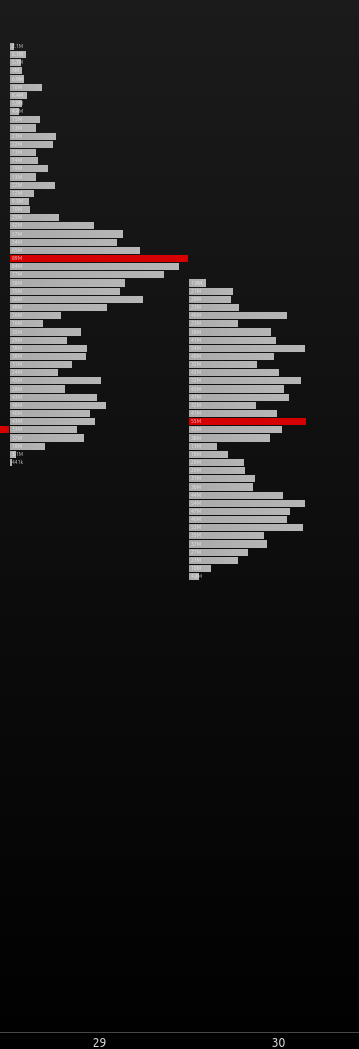
My main problem is I don’t know how to define xaxis for both minute coordinates and the height of the bars. Because for each minute data I want horizontal bar charts like this.
Or maybe there is another trick that I am not aware of.
I hope I’ve given enough information about what I want. If not please let me know how to elaborate on my problem.
Thank you for your time