Hi there,
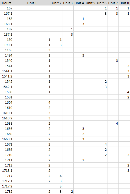
I have some data which has an x-column containing time information and a y-column containing various enumerated events.
Ultimately I would like to plot the events from multiple units on the same chart…maybe even a 3d chart?
Can some one suggest the best way to present this information on plotly?
Best Regards
Andy
sdeniz
2
Hi Andy,
I would represent time (X-axis), units (Y-axis), and type of event with colors.
Something like:
plot_ly(data = … , x=…, y=… , mode = “markers”,
color = events , colors = c(“green”,“yellow”,“orange”,“red”,“blue”)).
Try it
I forgot to add I am a complete newbie to Plotly.
Could you explain in more simple terms?
sdeniz
4
I would try because I am newbie too.
I use R. I would create a data frame.
This means, create 3 columns one for time, one for unit, one for event.
Time Unit Event
167 6 1
167 7 1
…
1732 1 2
Once you have created, the data frame
ot_ly(data = dataframe , x=Time , y=Unit , mode = “markers”,
color = events , colors = c(“green”,“yellow”,“orange”,“red”,“blue”))
Better ? If not I would re-explain it again