enyo
November 16, 2020, 8:59pm
1
Hello,
I am searching for a bar chart which is capable of creating a plot like this:
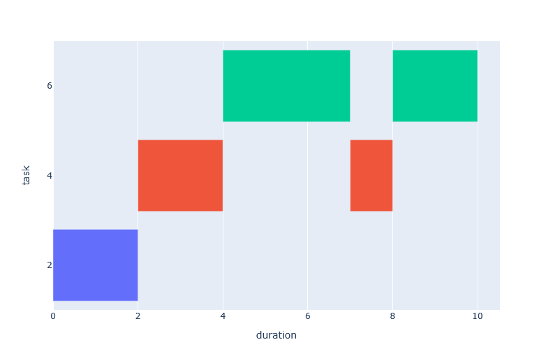
I am reading from an .csv file and my data looks like this:
1. Task   Start   End	Duration ....
2.  2       0      2		2
3.  4       2      4		2
4.  6       4      7		3
5.  4       7      8		1
6.  6       8	   10		2
...
So every task has a his start and stop time. Also his wide is given (duration). When a Task ends, the next task will start. A task can run multiple times.
Thanks
derive the coordinates and draw shapes in a scatterplot
You can use px.timeline to do just this. See more info on how to use it here .
enyo
November 17, 2020, 9:10pm
4
timeline is not working for me, since i dont have “Dates” on X. Is there a way or workaround to have the x-axe just as a value like 5, 10, 15 …
Right, then you can use the base attribute of the Bar elements:
import pandas as pd
import numpy as np
import plotly.express as px

df = pd.DataFrame(
    np.c_[
        [2, 4, 6, 4, 6],
        [0, 2, 4, 7, 8],
        [2, 4, 7, 8, 10],
        [2, 2, 3, 1, 2],
    ],
    columns=["task", "start", "end", "duration"]
)
fig = px.bar(
    df, base="start", x="duration", y="task", color=df.task.astype(str), orientation="h"
).update_layout(showlegend=False, yaxis_type="category")
fig.show()