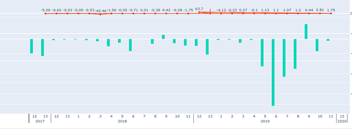
I see that I can use hierarchical data on the X-axis - that’s great!
# with plotly.py 3.8.1
import plotly.graph_objs as go
import plotly.offline as offline
offline.init_notebook_mode()

offline.iplot([go.Bar(x=[('A', 'A', 'B'), ('a', 'b', 'c')], y=[3, 2, 4])])
Now I am wondering if I can add a third dimension. I’ve tried the below, but it gives exactly the same graph as above. Any suggestion? Thanks
offline.iplot([go.Bar(x=[('A', 'A', 'B'), ('a', 'b', 'c'), ('d', 'e', 'f')], y=[3, 2, 4])])
Not at the moment unfortunately.
You can subscribe to Extend multicategory axes to more than 2 levels · Issue #2175 · plotly/plotly.js · GitHub for the most up-to-date development info.
1 Like
Thanks for the quick response. Sure I will follow the issue tracker, that’s a good idea !
Hi, I have an issue with this where the x axis messes up, for example if I want to plot year and month, but my data starts in month 5 of 2012, every consecutive year will then show as [5,6,7,8,9,10,11,12,1,2,3,4] as seen below. Any idea on how to fix this?

