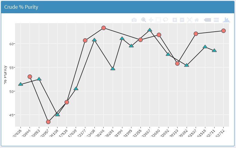
I am having an issue with the way a ggplot is rendered via plotly within a fluidrow box inside the Shiny Dashboard app I have created. In the example screen shot below, the x-axis text is missing about 4 characters and the y-axis label is partially rendered.
The outside margins of the plot look to be getting clipped and do not render the text completely for both the x & y axes. Is there a way to pad the margins of the plot to ensure all text can be made visible? I have tried adding an HTML break() within the plot window using shiny code and it does not resolve the issue. I also don’t see this same issue with any other charting package used for this app. Any help/information is appreciated.
Thanks Carson. I installed the devtools version and am still observing the issue.
The issue seems related to whether or not an axis label is present.
When no axis label is present…the text on the x-axis is not displayed entirely and is missing 2-3 characters (see attachment 1).
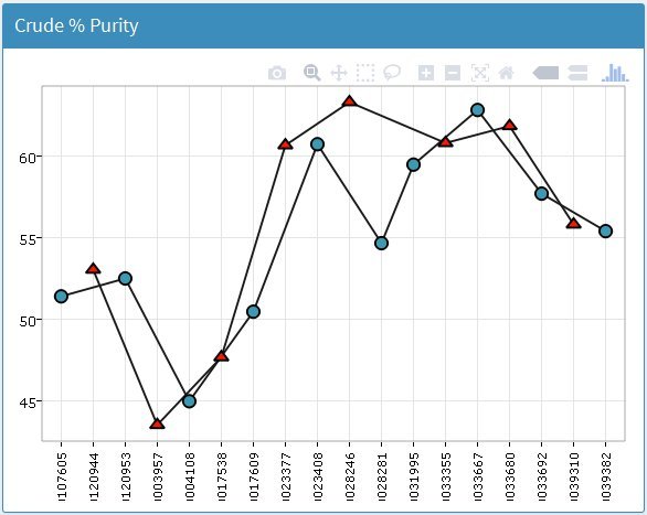
When an axis label is present…the text on the tick marks is displayed entirely but is over the axis label (attachment 2).
The issue also seems isolated to the x-axis. The clipping of the y-axis label (observed in my original post seems to have been resolved. Any additional help with this issue is greatly appreciated.
This issue had resolved itself (can’t remember how) until today. I just updated my plotly package to 4.7.0.9000 and now the output graphs will not stay within the bounds of a box in my shinydashboard app. Specifying width or height arguments to plotlyOutput do not solve the issue.
Is there a way to force the plot to stay within the bounds of the box again? Any help is appreciated.
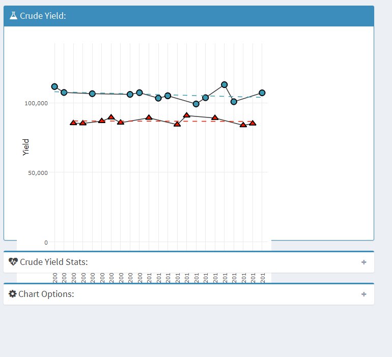
box(width = 12, title = tagList(shiny::icon("flask")," Crude Yield:"), status = "primary", solidHeader = TRUE, plotlyOutput("primer_crude_od"))
An example image where it can be seen that the plot ignores both height and width arguments can be found attached.
After downgrading back to plotly version 4.6.0…the issue is no longer present. require(devtools) install_version("plotly", version = "4.6.0", repos = "http://cran.us.r-project.org")
Resizing the browser window causes the plot to resize itself and stay within the box margins (as expected). Any idea what changed between versions that may have caused this?
But I use the plot in multiple locations with various sizes and I don’t want to have to feed a parameter from server.R into the function. It also doesn’t resolve a similar issue with the width.
I was wondering if there were any news on the topic.
We use plotly with an R markdown document that uses flexdashboard and shinydashboard and I constantly experience the issue described above. I also should not hardcode the dimensions as all of our content is “flex” and adjusts in size as needed to fill the page.
Sometimes, if I zoom out and back into the page of the web browser (CTRL + -/+), the issue disappears. But often, the plot has to become tiny before it is displayed fully and upon zooming in, half of it disappears again. My problems mainly concern the y axis, because the plots seem to be too wide.